The hawkish Fed pause, Chinese exports and sluggish Germany
.png)
This week’s charts begin with an examination of why the Federal Reserve’s latest move is being dubbed a “hawkish pause”: the “dot plot” of rate forecasts is creeping higher. We show the historic divergence between gross domestic product (GDP) and gross domestic income (GDI), which might be giving the Fed pause as it ponders the true strength of the US economy. As the US yield curve stays inverted past 300 days, we show how this historic recession indicator is reaching early 1980s proportions. Amid this environment, we visualise how US investors are continuing to choose the high yields of money-market funds. In Germany, we track how the nation’s economy is lagging European peers. Finally, for China, we break down slumping exports by destination, and show how the nation’s air traffic rebound has been largely domestically driven, with much less international travel.
“Higher for longer” in the Fed dot plot
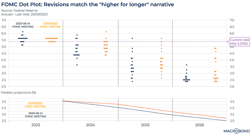
This chart shows why the Federal Reserve’s latest move was called a “hawkish pause.” The “higher for longer” interest-rate scenario is weighing on markets, even as policy makers unanimously voted to hold rates steady on Sept. 20.
To assess what policy makers are thinking, we turn to the “dot plot,” the Fed’s de facto monetary-policy forecast. Board members and regional Fed presidents are polled, resulting in 19 “dots” showing where they see the Fed funds rate at the end of 2023, 2024, 2025 and 2026.
This visualisation compares the dot plots released after the June (blue) and September (orange) Fed meetings. Broadly, policy makers are now expecting fewer rate cuts. Two outliers have removed their predictions of significant cuts in 2024; five “dots” call for rates above 4 percent in 2026, a scenario that was not being envisioned three months earlier.
The second pane tracks the median prediction to show how the dot plot has generally shifted upward. Note that it still implies one more rate hike before the end of 2023.
JPMorgan boss Jamie Dimon, one of the most public faces of Wall Street, recently mused that the Federal Reserve might end up having to hike its key rate to 7 percent to tame inflation. None of the dots in the plot are going that far for now.
(In June, we wrote about how the dot plot was already creeping toward a higher-for-longer scenario, using a different visualisation.)
China’s falling exports by region
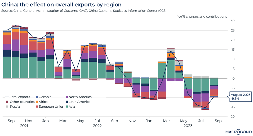
Chinese exports have been falling since May. As of August, exports were down by almost 10 percent year-on-year, the fourth consecutive monthly decrease on that basis, as our chart shows.
Our chart also breaks down demand from the various regions that import goods from China. (As such, it’s an alternative to a visualisation we published in August.)
All export markets are displaying a decrease, with the exception of Russia. The rest of Asia (in green) had been a bright spot early in 2023, but no longer.
The travails of the EU’s biggest economy
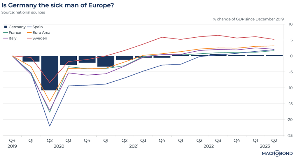
The phrase “sick man of Europe” was coined to refer to the late Ottoman Empire. In more recent decades, commentators have applied the phrase to dysfunctional economies. In the 1970s, it was Britain; in the 1990s, it was Germany as its economy struggled post-reunification.
The German economy roared back to life from the mid-2000s, benefiting from an export and globalisation boom and spearheading European growth. But since the disruptions from the war in Ukraine, some observers are bringing the “sick man” label back as barriers to globalisation and the end of cheap gas from Russia complicate the nation’s industrial model.
We compared Germany – using bars to make Europe’s largest economy stand out more clearly from the lines on the chart – to the aggregate euro zone as a whole (including Germany) and other EU nations. GDP is compared to pre-pandemic levels for all countries.
Germany’s economy resisted the Covid crash much better than some of the others. But for more than a year, its performance has trailed its neighbours. Germany’s economy is barely bigger than it was at the end of 2019; even French GDP is 1.7 percent above that level, and other nations have rebounded even more strongly.
The inverted US yield curve is reaching early ‘80s proportions
Tip: this chart can be applied to different countries using change region functionality.
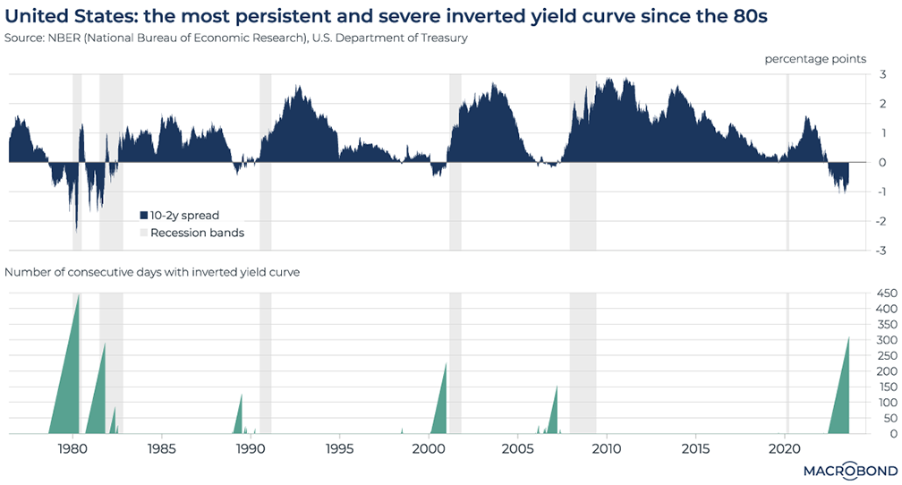
An inverted yield curve – which occurs when long-term interest rates are lower than short-term ones – used to be a reliable warning that a recession was coming soon. The theory: the yields reflect how traders are predicting that higher borrowing costs will slow the economy, prompting central banks to cut rates in the future.
We have written about the inverted curve several times over 2022-23. But an inversion has become a standard feature of the market, even as forecasters backed away from predicting recession.
This chart visualises the 10-year/2-year US government bond spread over the past five decades. The spread reached severely negative territory several times in the late 1970s/early 1980s period, when Paul Volcker ran the Fed. After that, much smaller inversions preceded the early 1990s, early 2000s and GFC recessions (highlighted in gray).
The second panel tracks the number of consecutive days that an inverted yield curve lasted. We have just exceeded 300 days – the longest inversion since 1980.
As some commentators have written recently, the inverted yield curve may not be as reliable an indicator as it once was.
The slow rebound of air travel in and out of China
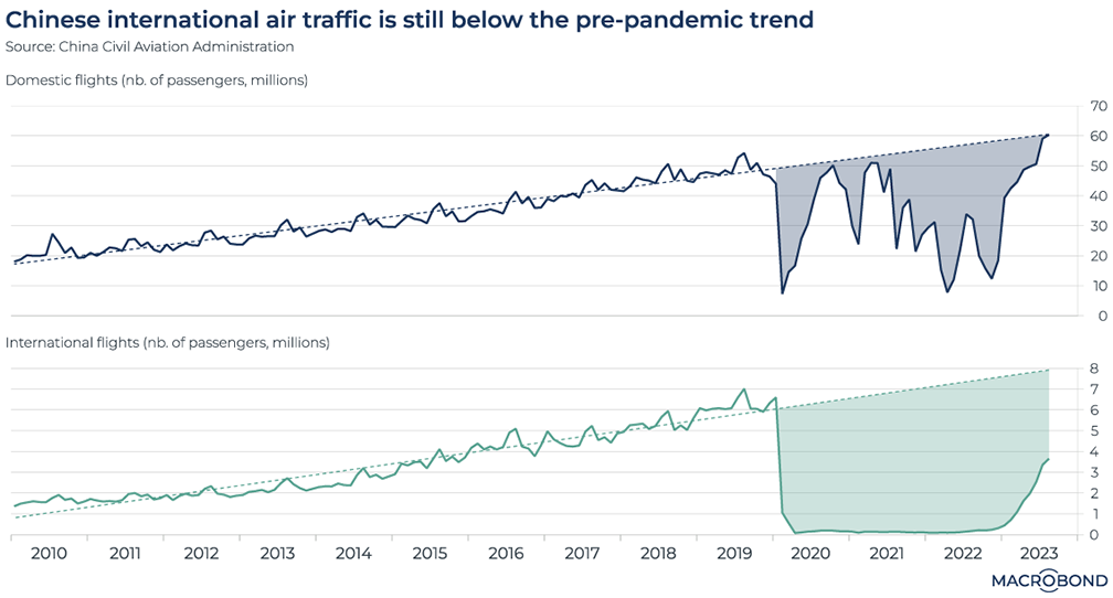
China's air travel market has seen a significant upturn after zero-Covid policies were relaxed this year. But the rebound is domestically driven.
As this chart shows, passenger numbers for air travel inside the country have just returned to the pre-pandemic long-term trend.
International air travel, however, remains less than halfway to that long-term trend line.
Discrepancies in measuring the US economy
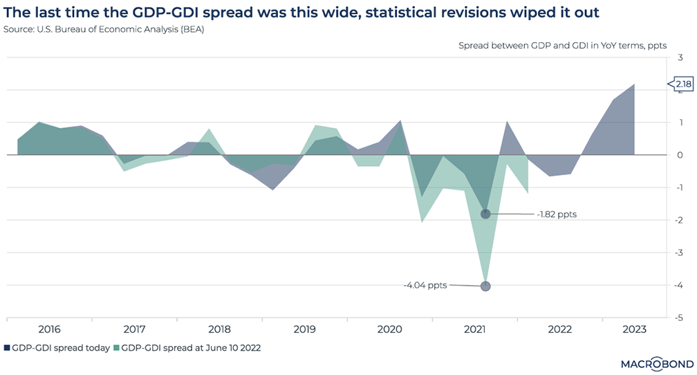
This chart uses Macrobond’s Revision History functionality, which is only available to our Data+ subscribers.
This chart compares US gross domestic product with gross domestic income. GDP includes an economy’s expenditures: consumption, net exports, investment and government spending. GDI, which is more challenging to measure, comprises its income: the sum of all wages, profits, and taxes, minus subsidies.
Since one person’s expenditure is another’s income, GDP and GDI should, in theory, be equal. However, statistical discrepancies mean there can sometimes be sizeable differences. (These discrepancies are one of the reasons why economic statistics are so frequently revised, demonstrating the importance of Revision History.)
We’re experiencing a historically large spread between these series in year-over-year terms, with GDP exceeding GDI by almost 3 percentage points. We saw the opposite extreme in 2021, where the spread was about 4 percent in GDI’s favour. But the figures were later revised, more than halving that spread. Will history repeat itself?
Given that the GDP-GDI spread widened for unclear reasons during the pandemic, this poses a challenge for policy makers assessing the health of the economy. Some observers believe that GDI is the better long-term indicator, and thus the economy is not doing so well.
Funds keep flowing into US money markets
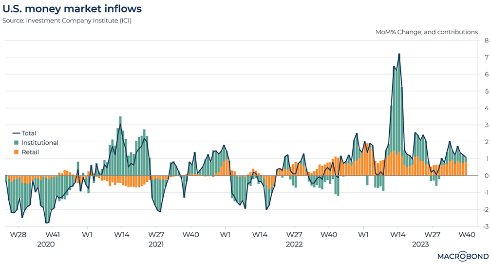
Higher rates since mid-2022 have meant steady inflows into money-market funds, as our chart shows. Both retail investors and institutions are attracted by higher returns on their cash.
This visualisation splits the inflows into institutional and retail investors, and tracks the month-on-month change. A spike can be seen in early 2023, when the Silicon Valley Bank failure and related tensions in the banking system prompted depositors to shift funds to money markets. (Institutional investors also sought to park their cash in a less volatile corner of the market during that crisis.)
But the month-on-month, week-on-week increases have continued, especially among retail investors.
(For more on inflows into US money markets, read our guest blog from Ashridge Macro – written at the height of the SVB tensions in March.)
SUBSCRIBE
3 topics
.png)
Macrobond delivers the world’s most extensive macroeconomic & financial data alongside the tools and technologies to quickly analyse, visualise and share insights – from a single integrated platform. Our application is a single source of truth for...
Expertise
.png)
Macrobond delivers the world’s most extensive macroeconomic & financial data alongside the tools and technologies to quickly analyse, visualise and share insights – from a single integrated platform. Our application is a single source of truth for...
.png)