Commonwealth Bank is 6.8x bigger than you think, Afterpay 2x, Z1P 4x, Webjet 60x...and other gems
One of our vigilant Members (Richard) picked me up on this chart of Flight Centre (ASX: FLT) in the newsletter on Tuesday.
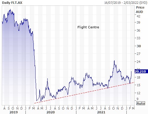
As we frenzy about borders opening the temptation is to buy travel stocks like Flight Centre for a return to their pre-pandemic glory and the chart ‘suggests’ that if Flight Centre got back to its pre-pandemic high the share price could double from $20 something to $43 something. It's right there on the chart. The company has halved in value, so surely it could double.
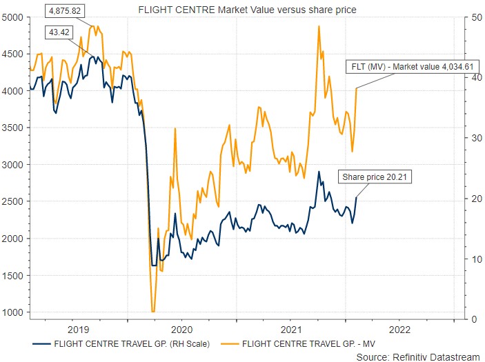
Well no. I hate to tell you, but the company hasn't halved in value at all. Yes, the share price has halved, but the market capitalisation hasn't.
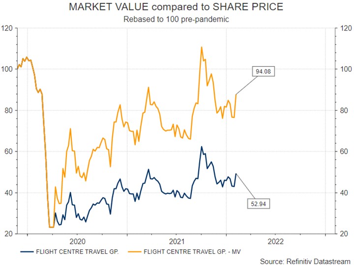
It turns out that whilst the share price of FLT is down 53.4% since the pre-pandemic high, the value of the company (the market cap) is only down 17%.
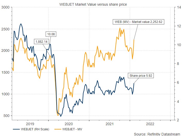
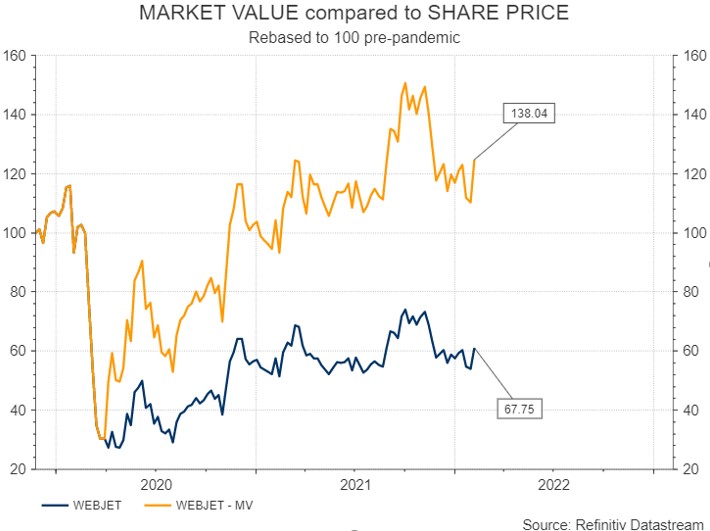
And its not just Flight Centre (ASX:FLT), there's another travel company whose share price does not represent the value of the company - Webjet (ASX:WEB). The share price chart of WEB would suggest the stock has dropped 41% since its pre-pandemic high, the share price has, but the market capitalisation of WEB is actually up (!) 19.6%.
So what's going on?
It's the big share issues they have had. When the pandemic started a series of travel companies held huge distressed capital raisings which involved issuing a significant number of new shares at significant discounts. Here's a list of them:

Source: Realindex, Factset
As you can see above, FLT had a massive 1 for 1.74 share issue in March 2020 just as the pandemic started. They obviously realised their business was going to get destroyed by border closures and tapped the market for survival money before anyone else (well done that broker).
That rights issue significantly increased the number of shares on issue and as a result, after the issue, the ASX adjusted the share price history by an adjustment factor. In the case of FLT they adjusted the whole price history (which is used in the charts) by an 'adjustment factor' of 90.02%. To put it plainly, they multiplied every share price in history, prior to the issue, by a factor of 0.9002. And that adjustment feeds out to every price service, trading platform, broker platform and technical software provider in the industry.
This standard calculation is not new, it is done using a theoretical ex-rights price basis (TERP) which uses the number of shares in existence before the issue, multiplied by the pre-issue share price, plus the number of new shares issued, multiplied by the issue price, added together and divided by the total number of shares now in existence. And that came out at 90.02% of the pre-issue share price. So the whole price history was 'adjusted' by that ratio. So a share price of 100c in history would from then on and in perpetuity appear on the chart as 90.02c.
Standard stuff, but the truth is that these TERP calculations and the adjustment factors they determine, change the whole share price history and in so doing regularly distort the share price history. But, as it turns out, these TERP based adjustments do not accurately represent the market value of the company having the issue, compared to history.
To make that clear I’ve pulled out a straight chart of FLT’s market value (share price times number of shares – a straight number available on Reuters) and plotted it against its share price. Share price in blue (right-hand scale). The inaccuracy of the share price as a representation of the market capitalisation of the company becomes very clear. Share price down 53%, market value down only 17.2%. And so the point is made, the adjusted price history, calculated using a TERP formula, is misleading in a number of ways, one of which is the recovery potential of FLT
- FLIGHT CENTRE - Share price down 53.4% since pre-pandemic. Market value down 17.2%.
- WEBJET (ASX: WEB) – Share price says it's down 41% from its pre-pandemic high. The market value is actually up (!) 19.6% since pre-pandemic.
It is a very interesting concept that investors need to understand, that the basis of calculation for share price histories after a share issue is misleading because the chart doesn't reflect the pre-issue value of the company on a like for like basis compared to the current value of the company. Maybe the standard TERP assumptions are flawed/limited/misleading.
If true a lot of technical analysis for companies that have had share issues (amusingly) becomes hocus pocus because the share price chart doesn't reflect the true value of the company.
This doesn’t mean there isn’t a handsome trade to be had buying travel stocks for a sentiment improvement on the border opening, but it does tend to suggest that you need to be aware that it is not a “value” trade, it’s a “sentiment” trade and is probably a trade, not an investment.
This phenomenon is most apparent in stocks that have had massive share issues relative to the existing number of shares (all the travel stocks last year) but the implication is this:
Any share issue from a DRP to a rights issue, is distorting the price history versus 'value of the company' relationship.
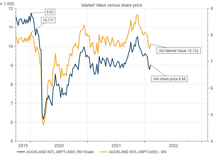
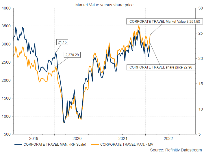
It is only visible/blatant on charts of stocks that have had huge issues but it is a creeping inaccuracy that affects the share price chart of every stock that issues shares or buys back any of its shares. Like these:
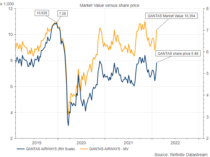
- QANTAS (QAN) - The market value is down 5.2% since pre-pandemic. But the share price is down 24.5%.
- AUCKLAND INTERNATIONAL AIRPORTS (AIA) - The market value is down 2.9% since pre-pandemic but the share price suggests the value of the company is down 22%.
- CORPORATE TRAVEL (ASX: CTD) - Market value is up 37% since pre-pandemic but the share price is up 8%.
- SYDNEY AIRPORT (ASX: SYD) - The market value is up 14% since pre-pandemic but the share price is down 2.1%.

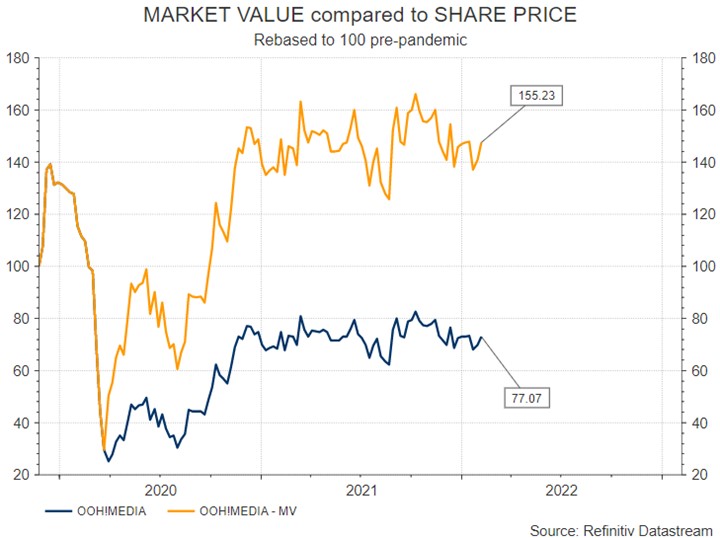
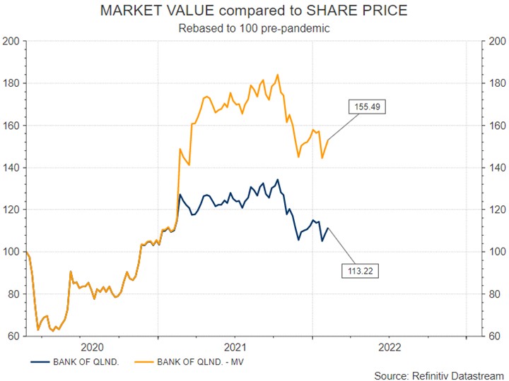
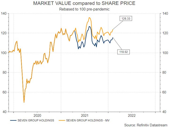
And of course there are other stocks - some mentioned in the comments below. Here are some of their charts. In these charts I have rebased the pre-pandemic scales to 100 which more obviously shows the "break" in correlation at the time of an issue:
OhhMedia! (ASX: OML) rebased to 100.
Bank of Queensland (ASX: BOQ) rebased to 100.
Seven Group Holdings (ASX:SVW) rebased to 100.
For your interest, here is Flight Centre rebased to 100.
Webjet rebased to 100.
AND THERE'S MORE
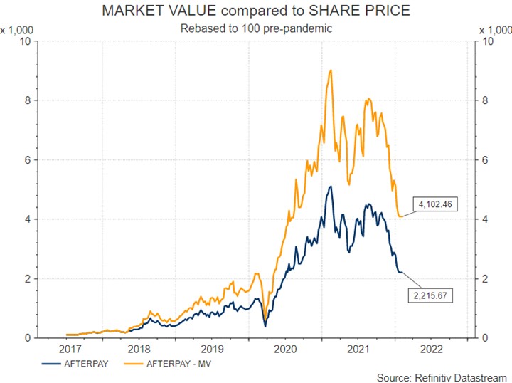
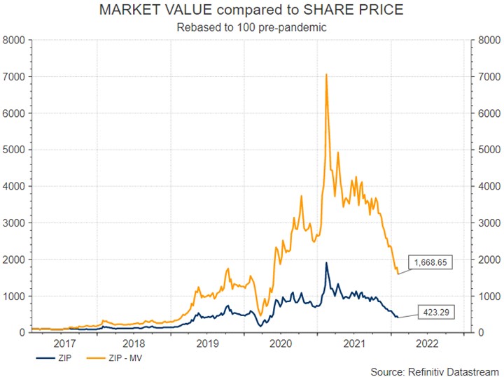
If you do the Misleading Chart Theory on stocks that have persistently not made money and had to survive on share issues its turn out that APT is almost double the size the share price would imply and Z1P is almost four times the market cap the share price would imply.
Here is Afterpay (ASX:SQ2) and Z1P (ASX:Z1P) showing the market caps compared to the share price since listing.
AND THERE'S EVEN MORE
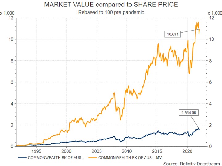
I have been back through a host of stocks. Every company that has ever had a share issue has a perverted share price history that does not reflect market capitalisation. I could give you a hundred (thousand) examples so let's just do a big one.
Turns out the Commonwealth Bank (ASX:CBA) is actually 6.8x bigger than the share price would imply if you go back to 1990.
CONCLUSIONS – There are a few of them:
- Share price charts are not the Messiah and could be termed misleading.
- The more a company shares issues a company does the more misleading the share price becomes as a representation of the company’s value.
- Share price charts don't reflect the value of a company over time.
- Share price history adjustments are a fudge that invalidates performance analysis.
- Using technical analysis over periods that include a share issue loses integrity.
- An index includes every issue of every company and consequently captures all the market value underestimation. In which case using an index as a benchmark is questionable. Using an index as a measure of equity market performance at all becomes questionable.
- Doing attrition on performance (a major task of fund managers) is riddled with difficulties/inaccuracy.
WHAT TO DO ABOUT IT
Nothing - there's nothing you can do. Fund managers may add it to their list of excuses for why they underperformed or outperformed. Because their benchmark is a fantasy based on price histories that do not reflect the market capitalisation history of the underlying stocks accurately. For retail investors, just beware, which is where Richard started, that drawing conclusions from charts about where a share price could go based on its history might be utterly flawed if comparing the price before an issue to a price after an issue.
Interested in Marcus Today? - CLICK HERE for a no-obligation 14-day free trial.
YOUR RESPONSES SO FAR
- Yes, it does appear misleading when the price is charted against time. The TERP is usually calculated after the last day of the rights issue using the current market value of all existing shares plus the funds used from the rights issue sales divided by the total number of shares on issue after the rights issue is complete. So the TERP is a predicted price used for arbitrage and is based on recent prices, not prices months to years earlier. The actual price will be obvious sometime after the rights issue is complete and all the issued shares are being traded. So I think you are correct that the price vs time chart can be misleading but it is not due to a problem with TERP. It is simply a failure on our part to appreciate the increased share issuance. After all the chart doesn’t pretend to be anything other than the change in the price of a share in a company over time.
- Your reasoning is entirely correct. I have been aware of this, particularly in relation to WEB and FLT. How can they be worth essentially more than pre-pandemic? I’m sure it will be some years before they make profits similar to pre-pandemic. FLT has closed a proportion of their shop fronts as well I believe. Sentiment can only go so far! The share market sometimes relies on a bigger fool….
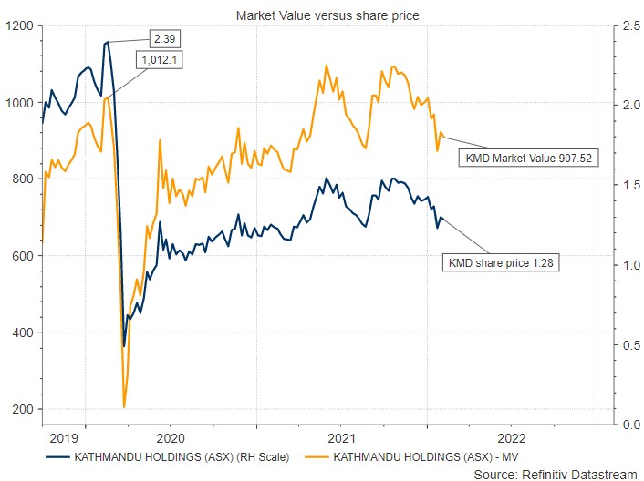
- I entirely agree with this recalculation taking into account the capital raises. I also raised this previously when looking at charts and relative share price movements. KMD is in the same boat. But thanks for the formula on how to equate the share price, as I knew a direct comparison wasn’t right but I didn’t have the formula to adjust.
Here's the KMD chart - Correct. Share price down 46%. Market value down just 10.4%.
- You are quite right, but for any such calculations to be truly useful, you do need to go back historically and that then introduces any number of problems. You’d be building some kind of arcane algorithm to actually accurately assess a company's worth over its life and taking into account everything that had ever happened to it. Now, who would want that? Or to do that?
Hi Marcus, you and Richard are not stupid but absolutely correct. This issue is brought up from time to time but is quickly forgotten as it requires some actual thinking and calculating. The broader populous is only interested in simplistic representations and the easy buck. Most have no understanding that the much-vaunted Dow Jones Index is not some fancy entity but a simple way developed by a couple of journalists to convey market sentiment to Mr and Mrs Dope on Main Street . The same applies to people quoting ASX200, S&P 500 or All Ords levels, in reality, when trading these indexes ( with the exception of DJ30 which is more stable) the only trade is long for the long term as poor performers are dropped and replaced by new favourites. But the general public isn’t interested in reality. I am a full-time trader, have been since the early 90’s and although not in the Rich List live very comfortably enjoying whatever I want whenever I want ( which is my definition of wealth) with no debt. For the reasons above I have never applied technical methods or indicators to equities markets however find them of some use in other markets such as FX, (where I derive most of my income as opposed to equities where capital growth is the aim) or options, possibly bonds but that also questionable given the influence of Reserve banks these days. Good job on highlighting this, will be interested to see where the discussion ends up…although I suspect I already know.
I am a finance IT person and have done a lot of work for Funds Management and Investment Banks in the UK and here in Australia and this is one of the most annoying aspects of maintaining an investment database. When a capital event of some kind occurs you end up with an adjustment factor which is what you have to multiply every historic price in your database with in order to get correct answers to the sort of questions you are asking (i.e. charts but also performance attribution of investment decisions etc.) Those adjustment factors are not easily found for retail investors and pretty much every charting website just shows you historic prices (because ignoring the issue is the easiest way). Most data services that I've worked with professionally however give you them you just need to build the IT to make it work with your investment database. Not something most retail investors have access to. Anyway, basically, I think the chart that you are looking at is only showing historic prices (i.e. the historic prices have not been discounted by the adjustment factor that would have been required based on how many of those FLT rights were taken up). The effect of applying the adjustment to historic prices basically gives EXACTLY the same effect as you have achieved by charting the historic prices by the historic shares on issue. It is annoying that pretty much every provider just gives you historic prices but I guess you get what you pay for! (And it is a hassle to deal with in an IT sense so I get why most places servicing retail customers don't worry about it). Most of the time the difference is pretty small but the further back you go in time the more the adjustment factors combine the bigger the difference. Every DRP, bonus share issue, SPP, etc. etc. causes those history adjusted prices to change. Hope that makes sense.
The traditional way of calculating the TERP is not correct in these cases of WEB FLT SYD etc. The traditional calculation of TERP by adding the value of the new capital raised to the pre-issue market cap is done on the assumption that the new funds will be deployed in the business to ultimately enhance its future market value at least by the amount of new capital that was raised. This might be by way of an acquisition, expansion of the existing business or even just paying down debt etc anything that is at least equal to the value of capital raised. However, these companies have raised this new capital just to pay the bills and keep the doors open to survive the pandemic. When the pandemic is over they may not have any of this cash left and have nothing to show for it except that they are still standing and the competition isn't. In my view this new cash raised should not be included in the TERP in these cases. Therefore the dilution in market value is far greater than what is currently thought. The cash is gone but the shares still exist. Bit like borrowing money to go on a holiday. When the holiday is over the loan is still outstanding. There are some minor offsets e.g. FLT has used some of the new capital to close underperforming stores and reduce overheads (redundancies etc) which has reduced losses and WEB has used some to finance development work on its existing and new products.
Never miss an insight
Enjoy this wire? Hit the ‘like’ button to let us know. Stay up to date with my content by hitting the ‘follow’ button below and you’ll be notified every time I post a wire.
Not already a Livewire member? Sign up today to get free access to investment ideas and strategies from Australia’s leading investors.
4 topics
7 stocks mentioned

