The single most important chart we are watching
Livewire reached out to Ardea, asking us three questions: What is the single most important chart we are watching, what is it currently telling us, and what are the implications for investors? Responses below from Tamar Hamlyn, Ardea's Principal:
What is the single most important chart you are watching?
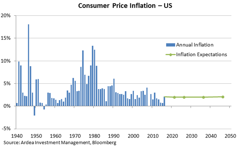
As fixed income investors concerned with protecting the value of client portfolios, the most interesting chart for us is the outlook for US inflation. A liquid market exists for US inflation due to the existence of Treasury Inflation Protected Securities or TIPS, which pay a coupon and principal indexed to consumer price inflation. TIPS can be compared with the yields on regular Treasury securities to derive the market’s expectation for inflation, both near term and into the distant future.
What is it currently telling you?
What’s astonishing is that financial markets have moved to price a higher Fed funds rate and higher bond yields, and yet market pricing for inflation is flat for the next 30 years. This means that markets are prepared to bet that US inflation will average 2%, each year and every year, for a very long time. This would be optimistic at best, but in the current environment where risks to inflation are rising with each passing day, it seems almost surreal.

What are the implications for investors?
The implications for investors are that protection against rising inflation can be accessed very cheaply. Inflation can be “locked in”, such that the investor is hedged against any future increases in inflation. Even if inflation were just 1 percentage point higher, this represents a 1% gain for investors each year, with further gains accruing if inflation were to rise more aggressively. If inflation were to decline the hedge would detract from returns, however we see this as unlikely over the next 30 years. We have implemented variations of this strategy in the Australian and US inflation markets.
2 topics

