TOL - 7th Aug, 2024
This indicator predicted every US recession for 35 years and it’s flashing a major warning for stocks!
US stocks are tumbling and investors are trying to figure out what’s next for the ASX. This indicator may be a critical piece of the puzzle.
After a massive run up through to mid-July, US stocks appear to suddenly be under immense selling pressure. The media is full of reports of impending doom and gloom, and the usual bearish mouthpieces are taking the recent decline as vindication of their “the sky is about to fall” narrative.
Before we get too excited, let’s put things into perspective. Using the S&P 500 as a guide, the US stock market peaked on 16 July at 5669.7, up 25.8% on a 12-month rolling basis, and up a whopping 45.4% from its October 2023 low. At its close on Friday 2 August, it is down 10% from that 5969.7 all-time high.
So, first of all, let’s all take a chill pill here – most stocks are still well up on where they were a year ago – or any other time frame you wish to compare.
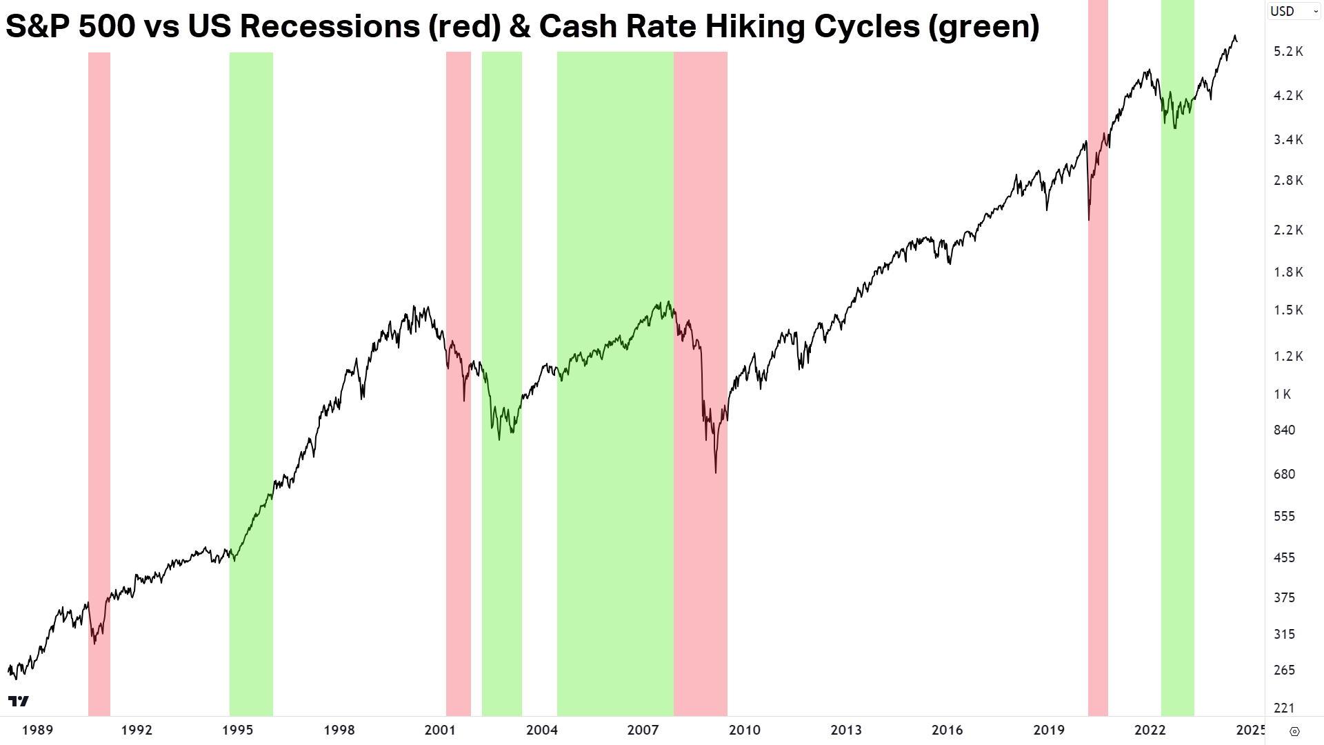
Even the most ardent bulls, however, must concede that history is littered with examples of when the stock market looked its very best, right before it did its very worst (I can think of 1929, 1987, 2000, 2007 and 2020 just off the top of my head!).
In discerning the tea leaves of this morning’s macroeconomic and technical indicators, I felt there is now compelling evidence to support one of my long-held theories: Lower interest rates are good for the stock market up to a certain point.
It’s something I opined in the ChartWatch section of my 15 July Evening Wrap – coincidently just one day before the US stock market peaked (pure coincidence I promise you!).
I’m going to quote what I wrote there, because I can’t put it any better:
“…there is an inflection point where lower rates stops being good for stocks. This is the point where market yields are falling not because of central bank cuts being a good thing and helping stocks, but because the US economy is on the brink of a recession, and that's bad for stocks.
I don't know where that inflection point is – it's not a line or level in the chart above [of the US 2-Year T-Note Yield]. It will be based on market sentiment...but you will see it in the charts of stock indices when black candles here translate to black candles there too!
You know I keep saying this: The charts of the key benchmark yields are far more important than any stock chart you're looking at right now - or ever!”
Preceding the above quote is quite a lot of background work I’ve put out in previous articles about the importance of understanding how bond yields impact stock prices.
In short, bond yields represent a risk-free return, and therefore they influence the price of money in the economy (i.e., via lending rates). For the most part, when the price of money's getting cheaper, it’s good for company profits, and by extension, their stock prices.

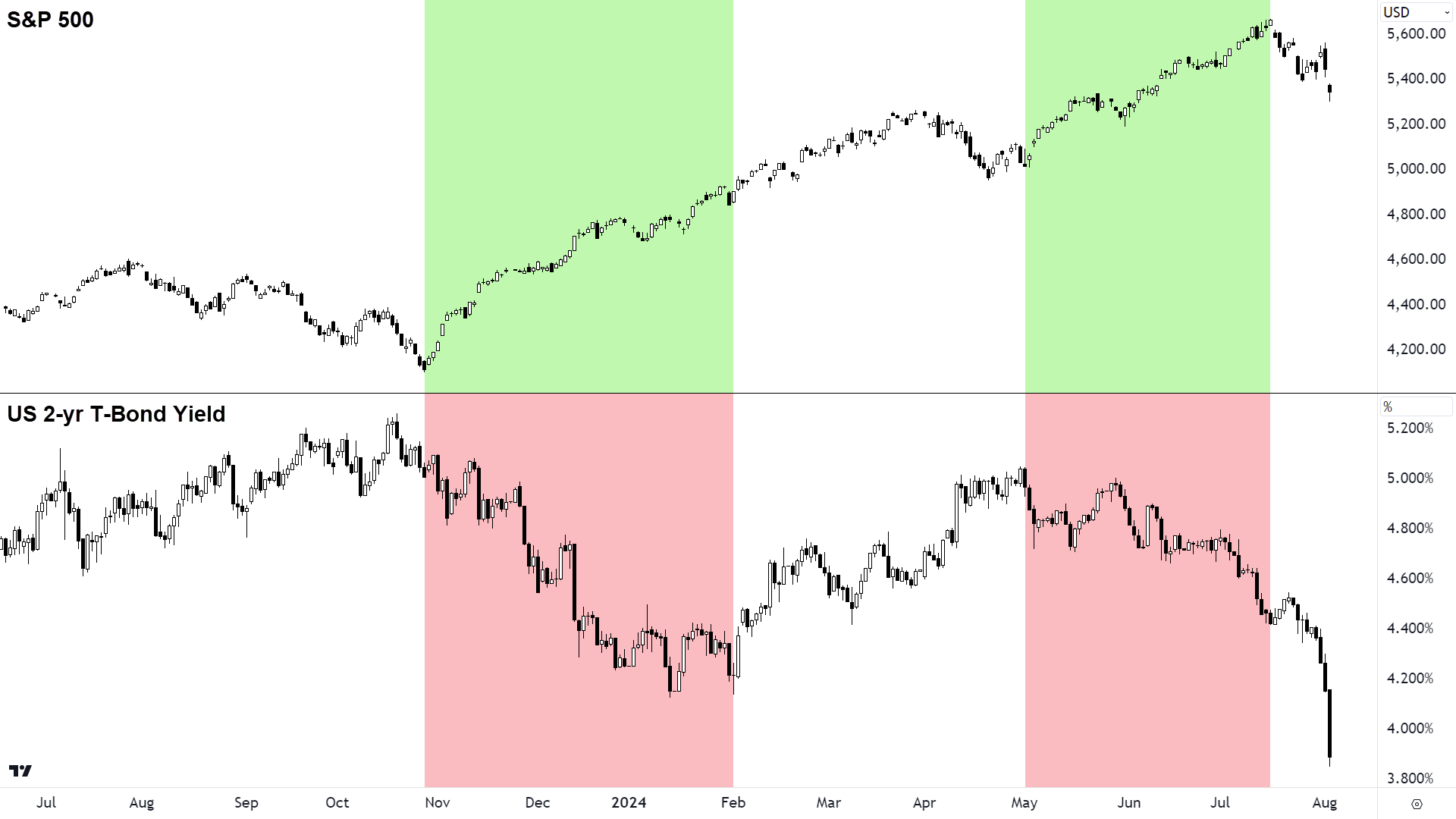
As can be seen from the above chart of the S&P 500 and the US 2-year T-Bond yield, falling yields (i.e., falling market interest rates) tend to stimulate a positive response from the stock market. Most of the time, stocks love lower interest rates.
It can also be seen that the opposite is not always true – sometimes rising yields also correspond to rising stocks. This might occur when the economic outlook is good, or earnings are growing despite the burden of higher yields – or other reasons like NVIDIA is on a rampage!
When bad news is bad news (again)!
Generally, a stronger economy is associated with higher rates. During or after a rate hiking cycle (like the one we’ve just had) it is not uncommon to find something very unusual occurring in markets. If strong economic data increases the prospect of further rate hikes – then it must be bad news. Therefore, conversely, weaker economic data must be good news.
For some time now, weaker data on the US economy has been cheered by stock investors believing it firms the case for the US Federal Reserve to start cutting rates. Over the last couple of weeks, the data appears to be turning markedly worse (check recent housing, employment, and manufacturing indicators), but the response from stock investors has not been to buy stocks – rather it’s been to sell them.
It appears bad news is bad news again. Investors are now fearing the prospect of a protracted slowdown in the US economy as being worse for company earnings than the prospect of lower interest rates. Many had bet on the “Goldilocks” scenario – a strong economy boosted by Fed interest rate cuts.
Unfortunately, the data is beginning to point to the economy side of the Goldilocks equation turning out weaker than originally expected. So, stock prices are currently factoring to some extent other potential economic growth/interest rate combinations.
The US recession predictor
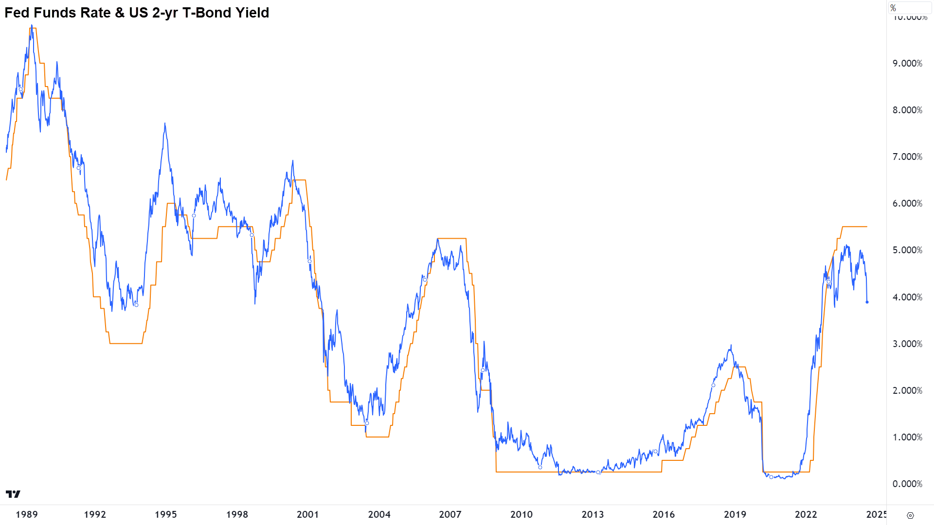
One useful tool for helping determine when bad news has become bad news again (and also when it is bad news for stock prices!) is the comparison between the US Federal Funds Rate, or “cash rate”, and the US 2-Year T-Bond Yield. The latter is generally considered to be the best indicator of where the cash rate is going to be in the very short term (hint: use the 10-year T-Bond for long term cash rate expectations).
Typically, downturns in the US economy have occurred just prior to rate cutting cycles. This is because the higher rates that preceded those rate cutting cycles were often the exact cause of the subsequent economic weakness. It’s just the way markets work: push and pull.
Bond yields tend to lead the cash rate because investors always base their investing decisions on what is likely to happen, not what has happened in the past. So, if you start to see the yield on the 2-year T-Bond become significantly out of whack with the cash rate – it might be a sign there’s going to be a big change in economic conditions ahead.

Note in the above chart which overlays the cash rate and the yield of the 2-year T-Bond, we can see the blue line representing the 2-year T-Bond often takes a dive just before the Federal reserve cuts interest rates. In particular, note the major rate cutting cycles in the early 90’s, early 2000’s, 2007, and 2020. When we look at the next chart, these periods will make more sense…

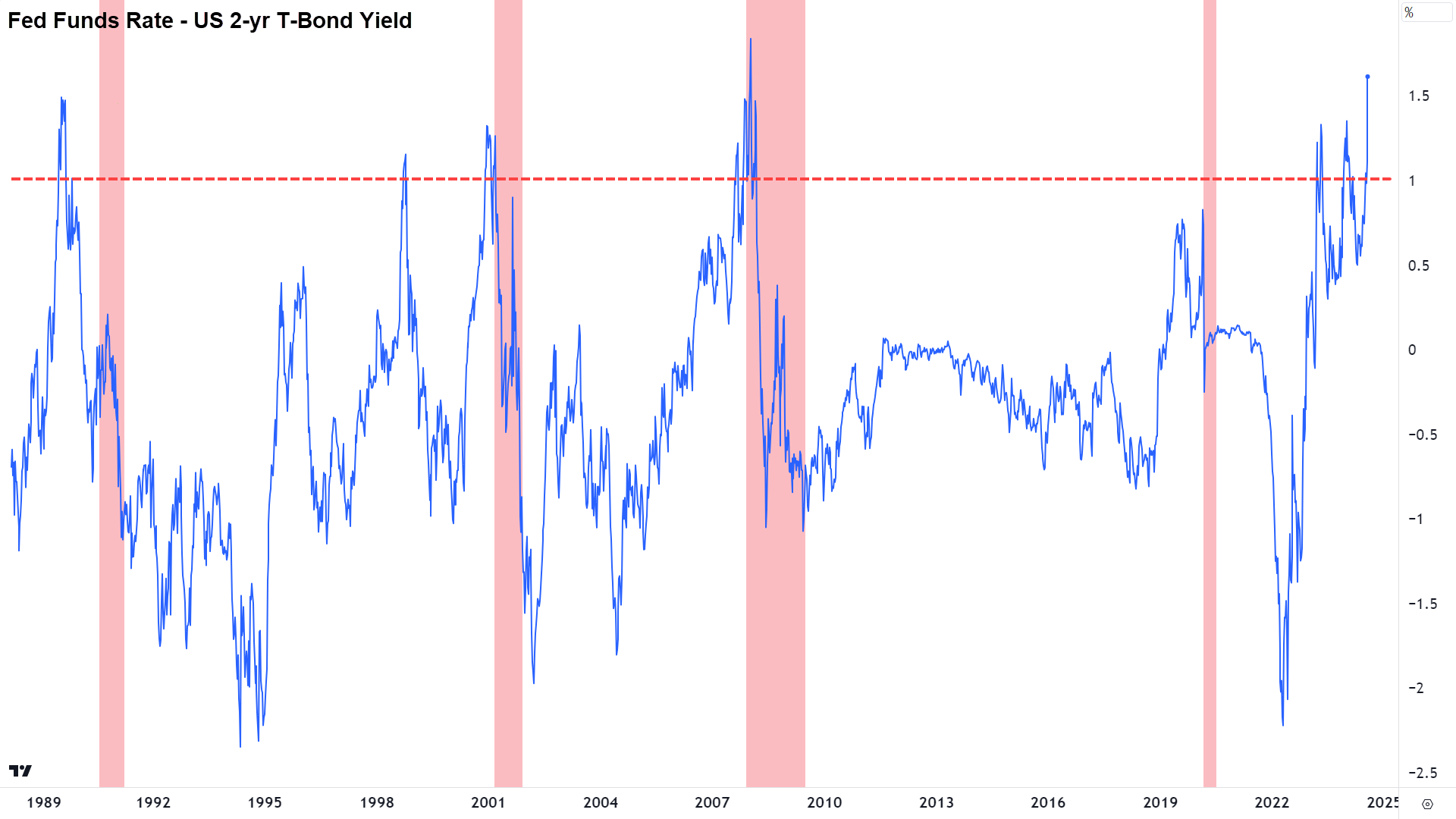
…Because they correspond immediately prior to each of the recessions of the last 35 years.
The above chart shows the difference between the cash rate and the 2-year T-Bond yield with each of the recessions since 1989 shaded in red. For ease, I will now refer to it as the “blue squiggly line”. Note how the blue squiggly line usually hovers plus or minus 0.5% above or below zero. For the most part, there isn’t a great deal going on in the US economy to warrant a big disconnect between the cash rate and market expectations for the cash rate.
But, note how immediately prior to each of the red zones, the blue squiggly line trended towards a 1-1.5% difference. This is the market betting the Fed is about to cut rates – and cut them big. Why would the Fed want to all of a sudden slash the cash rate? Yep, the economy’s in the toilet – the Big “R”.
Right now, the blue squiggly line is rising deep into what has been dangerous territory in the past. It’s at a level only rivalled by what occurred at the beginning of the GFC. Sound the warning bells!? Hey…the future is unknown, and anything can happen. I am just pointing out a tool that’s been historically very accurate. Draw your own conclusions!
It’s also worth noting here before we move on, the downward spikes in the blue squiggly line. This has occurred when the cash rate is substantially below the 2-year T-Bond yield. Why might this happen?
Well, it’s usually occurred after an economic downturn and when the Fed has been forced to cut rates to stimulate growth. Eventually, the strategy works, the economy gets going again, and the market starts betting via the 2-year T-Bond that rates will have to go up again. These upward swings in the blue squiggly line are just as valuable to us as investors – as we’ll see in the next chart!

This is where the rubber meets the road. Blue squiggly lines of stuff we don’t quite understand but Carl assures us are important are all good – but what's the impact on the stock market!?
In short, when the blue squiggly line starts going vertically higher, it has foreshadowed an imminent recession in the US economy four out of five times in the last 35 years. Each recession coincided with a bear market in the S&P 500.
The “one out of 5” is the spike in 1998, but I note that while the 2001 recession was still a few years away, that spike also coincided with a short-sharp bear market in the S&P 500 that ended in October 1998 (does anyone remember the Asian Financial Crisis?). So, in-terms of blue squiggly line spikes and bear markets – its closer to a perfect record here.
When the blue squiggly line spikes towards historical highs, it has every time in the last 35 years foreshadowed a bear market in US stocks.
It's also important to note that the blue squiggly line is not just a forecaster of impending doom, it can also forecast periods of incredible prosperity. Note here, the green zones. These are areas that correspond to major low points in the blue squiggly line, that is, where the 2-year T-Bond yield spiked significantly above the cash rate.
These are periods after each recession where the Fed’s interest rate cuts had started to do their work, and the US economy was getting going again. When the blue squiggly line turned sharply off its lows, it indicates times when yields rose rapidly ahead of rate hikes – the bond market knew what was coming. They always do...
When the blue squiggly line spikes from historical lows, it generally corresponds with major lows in the S&P 500, and or very strong periods of stock market performance.
Basically, we find that bond yields and stocks bottom out just before the economy turns up again, that is, stocks do well when the general expectation is that the economy is going to improve.
Lies, damn lies, and blue squiggly lines!
There are a few conclusions I think we can draw from the data I’ve presented here today. Firstly, markets are very good at predicting the future direction of official cash rates – and by subsequently sending stock prices lower – very good at predicting recessions. Similarly, after economic downturns, markets are just as good at predicting the next period of economic growth, and therefore marking up stock prices in anticipation of better times ahead.
We might also conclude that the current experience, where falling yields and the prospect of Fed interest rate cuts – are no longer stoking stock prices – is a good indication that bad news is back to being bad news. Also, that possibly we’ve passed the important inflection point where we actually need some good news on the US economy, and therefore fewer rate cuts, to rejuvenate stock prices.
Finally, I propose that any blue squiggly line – regardless of how accurate a predictor it is of the past – doesn’t guarantee anything in the future. It’s just a guide. It’s up to each investor to collect and interpret all available information and to make the best decision for their portfolios. But at least now you know about the blue squiggly line!
This article first appeared on Market Index on Monday 5 August 2024.
Never miss an update
Enjoy this wire? Hit the ‘like’ button to let us know.
Stay up to date with my current content by
following me below and you’ll be notified every time I post a wire
Carl has over 30-years investing experience and has helped investors navigate several bull and bear markets over this time. He is a well respected markets commentator who specialises in how the global macro impacts Australian and US equities. Carl has a passion for technical analysis and has taught his unique brand of price-action trend following to thousands of Aussie investors.
........
Investing is risky. Inevitably you will endure losses. If you can't cope with losing, don't invest.

5 topics

Carl has over 30-years investing experience and has helped investors navigate several bull and bear markets over this time. He is a well respected markets commentator who specialises in how the global macro impacts Australian and US equities. Carl...
Carl has over 30-years investing experience and has helped investors navigate several bull and bear markets over this time. He is a well respected markets commentator who specialises in how the global macro impacts Australian and US equities. Carl...
Comments
Comments
Sign In or Join Free to comment