Value catches a (correlation) break
Given the relatively minor drawdown in equity markets recently, there seems to be a surprisingly large number of dislocations appearing in global financial markets.
We have written previously about why we believe inflation is likely to run higher for longer and the burgeoning energy crisis we’re witnessing globally seems almost certain to support this view. Central banks and global bond markets are also growing increasingly concerned, with longer-term interest rates well bid in recent weeks.
One such dislocation is the continued divergence of Growth and Value equities. Chart of the month is attributed to Goldman Sachs and highlights the correlations of global Growth & Value shares versus bonds.
From a correlation perspective, it has been difficult to discern between Value and Growth stocks for most of the past 20 years. Over this period the relationship has been firmly negative, although if we were to extend this chart back a further 40 years this negative relationship would appear as an outlier.
However, in recent weeks there has been a breakdown between the correlations of Value and Growth shares versus bonds. The dark blue line shows that Growth equities have more recently delivered a positive correlation to bonds, meaning that as interest rates have risen and bonds fallen, these shares have also mostly fallen. Conversely, the light blue line is showing a continued negative correlation for Value equities, meaning they have been generally appreciating during the recent interest rate spike.
This represents a meaningful divergence from the 20 year trend, where typically the market made little distinction between Value or Growth, they were just ‘equities’.
This has likely proven a boon for Value investors during the most recent mini-drawdown. The reason can be attributed to the increasing duration, or interest rate sensitivity of Growth stocks in recent years. As valuation multiples expanded for future earnings that were not expected to be delivered until much further into the future, even slight upward movements in interest rates can have a large impact on valuations. Value stocks have much less of this issue, as typically the multiples are lower, and profits are expected to be realised much sooner.
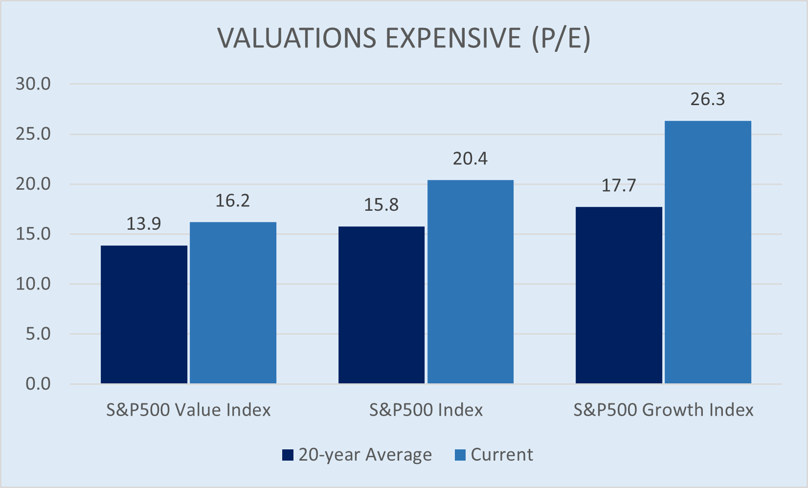
The extreme valuations of the tech and Growth sector has been well documented elsewhere, but one way to look at it is to compare current P/E multiples with their 20-year average. While Growth has always traded at a premium to the market and to Value, it remains at extreme levels.

Source: Bloomberg, Wheelhouse
Interestingly, the chart also shows that Value is similarly trading at a valuation premium, relative to its own history. It’s only relative to Growth that it looks a much safer bet, but for more absolute return minded investors this does raise questions regarding capital at risk.
Can Value's negative correlation to Bonds be sustained?
In the short term, with valuation levels as they are, it is certainly possible. However, with valuations for Value also at record levels, we believe this relationship has a limited horizon. It would be unusual to see value shares continue to appreciate should rates continue to march higher.
A look back to the tech bubble deflation in year 2000 highlights this point. While Growth stocks started falling in March 2000, Value stocks actually kept appreciating through to December. It was only then that Value also succumbed to gravity and started falling (although at this point a recession had also emerged, which is a risk that may also materialise this time around should rates keep climbing).
In our view this makes all equities risky, whether they be Value or Growth in colour. For investors that seek access to the longer-term returns of equities, it seems obvious from the valuations of all equities that risks are clearly higher in the current environment.
A more reliable alternative
One solution for investors looking to introduce negative correlations into their portfolios is to consider derivative strategies. Whether this be tail hedging or systematic option selling overlays, both can deliver negative correlations of far higher magnitude and with far more reliability, as they have zero reliance on Value/Growth tilts or other idiosyncratic relationships. This is our speciality at Wheelhouse where we utilise both tail hedging and income producing overlays, and helps explain why the risk in our Global fund is so low.
In the chart below we have plotted 3-year risk and return for all Global and Australian funds in the Morningstar long-only equity categories*. Risk is defined as Standard Deviation and is plotted on the x-axis, with return on the y-axis. The Global and Australian benchmarks are represented by the pentagon and the triangle, respectively. While the Fund is always near fully invested in a portfolio of equities, with very little cash, the derivatives serve to materially dampen volatility and generate income, particularly during large drawdowns.
Source: Morningstar Direct. *Morningstar categories; Equity World Large Value/Growth/Blend/Other, Australia large Value/Growth/Blend.
As a postscript, we’d highlight that during the tech deflationary period in year 2000-2003, systematic overlays using Index options meaningfully outperformed both Value and the market by preserving capital better and delivering regular cashflow in lieu of capital growth. Should growth have peaked, and rates continue a more normalised ascent, one could argue we may be entering a very similar environment.
4 topics

