Watching the NBER’s six recession indicators as US growth confounds the skeptics
.png)
Recently, Bill Ackman, while covering his short bond positions, said that “the economy is slowing faster than recent data suggests.”
That contrasts with US “GDP figures released today that again beat expectations”. Third-quarter gross domestic product rose at a 4.9 percent annualised pace.
Nevertheless, voices like Ackman’s carry weight. Assessing an economic slowdown necessitates pinpointing the peak of the economic cycle. However, in this current cycle, accurately identifying when we’ve hit the peak seems to be quite challenging.
Seeking insight, we can turn to the National Bureau of Economic Research (NBER) – the nonprofit US think tank that’s best known for calling the start and end of recessions.
The organisation defines a recession as a “significant decline in economic activity that is spread across the economy and lasts more than a few months.” This differs from a more common definition of recession – at least two consecutive quarters of negative growth.
By contrast, the NBER doesn’t use GDP in its analysis. Instead, it looks at six factors to gauge whether the US is in a recession.
- Real personal consumption expenditures
- Real personal income minus transfer payments
- Nonfarm payrolls
- Employment as gauged by the Bureau of Labor Statistics’ household survey
- Manufacturing and trade sales
- Industrial Production
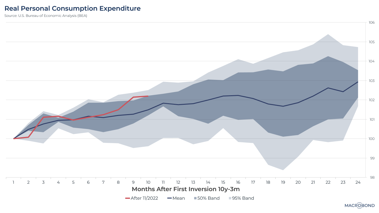
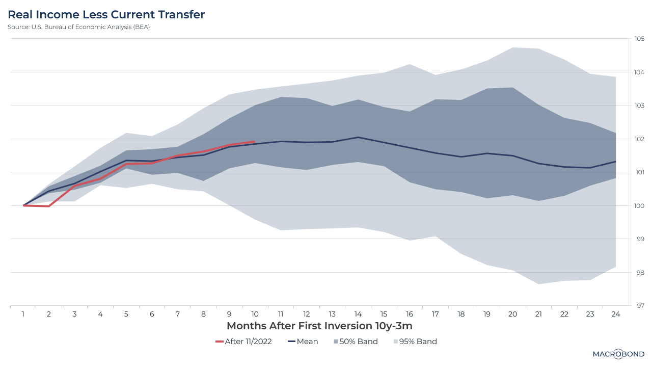
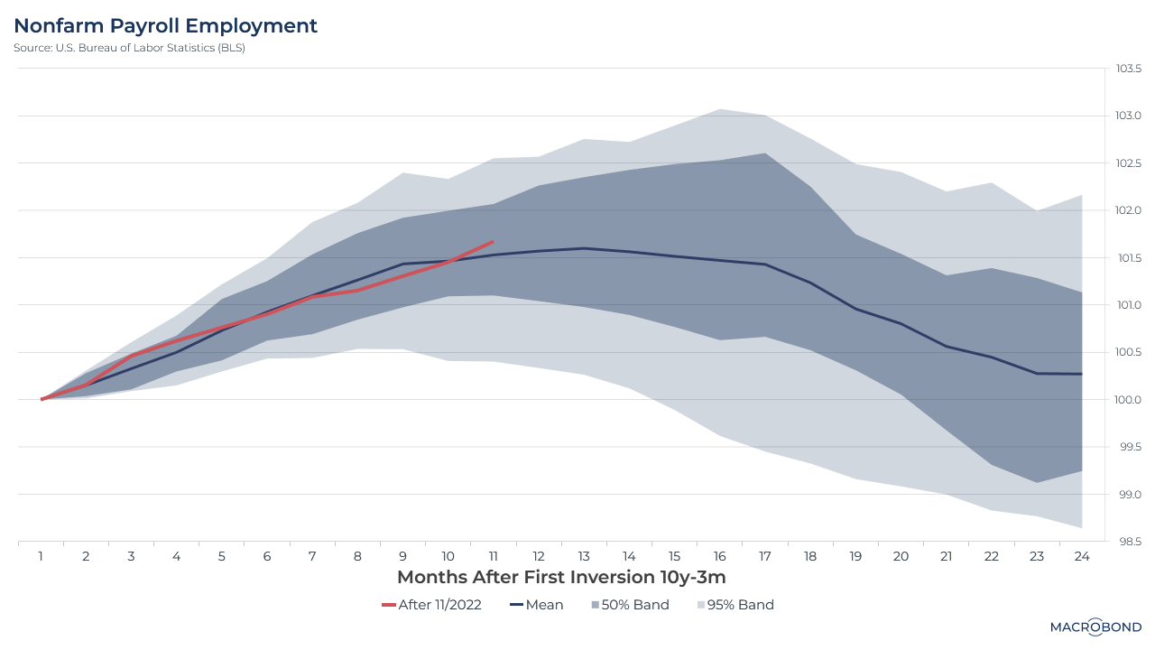
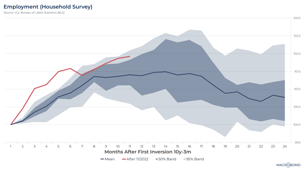
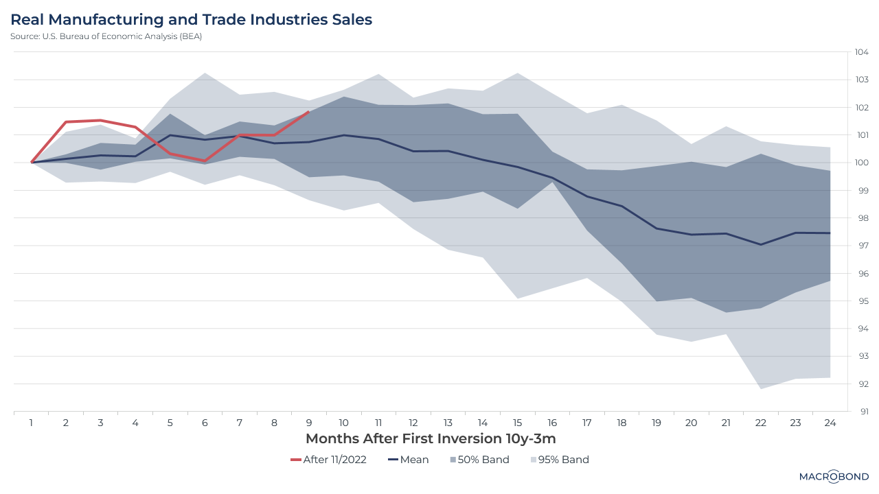
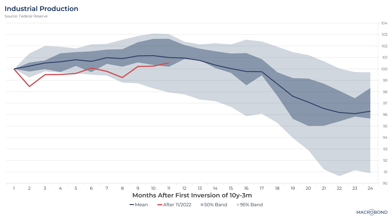
Our dashboard tracks these six indicators via six charts, as seen below. They compare the current trajectory relative to historic trends since 1968, starting with the day when the yield curve inverted (a classic leading indicator of recession). The current cycle, in red, is traced against the mean trajectory and the 50 and 95 percent bands of historic performance.
What is our dashboard telling us? It’s a mixed picture.
%20After%20First%20Inversion%20of%2010y-3m.png)
Real personal consumption expenditure continues to be historically high, primarily due to an excess of savings. However, this indicator has plateaued recently.
Real personal income, which directly correlates with individual spending power, is closely tracking the historical average.
Nonfarm payrolls remain on an upward trajectory that roughly matches the historic mean. However, based on the trend, this is usually the moment where it starts turning downward.
Employment, as measured by the BLS survey, has been exceeding the historic average – sometimes dramatically.
Real manufacturing and trade industries sales have both exceeded and lagged behind the historical average in this cycle. This indicator tends to start sliding about 10 months into the inversion.
Lastly, industrial production has evolved more bearishly, staying below the historic average.
Will this economy follow past trends and start weakening along the lines of Ackman’s expectations? We’ll only have a more definitive understanding once more data is released.
Macrobond users can access the most up-to-date data for this dashboard here.
3 topics
.png)
Macrobond delivers the world’s most extensive macroeconomic & financial data alongside the tools and technologies to quickly analyse, visualise and share insights – from a single integrated platform. Our application is a single source of truth for...
Expertise
.png)
Macrobond delivers the world’s most extensive macroeconomic & financial data alongside the tools and technologies to quickly analyse, visualise and share insights – from a single integrated platform. Our application is a single source of truth for...
.png)