Weekly S&P 500 #ChartStorm - 11 Dec 2016
Those that follow my personal account on Twitter (VIEW LINK) will be familiar with my weekly S&P 500 #ChartStorm in which I pick out 10 charts on the S&P 500 to tweet. Typically I'll pick a couple of themes and hammer them home with the charts, but sometimes it's just a selection of charts that will add to your perspective and help inform your own view - whether its bearish, bullish, or something else!
The purpose of this note is to add some extra context beyond the 140 characters of Twitter. It's worth noting that the aim of the #ChartStorm isn't necessarily to arrive at a certain view but to highlight charts and themes worth paying attention to.
So here's the another S&P 500 #ChartStorm write-up
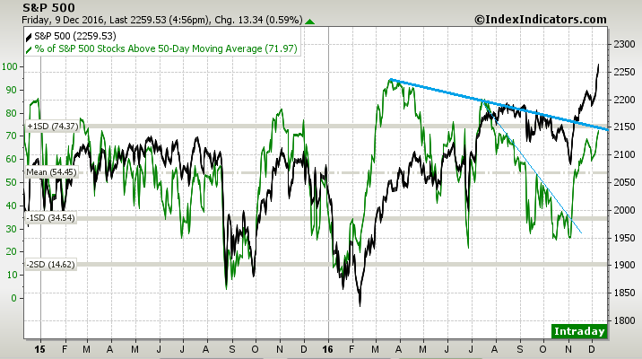
1. 50-day Moving Average Breadth: The previous line in the sand for 50dma breadth was the downtrend line which got decisively broken to the upside following the US election. But now there is another line, and another test for the market. Should breadth break through that line it will open the door for even more new highs and mark a transition to a more frothy and euphoric market. But if it fails the test it will likely be the start of a correction.
Bottom line: 50 day moving average breadth is coming up against another line in the sand.
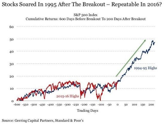
2. The 1994-95 Analog: Analogs are always a dubious, yet often interesting and amusing, analysis method. Basically an analog is where you overlay one market on to its history (or even some times the history of another market), with the understanding that it could follow the same pattern as the past. As they say, history doesn't repeat but it often rhymes. So then we look at the interesting analog below by Gerring Capital, pointed out by Joseph Fahmy (VIEW LINK) of Zor Capital. The implication is that today's market could follow what happened in 1994-95. You can't rule anything out, but you'd best look for a fundamental story to back up such an analog...
Bottom line: The 1994-95 analog suggests much more upside for the S&P500.
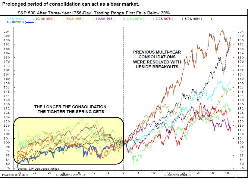
3. Prolonged Periods of Consolidation: The below chart from Will Geisdorf of Ned Davis Research (VIEW LINK) that a prolonged period of consolidation can act as a bear market. This makes sense from a number of angles, a sideways market can sometimes reflect wide variation of returns between sectors e.g. biotech vs commodities. It can also have a cleansing effect on sentiment and keep money out of the market and on the sidelines. And the other point is that stability or low volatility is a rare and fleeting thing in markets - any period of low volatility and range-trading will often be shortly proceeded by a trend change and period of greater volatility. Of course, the implication for today's market is that it's good news because we've just been through a prolonged period of consolidation.
Bottom line: Periods of consolidation, like we've just been through, can set the scene for a new bull market.
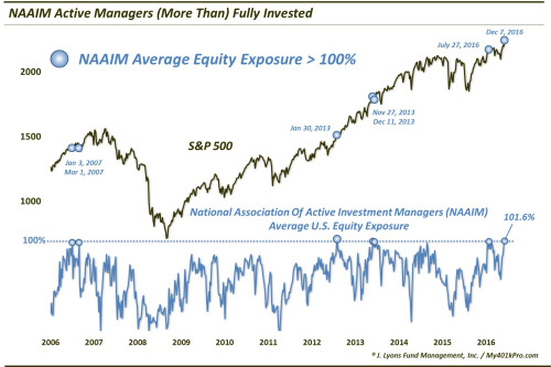
4. NAAIM Exposure Index: The NAAIM (National Association of Active Investment Managers) runs a survey including the exposure index which is charted below by Dana Lyons (VIEW LINK) . The latest reading of the NAAIM exposure index shows investment managers are "all-in" ...and then some. While you tend to get nervous from a contrarian standpoint when you see sentiment surveys reach extremes, the previous times the index reached these levels it didn't foretell a downturn, if anything it was a bullish continuation signal.
Bottom line: The NAAIM exposure index has made a rare trip beyond the 100 point mark.
5. StockTwits Sentiment: The StockTwits sentiment indicator for the S&P500 has flipped around to 64% bullish - a big turnaround vs a few months ago where it was basically the opposite. In addition to that there is what appears to be an uptrend in sentiment, and given it's "only" at 64% there's potentially scope for it to go higher from here. Anyway, it's another data point that shows the big turnaround in investor sentiment and the increasingly buoyant mood of the market.
Bottom line: StockTwits investor sentiment has climbed to 64% bullish and could go higher.
[SPXCS1112-5.PNG]
6. Implied Correlations: This chart appeared in the latest edition of the Weekly Macro Themes (VIEW LINK) (which is the paid subscription service of Topdown Charts Institutional). The Implied Correlation index is another one by CBOE based on option prices (from the same guys that brought you the VIX, VVIX, and SKEW). Essentially the higher it goes the higher the implied level of correlation in the market, and vis versa. From a market timing and signal perspective there is a loose link, as shown in the chart below (note the implied correlation index is displayed inverted). So when you see the latest reading punching the lows for the implied correlation index you'd perhaps expect a higher chance of a short-term market top based on the post-2009 experience.
Bottom line: The CBOE implied correlation index has hit the lows, which could be a bad sign for the market.
[SPXCS1112-6.PNG]
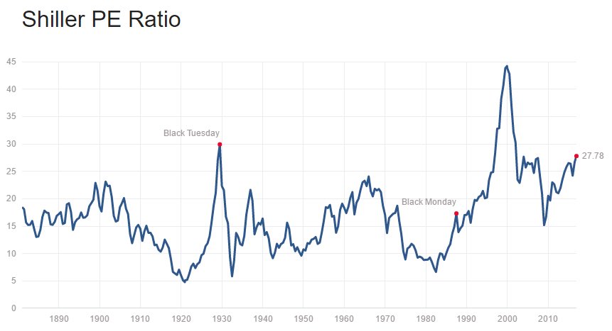
7. CAPE/Shiller PE Ratio: While implied correlations are hitting the lows, the Shiller PE Ratio (VIEW LINK) (or CAPE/Cyclically Adjusted PE) is hitting the highs. It's rarely been this high in history, only really making the journey in 1929, 2000, and 2007. While such indicators are practically useless for market timing, it is an interesting background piece of information, particularly for those with a long-term investment horizon.
Bottom line: The Shiller PE ratio for the S&P500 has gone higher.
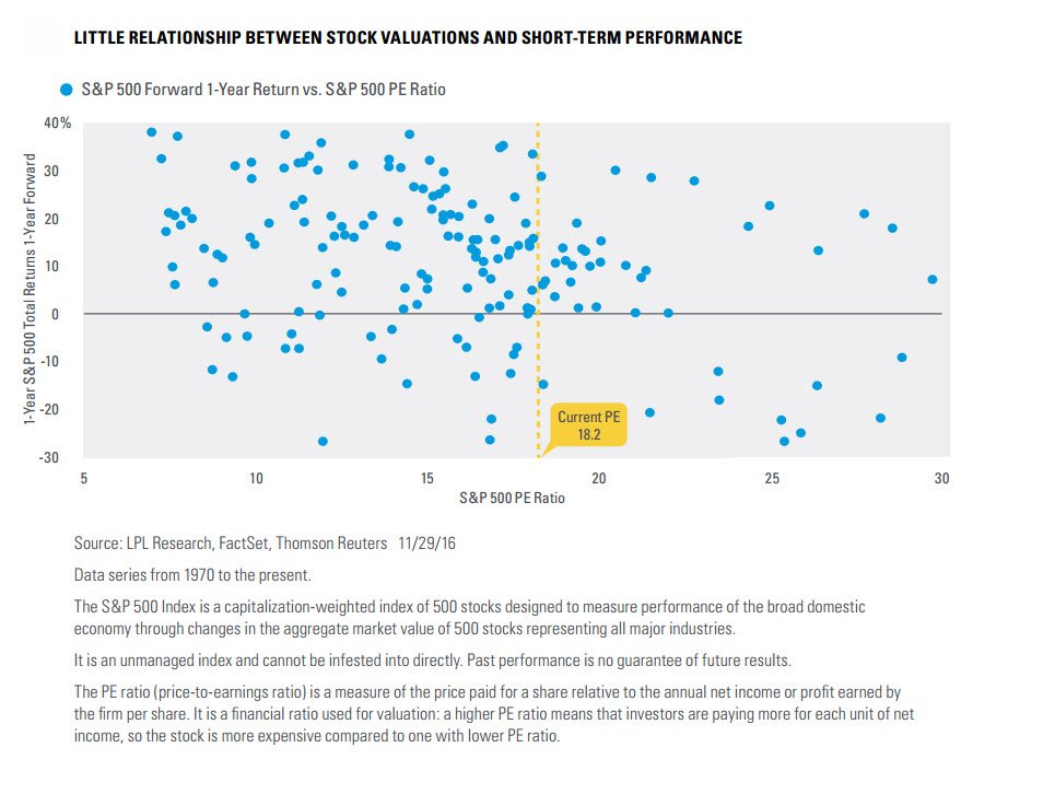
8. Valuations vs Returns: Just to prove the point about valuation being a poor signal in the short-term, the below chart from Ryan Detrick (VIEW LINK) shows the relationship (or lack of relationship) between valuations and future returns. The key point to note is that it shows short-term returns (i.e. one year forward), these types of analyses will show more of a relationship the further out the holding period you use e.g. say 7-10 year forward returns. So while high valuations can be a hurdle to future performance, you need to keep the bigger picture in mind.
Bottom line: Valuations have little bearing on short term returns.
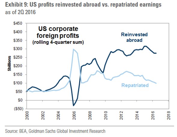
9. Foreign Earnings: The below chart posted on Twitter by Driehaus Capital (VIEW LINK) shows The breakdown of how much of US corporate foreign profits gets reinvested abroad vs repatriated for things like domestic capex and M&A, and perhaps more importantly, buybacks and dividend payments. Indeed, were you to see some sort of forced or "encouraged" repatriation drive by Trump you might expect to see a substantial sum one-off and ongoing that could be directed to uses such as buybacks. This sort of thing could be a potential supercharger for the market next year, but of course the overall policy mix and funding environment will also be important.
Bottom line: US companies have substantial offshore profits of which the majority is reinvested abroad.
10. Wage Growth vs Interest Rates: The below indicator (which also appeared in the latest edition of the Weekly Macro Themes (VIEW LINK) ) shows how accelerating wage growth is not necessarilly a bad thing for the market. Indeed as the indicator shows, when you have high or accelerating wage growth in the context of low interest rates (and thus stimulatory monetary policy) it can actually provide fuel to the bull. This makes sense in that high wage growth improves confidence, and low interest rates are stimulatory for the economy and overall monetary backdrop. So rising wage growth may not be a bad thing for the market (unless of course it spurs the Fed to become more aggressive on rate hikes).
Bottom line: The wage growth vs fed funds rate indicator is sending a bullish signal for the market.
[SPXCS1112-10.PNG]
So where does all this leave us?
This week there's probably 2 categories:
1. Bearish signs
The bearish signs are the buoyant sentiment readings (from a contrarian stand point), high valuations (from a longer term perspective), the fall in implied correlations (short-term timing signal), and potentially the trend line on the market breadth chart if the market fails to punch through it.
2. Bullish signs
On the bullish side there's the 1994-95 analog, the point about prolonged periods of consolidation setting the scene for new bull markets, sentiment from a momentum standpoint, potential foreign profit repatriation flows, and the wage growth vs fed funds indicator. The first chart could be bullish if it breaks through the trend line.
Summary
Overall while there are a lot of reasons the market can go higher short-term and medium term, there are likewise a series of data points and charts that have short-term and longer-term bearish implications. Indeed, as the market drives higher and takes valuations and sentiment along with it to even higher levels the risk of a short-term correction will rise. It's in this type of environment where the decision to keep going with momentum, or try and stand in front of the train gets harder, as the train could stop at any moment, but it could equally run you down. My best guess is it goes higher medium term, but the risk of a short-term correction or selloff is elevated.
See also: Weekly S&P500 #ChartStorm - 4 Dec 2016 (VIEW LINK)
9 topics

