Weekly S&P500 ChartStorm - 10 April 2022
The Weekly S&P500 ChartStorm is a selection of 10 charts which I hand pick from around the web and post on Twitter. The purpose of this post is to add extra color and commentary around the charts.
The charts focus on the S&P500 (US equities); and the various forces and factors that influence the outlook - with the aim of bringing insight and perspective...
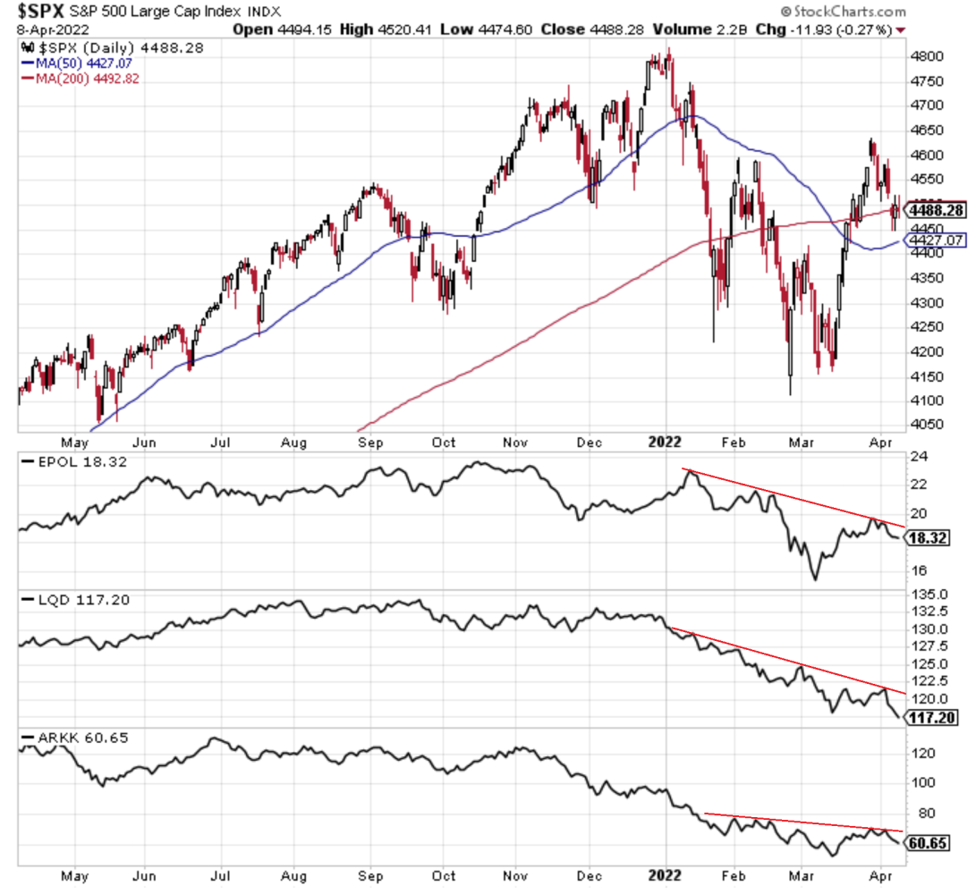
1. Correction Drivers Update:
-EPOL [Poland ETF] (geopolitics proxy): relief rally stalled
-LQD [IG Credit ETF] (credit/rates): new lows as bond yields spike
-ARKK [New Tech Fund] (tech burst): lower highs, rolling over again
Thus, my overall sense: path of least resistance = lower
Source: @Callum_Thomas
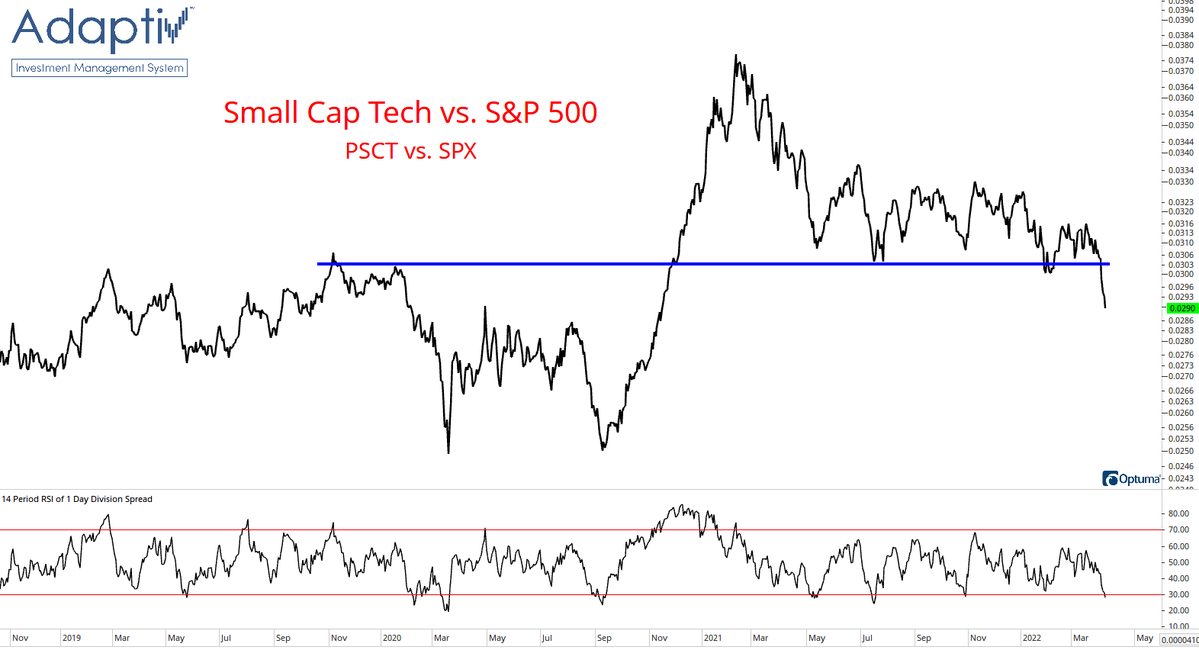
2. Big Trouble in Small Tech: Seems small cap tech stocks are struggling to keep up. For that matter, small caps in general have been a picture of weakness, and tech still seems vulnerable. I would call this breakdown here a red flag.
Source: @adaptiv
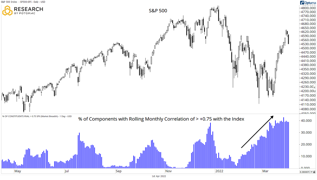
3. Stock Correlations: Can deduce from this chart that the correction saw big rotation, whereas the rebound however floated all boats...
Correlations spike during times of panic selling and panic buying: especially when it's a generalized risk-on/off move, and especially accentuated by passive flows.
Source: @DrewTheCharts
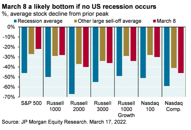
4. Recession vs Correction: "March 8th was likely the bottom unless we witness a recession." (J.P. Morgan's Michael Cembalest). So basically: tell me if we're headed into recession, and I'll tell you what the market's going to do...
Source: @SethCL
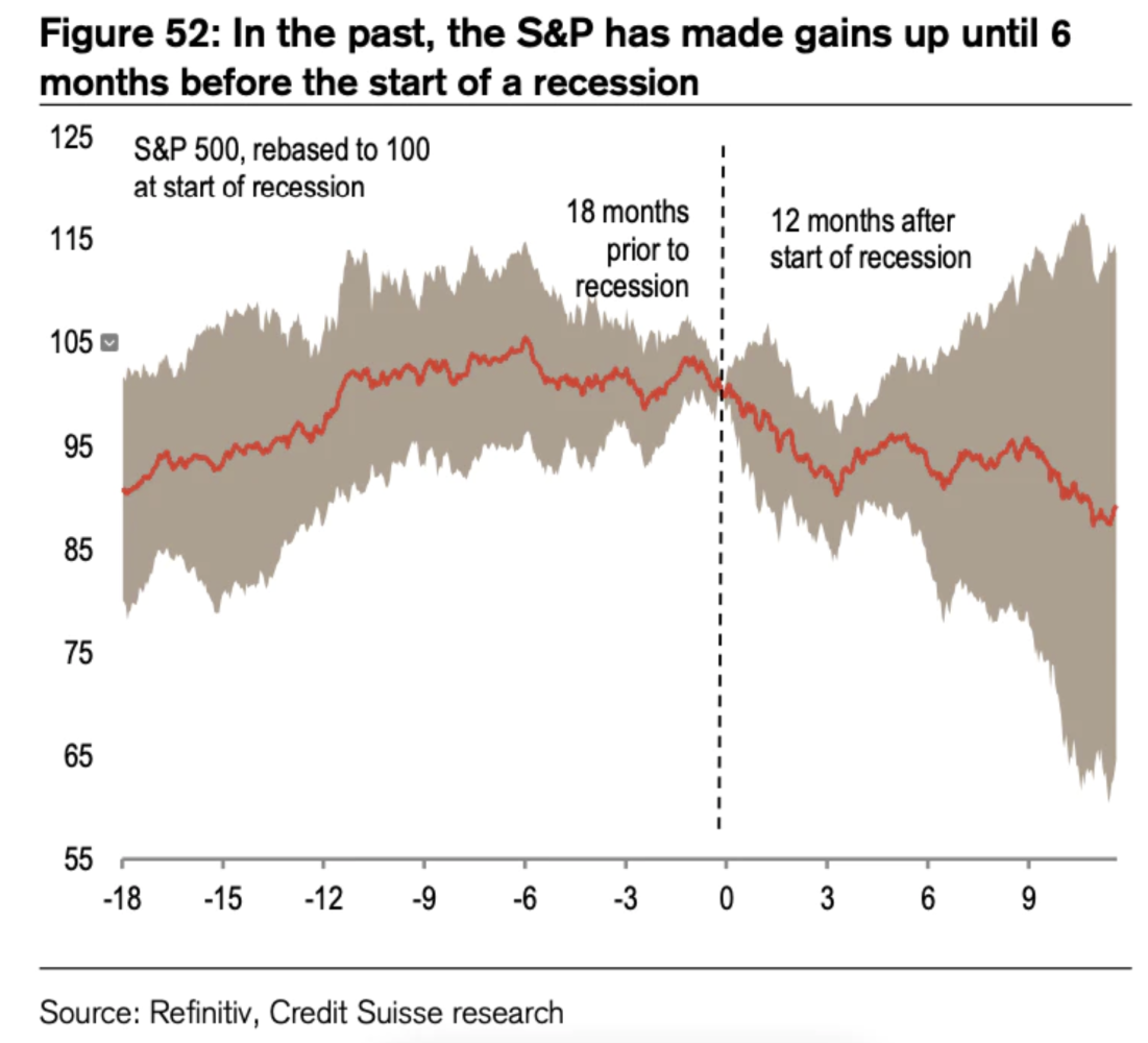
5. Stockmarket vs Recessions: Market seems to typically stall about 6-months before the official beginning of a recession according to this chart.
Source: Bear Market Warnings
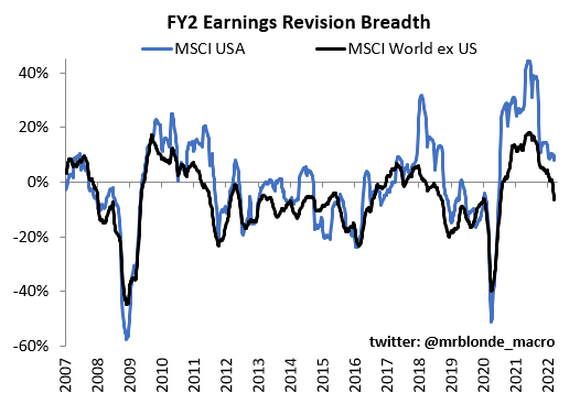
6. Earnings Revisions: It was always going to be hard to maintain the post-pandemic rebound momentum, but this looks like a fairly clear red flag for growth/earnings...
Source: @MrBlonde_macro
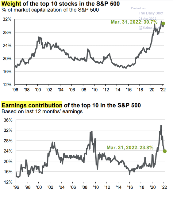
7. Big Stock Earnings Impotence: Seems like the top 10 stocks are no longer on top when it comes to earnings contribution to the S&P 500…
Source: @SoberLook via @jessefelder
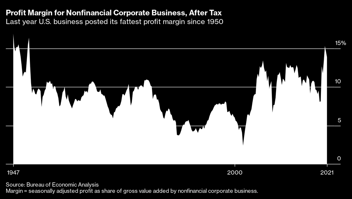
8. Peak Profit Margin?
Source: @MaverickBogdan
9. Sectors and Bubbles: Interesting thing to me on this chart is (not annotated) Energy basically had an echo-bubble in the late-2000's. One could argue that Tech is currently in the middle of an echo-bubble... (or maybe it's just the “new normal”, as many assert).
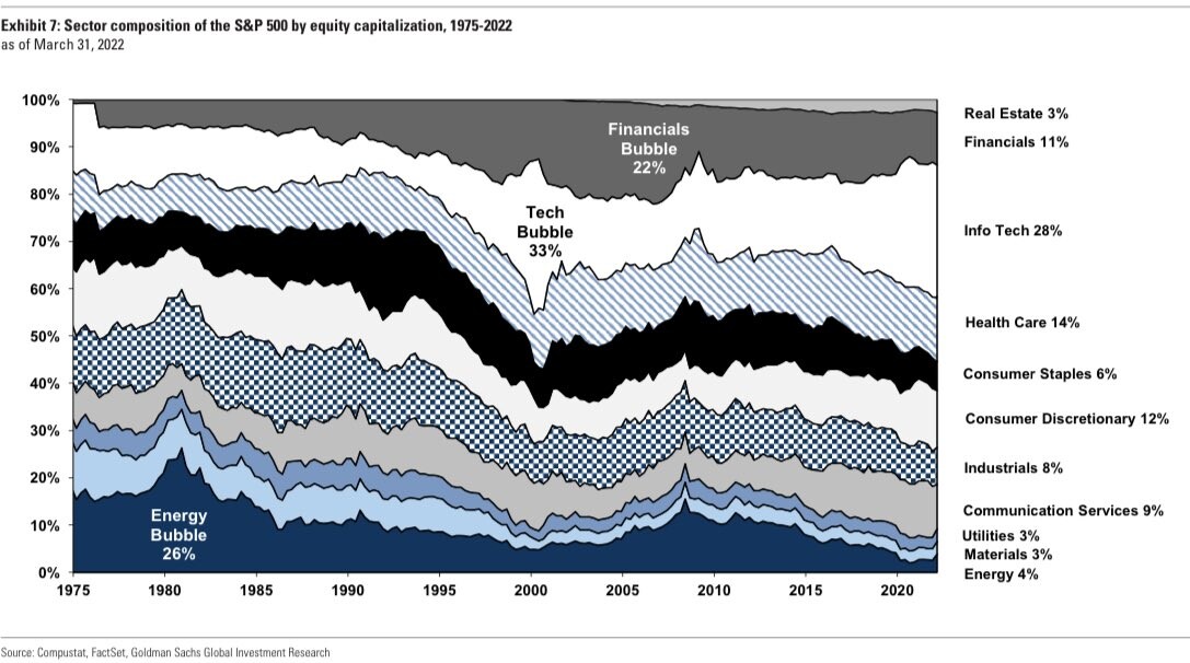
Source: @SamRo
10. Space Investing to the Moon!!
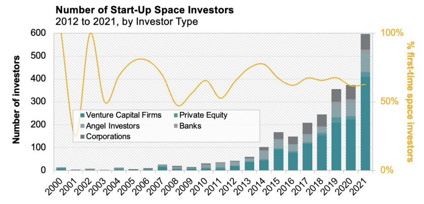
Source: The Space Investor
Thanks for reading!
Callum Thomas
Founder and Head of Research at Topdown Charts
Any feedback, questions and views are welcome in the comment section below.
5 topics

