Weekly S&P500 ChartStorm - 17 July 2022
The charts focus on the S&P500 (US equities); and the various forces and factors that influence the outlook - with the aim of bringing insight and perspective...
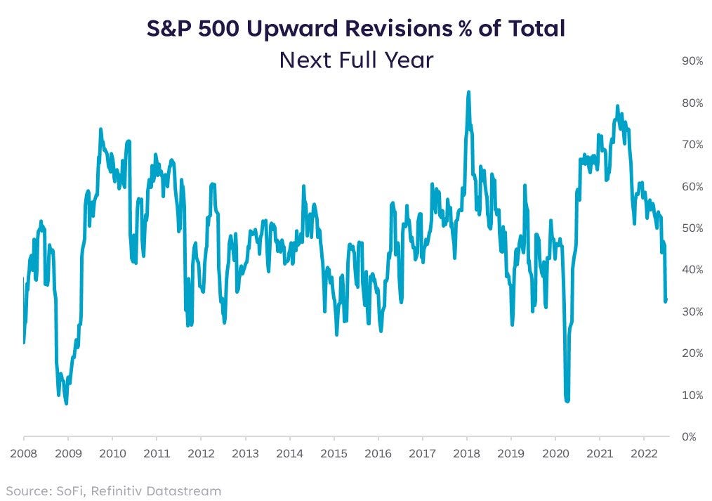
1. Earnings down-and-Outlook: Clear downward momentum in earnings revisions, only 33% of analyst earnings estimates have been revised upward (i.e. the rest downward) -- matches the worsening macro.
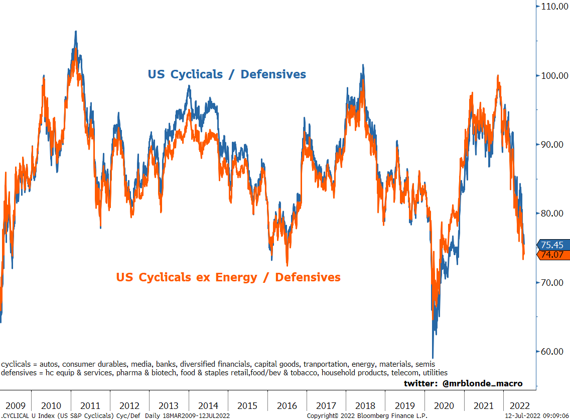
2. Cyclicals vs Defensives: That earnings revisions path (previous chart) looks suspiciously similar to the path of cyclicals vs defensives...
In other news, defensives have been having a dream run (in relative terms) this year — goes to show: “there’s always a bull market somewhere“.
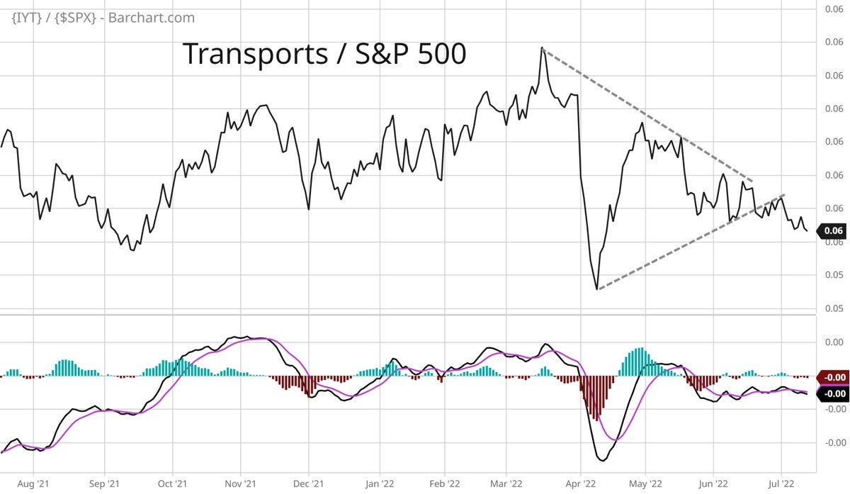
3. More Malign Macro: Transports IYT 0.99%↑ vs S&P 500 SPY 1.01%↑ relative performance line is trailing down to the right... basically a signal of weakening economic activity in that transport sector is heavily exposed to the ebb and flow in economic activity.
… and or all the nGDP and Labor Stat warriors out there saying things still look good, the market almost always knows the real story *well in advance* of those lagging and low frequency indicators!
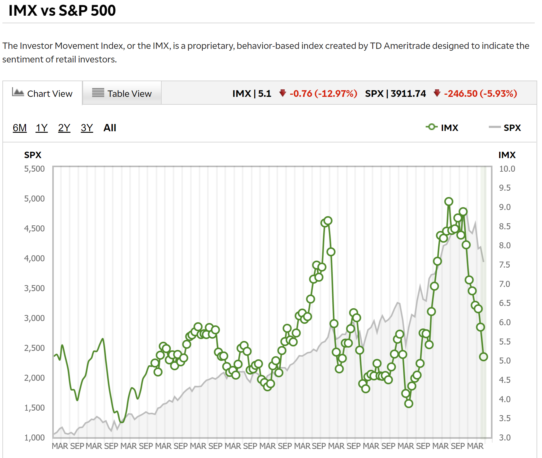
4. TD Ameritrade Investor Movement Index
(not to be confused with the bowel movement index!)
The June reading dropped to the lowest point since 2020, that’s a big round trip in investor sentiment right there...
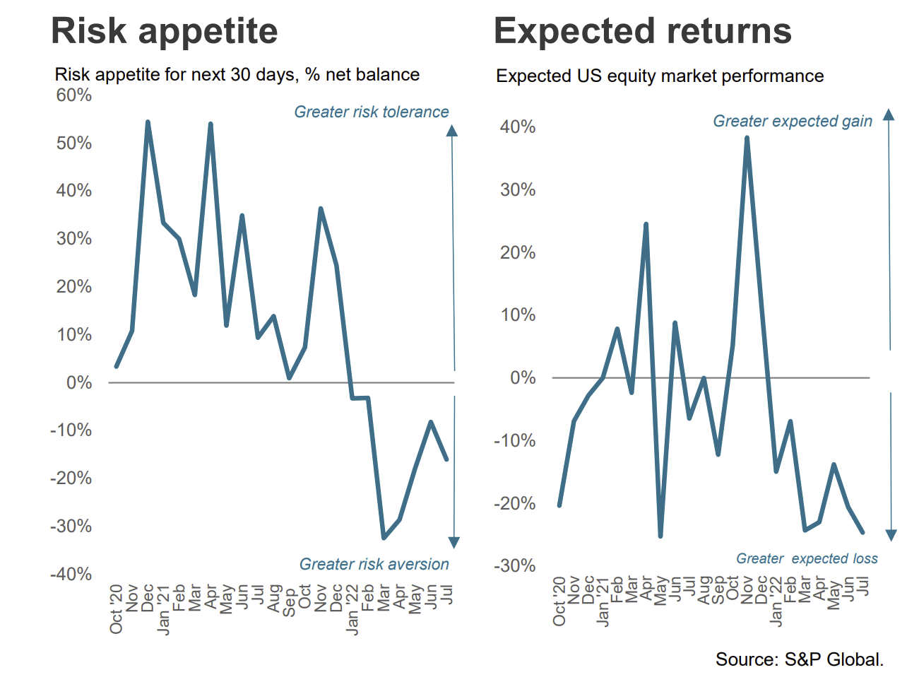
5. Investment Manager Index: US equity investors became more risk averse in July according to S&P Global (used to be Markit, but they bought em). According to the survey details, macro issues were overwhelmingly cited as the main downside driver for markets in the near term. We are all macro investors now.
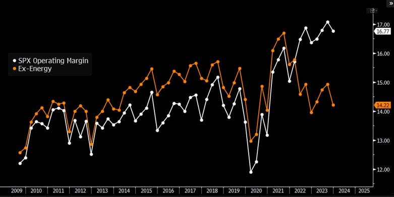
6. Energy Earnings Margins: Apparently S&P 500 expected Operating Margins are being entirely propped up by the Energy Sector...
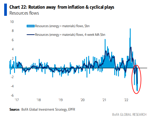
Thus the energy (and materials) sector is going from a driver of strength to driver of weakness as the commodity bubble bursts.
7. Run on Resources: Investors are dumping Resources equities (energy + materials) as the commodity bubble begins to burst.
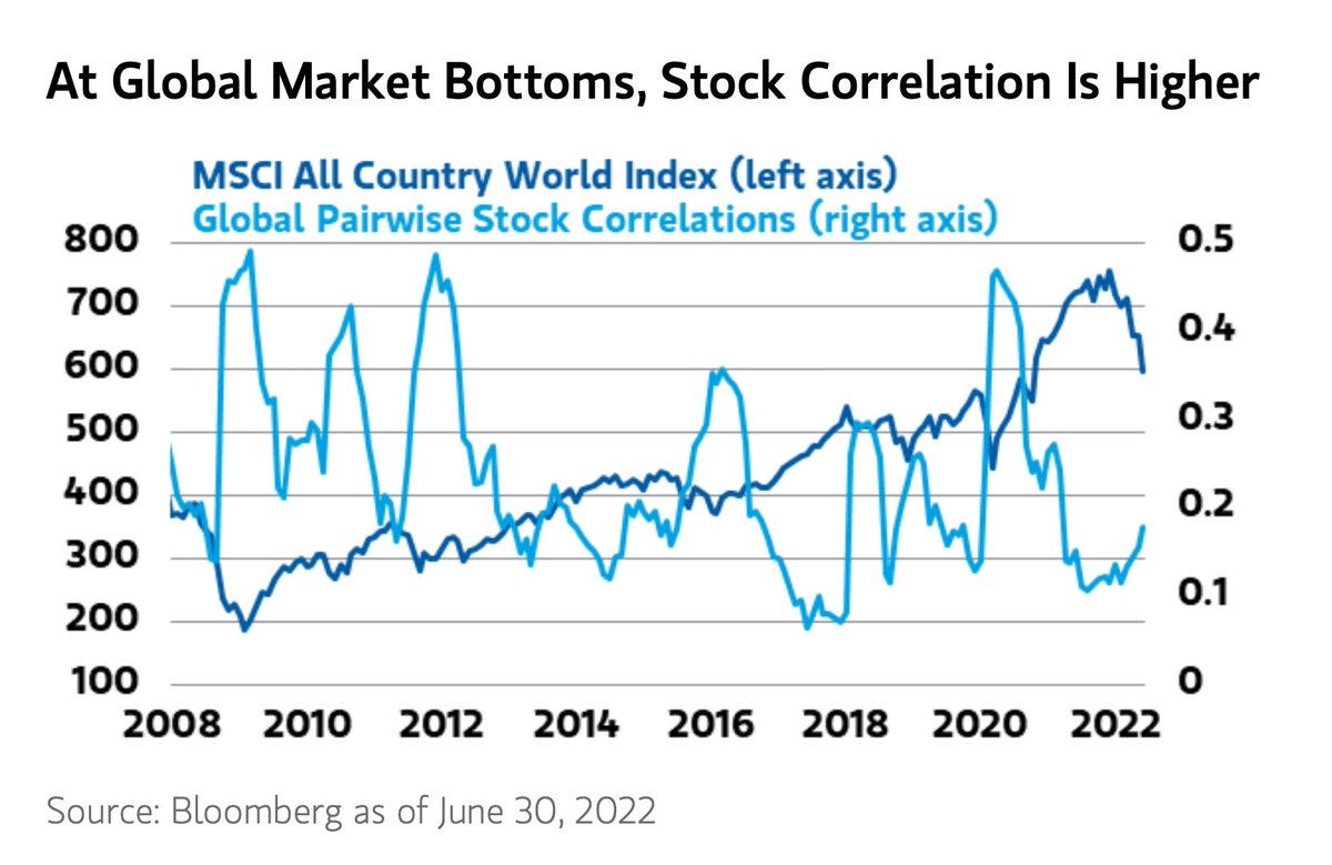
8. Global Equity Correlations: How to tell when global equities bottom?
(when everything turns to sh..🤫)
Correlations usually spike at that cathartic moment where everything goes to the wall, when the last bastions of strength get broken, when everything is at its worst. “Darkest before dawn” and things of that nature. Across the various macro/cross-asset indicators I watch, we are getting closer, but I still get the sense that we need another cathartic wave down before it’s going to be safe to get back in the water.
9. Correlations Again: Given the previous chart, it is interesting then to see correlations among S&P 500 stocks on the rise...
The market is becoming more and more macro-driven by the day, especially as policy screws tighten, commodities crumble, and cracks increasingly start to show in the economy.
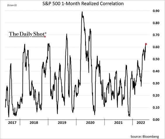
Source: @SoberLook via @SnippetFinance
FYI: Snippet Finance delivers a great regular email with snippets on stocks, macroeconomics and investing presented in a short easy-to-digest way.
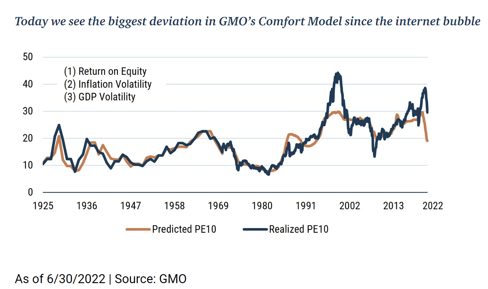
10. Valuation Situation: This chart is a great illustration of what I have been stressing — the question we need to ask is not how far *have* valuations come down… it's how far do they *have to* go before investors are sufficiently compensated for the bad macro? (i.e. for the risk of excessive monetary tightening and recession) This chart (link to the research note below) suggests quite a bit lower yet.
Thanks for reading!
Callum Thomas, founder and head of research at Topdown Charts.
Any feedback, questions and views are welcome in the comment section below.
4 topics

