Weekly S&P500 ChartStorm - 18 September 2022
The charts focus on the S&P500 (US equities); and the various forces and factors that influence the outlook - with the aim of bringing insight and perspective...
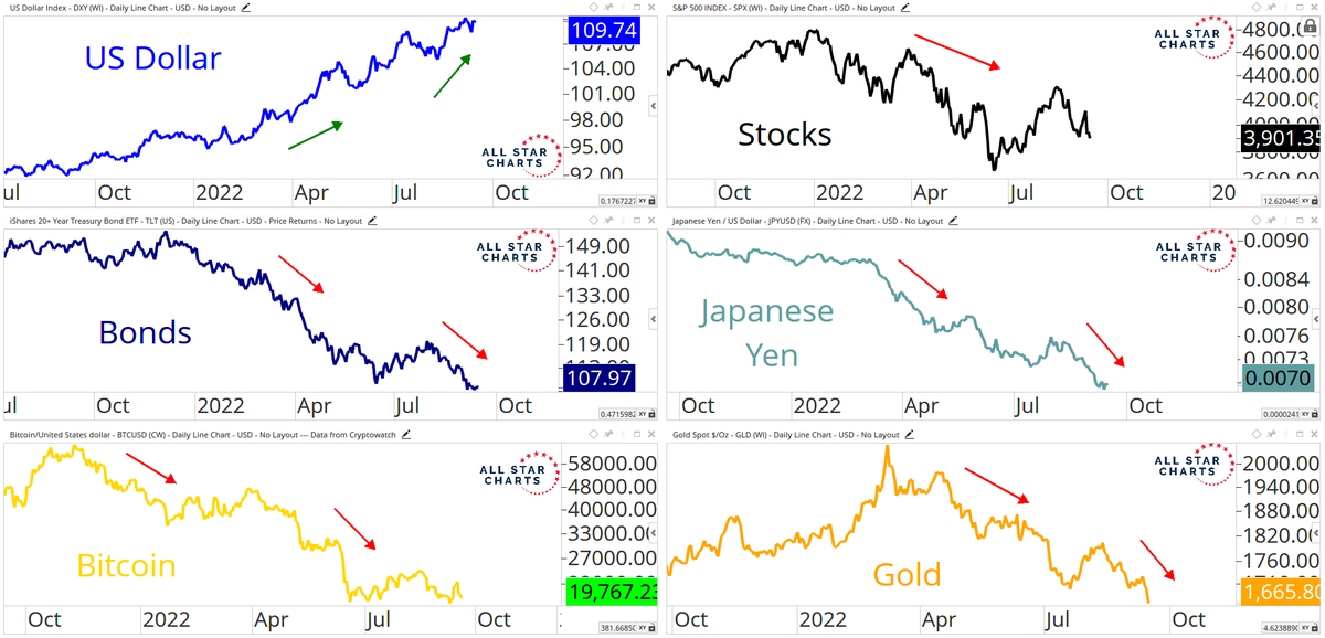
1. The Trend is Your Friend? They say "don't fight the Fed", but another key market aphorism is **don't fight the trend** (which is kind of in many ways driven by the Fed). But either way, as the chart shows, there are clear trends at play across assets as the liquidity tides go out and the cycle progresses…
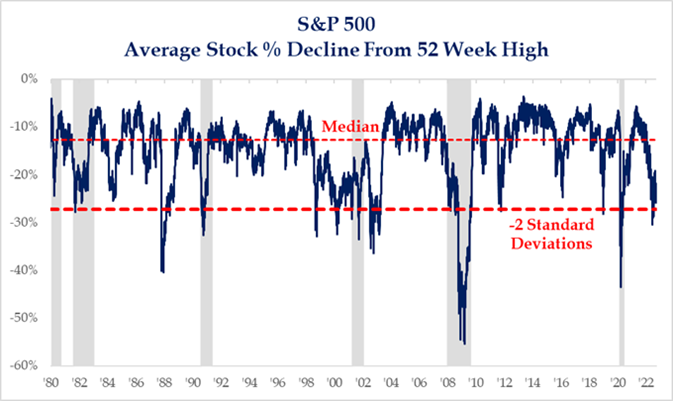
2. Extreme Pricing: The S&P500 is down almost -20% YTD but more importantly, the average stock decline % is near the 2 S.D. level "that is often associated with a bounce"
Issue is: it can get worse (e.g. 87, 08, 20), and it can stay bad (e.g. dot com bubble burst).
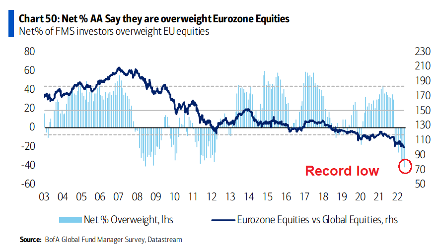
3. Exiting the Eurozone: Allocations to Eurozone equities dropped to a record low in the latest BofA fund manager survey. Europe is basically the epicenter of the 2022 macro meltdown, so we should expect this - maybe we can call it rational fear (but at some point it becomes irrational (and a source of opportunity)).
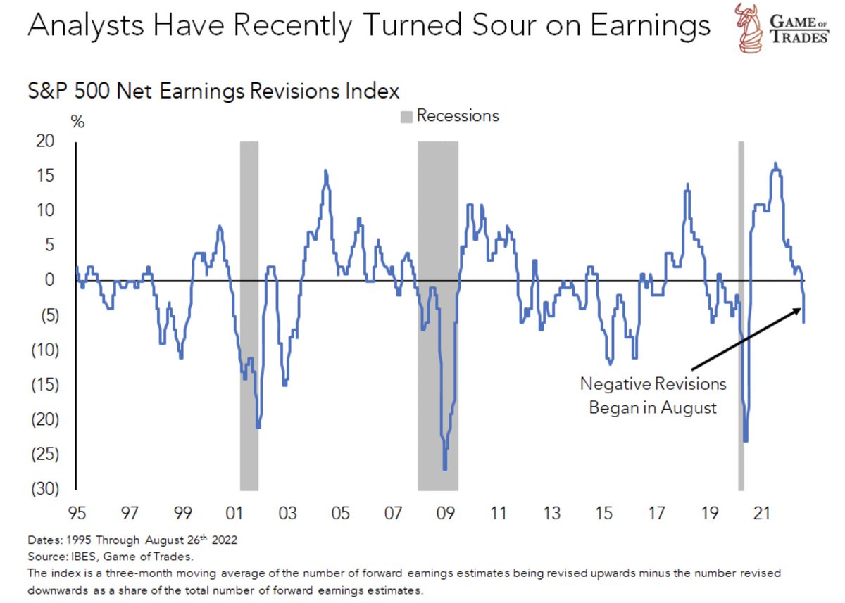
4. Analyst Sentiment Souring.
Logical 🖖: this is what happens in recession.
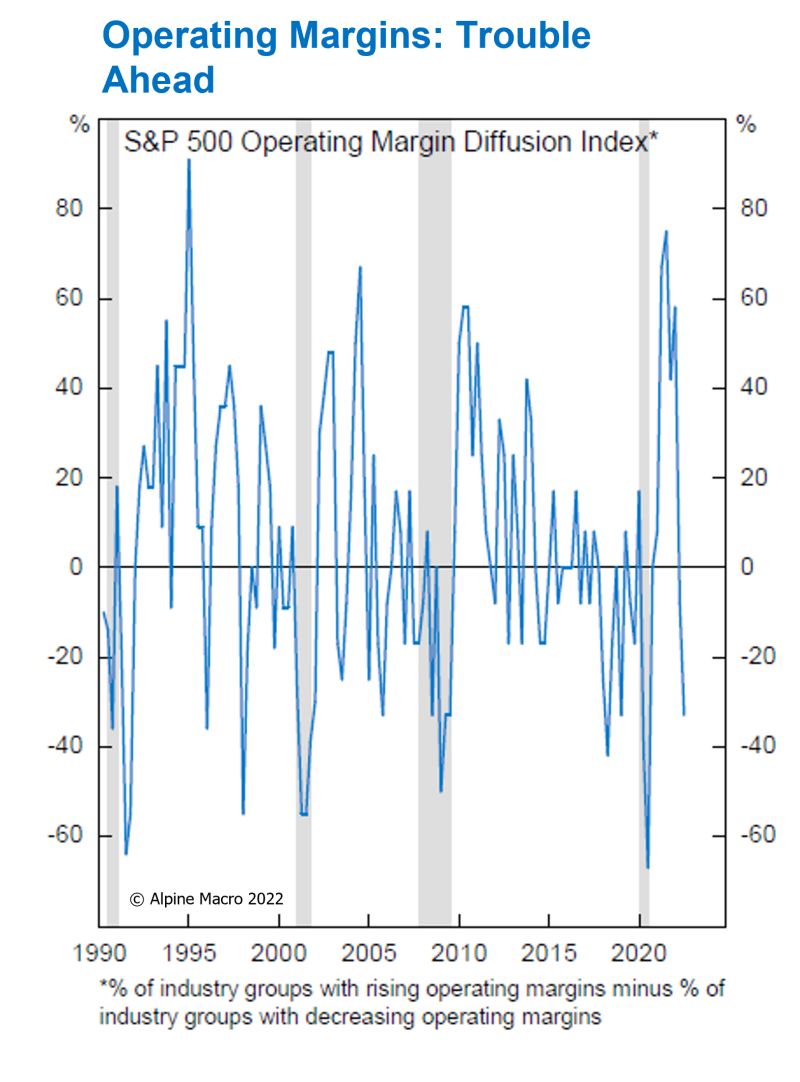
5. Earnings Recession Incoming: Sure looks that way when you consider the momentum in the previous chart, and then notice that the S&P 500 "Operating Margin Diffusion Index has declined to levels that are typical in recession."
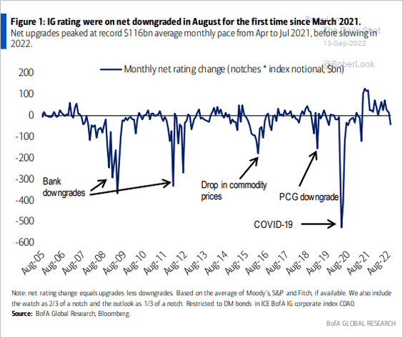
6. Credit on Borrowed Time? Similar vibe to the previous 2 charts — credit ratings downgrade cycle looks to be kicking off...
Also logical.
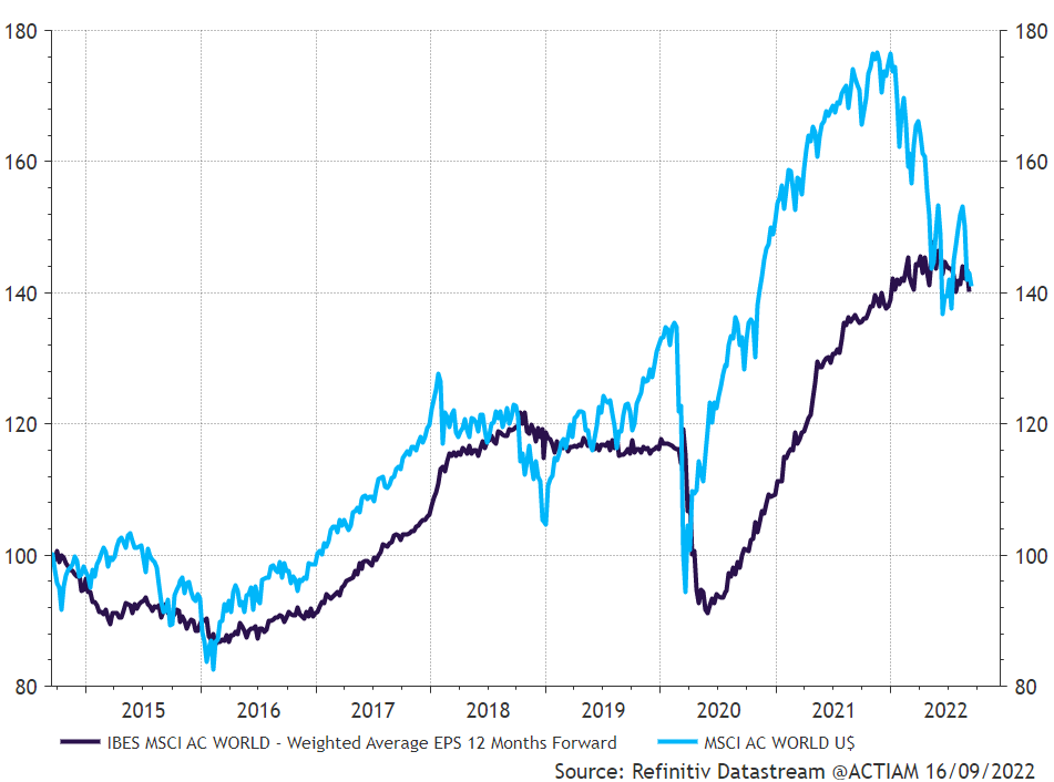
7. Global Equities vs Global EPS: The market happily front-run the earnings rebound in 20/21 thanks to massive stimulus. But next steps?
From here the stockmarket basically needs earnings to at least holdup, ideally head higher, or find new stimulus. All seem unlikely at this point...
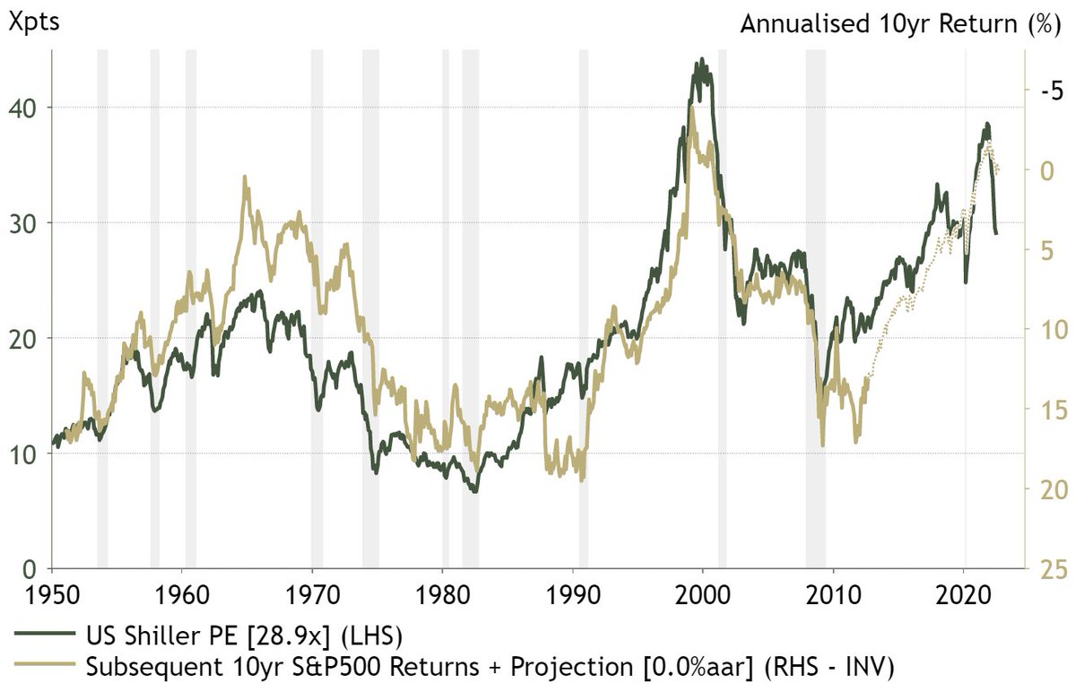
8. Valuations and Future Returns: Profit depends on Price paid.
The current Shiller PE ratio level is historically consistent with an annualized return of 0% over the next decade.
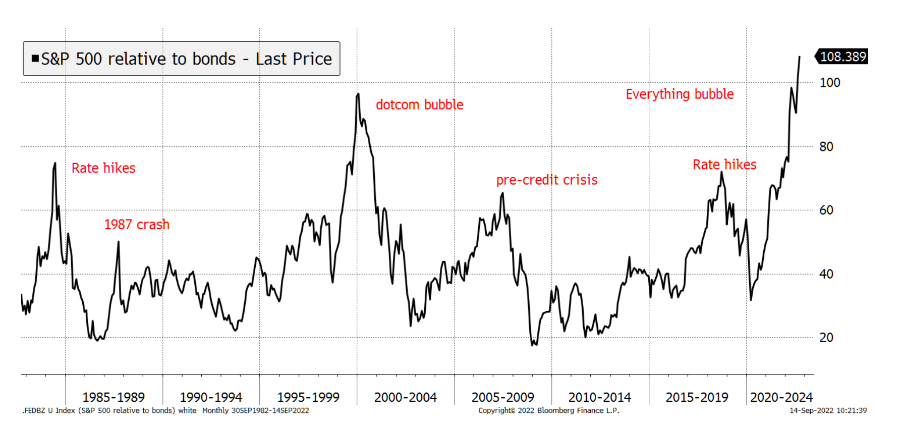
9. Stock/Bond Ratio: Wild.
Kind of speaks for itself, but to spell it out: equities are extremely stretched vs bonds. I suspect this will reverse eventually, and most likely when recession hits, inflation falls, and bonds finally start to fight back.
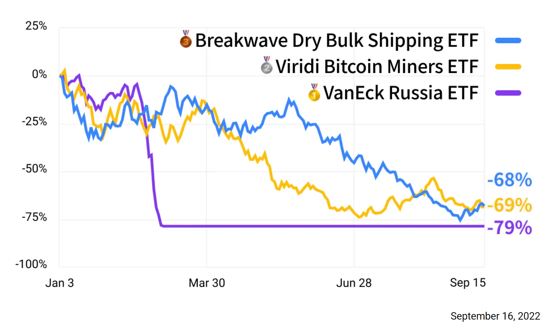
10. Worst performing ETFs of 2022 (YTD)
AKA — reminder: investing is risky.
Thanks for reading!
Callum Thomas, founder and head of research at Topdown Charts.
Any feedback, questions, and views are welcome in the comment section below.
5 topics

