Weekly S&P500 ChartStorm - 20 February 2022
The Weekly S&P500 ChartStorm is a selection of 10 charts which I hand pick from around the web and post on Twitter. The purpose of this post is to add extra color and commentary around the charts.
The charts focus on the S&P500 (US equities); and the various forces and factors that influence the outlook - with the aim of bringing insight and perspective.
Hope you enjoy!
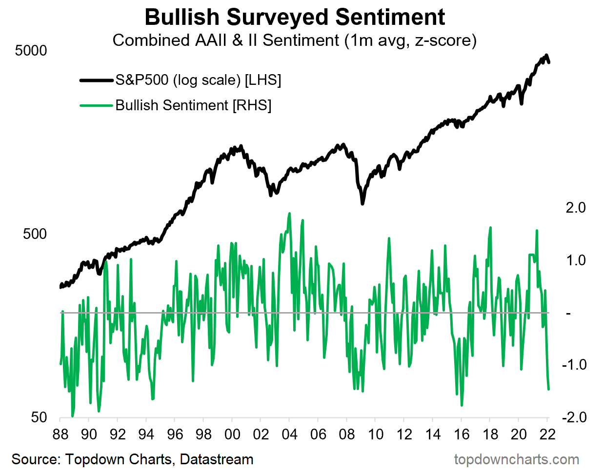
1. Market Mood: To borrow a term, investors are now convinced that the stockmarket has decided to invade into bear market territory. Interesting to note how rare it is for bullish sentiment to drop this low (n.b. this is the combined monthly average of the AAII & Investors Intelligence surveys).
Source: @topdowncharts
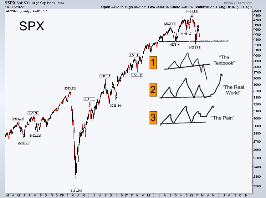
2. Best Laid Plans: Chart lines are good and useful, particularly in helping frame decision making/triggers. But the annotations on this chart provide a timely reminder that there is the textbook and then there is the real world. Have a plan (better to have a plan and get confounded than have no plan at all and get washed about in the rivers of fate), but remember Iron Mike’s golden rule of planning.
Source: @FusionptCapital
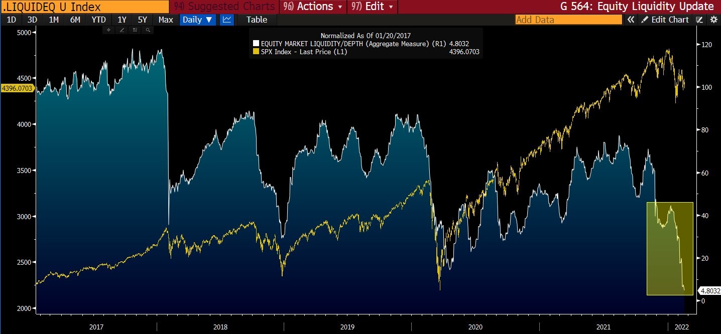
3. Equity Market Liquidity: This indicator is designed to ‘measure the depth and resilience dimensions of "liquidity" to gauge price impact of flows’ — clearly things are changing, as I’ve noted before the macro risk backdrop is basically permanently different to that which we enjoyed in the last ~2 years… “Regime Change“.
Source: @FadingRallies
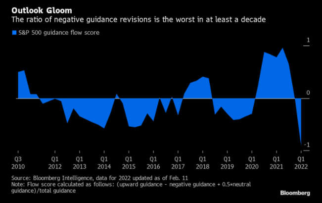
4. Earnings Guidance: From boom to gloom. One explainer for this chart is the fact that the pandemic gifted a lot of companies a *one-off* surge/pulling-forward in growth (e.g. zoom, peloton, netflix, etc) — something that could not be repeated. Add to that rising cost pressures and signs of a slip in growth momentum and the picture below begins to seem the obvious outcome.
Source: @C_Barraud
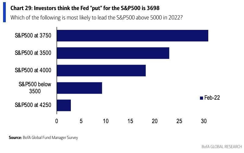
5. Fed Put Where? At least -15% lower, says the consensus… (i.e. with regards to the question, at what point would the Fed abandon plans to hike rates? and perhaps even pivot back into stimulus mode to stop the market fall,., uh, to stop financial conditions from tightening too much).
Source: @LizAnnSonders
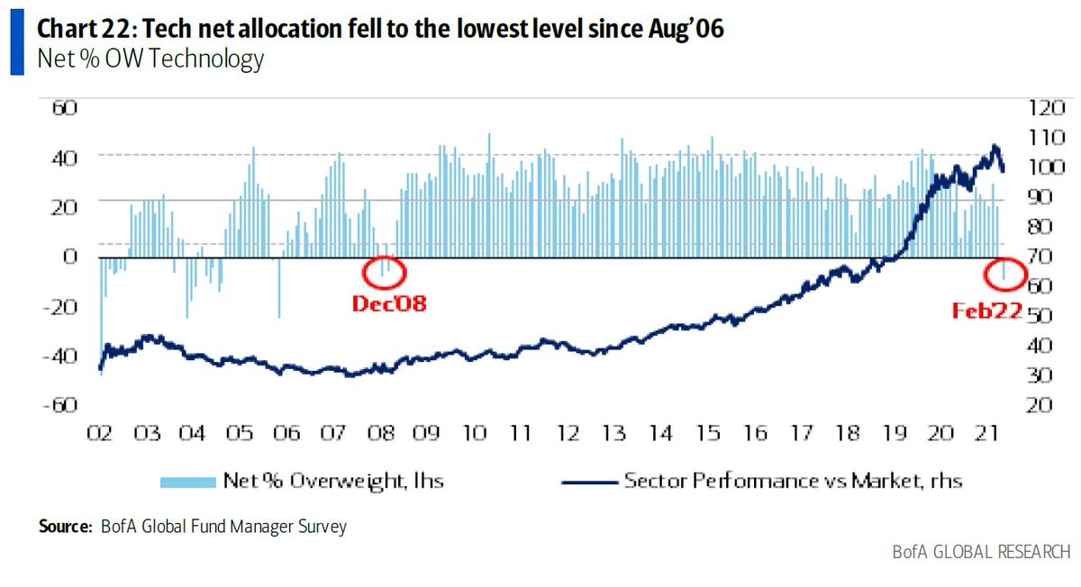
6. Tech Trucked Off: As real yields rise and reality sets in (that point about the one-off earnings surge, not to mention lofty valuations), investors’ love affair with tech appears to be ending/pausing…
Source: @SpecialSitsNews
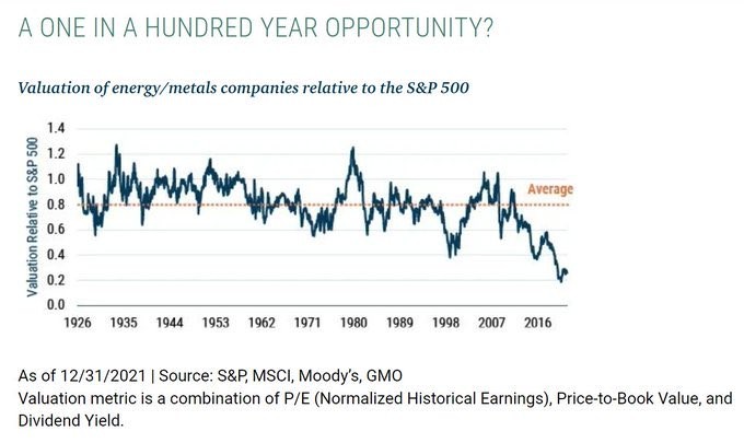
7. Commodity Stocks: Irrational hatred of commodity stocks (and love of tech) has created a relative value opportunity unseen in centuries. [albeit, n.b. this chart is from Dec, these stocks gone up about 10-15% since then, and tech has fallen by about the same, so I would imagine the discount is less now]
Source: @PlanMaestro
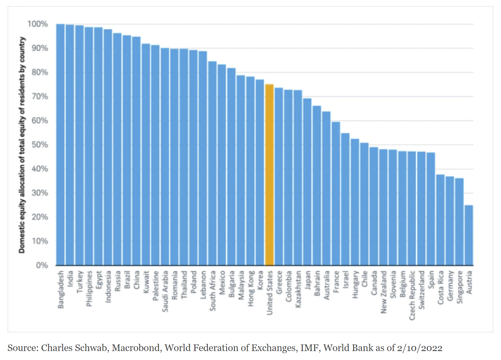
8. Home is Where the Stocks Are: Turns out "investors’ portfolios tend to overweight their home country no matter where they live" — few understand why they should go global, even if tactically vs strategically.
Source: @JeffreyKleintop
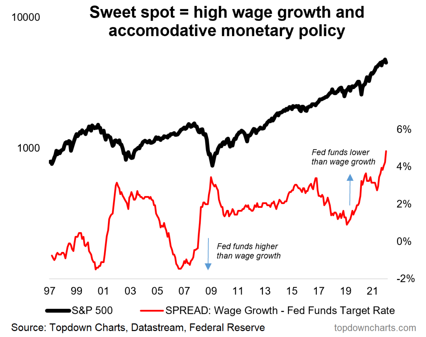
9. Fed Sweet Spot Indicator: Wage Growth > Interest Rates = Upside?
Source: Chart of the Week - The Fed vs The Stockmarket
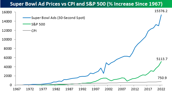
10. Super Bowl vs the S&P: The real momentum play is Super Bowl ad prices.
Kind of astounding: "the price of a Super Bowl ad is up 18% this year" — which is the largest annual % increase since... *2001*
Source: @bespokeinvest
Thanks for reading!
Callum Thomas
Founder and Head of Research at Topdown Charts
Feedback/questions/views welcome in the comment section below:
4 topics

