Weekly S&P500 ChartStorm - 24 April 2022
The Weekly S&P500 ChartStorm is a selection of 10 charts which I hand pick from around the web and post on Twitter. The purpose of this post is to add extra color and commentary around the charts.
The charts focus on the S&P500 (US equities); and the various forces and factors that influence the outlook - with the aim of bringing insight and perspective...
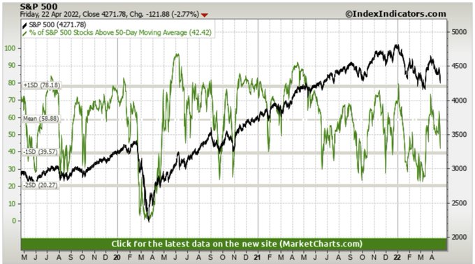
1. Selling Starts Again: Looks like another wave of selling is underway. First glance at this chart I would say look for 50dma breadth to fall <30% before showing up as oversold, and price probably retests the March lows...
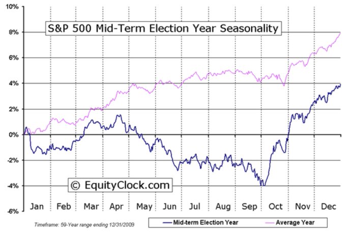
2. Mid-Term Election Year Seasonality Update: Season's Greetings…
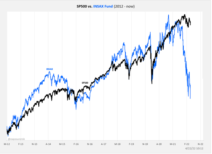
3. Insider Buying Fund: The social/saas/tech-heavy insider buying fund, INSAX, is continuing its plunge (crash?). Doesn’t look like a good omen for the rest of the market...
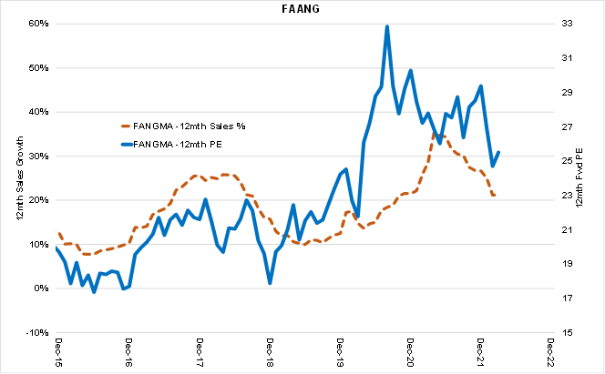
4. FAANG: FAANG going ex-growth? I guess it’s a good reminder that a bunch of techy growth stocks basically got a one-off boost to growth from the pandemic and valuations rose to levels consistent with/requiring ongoing strong growth. Priced for perfection means anything less than perfection will mean imperfect price action.
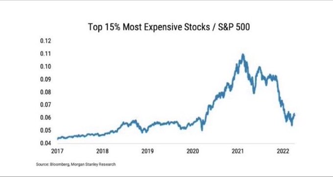
5. The Most Expensive Stocks: "Valuations Don't Matter" they told us…
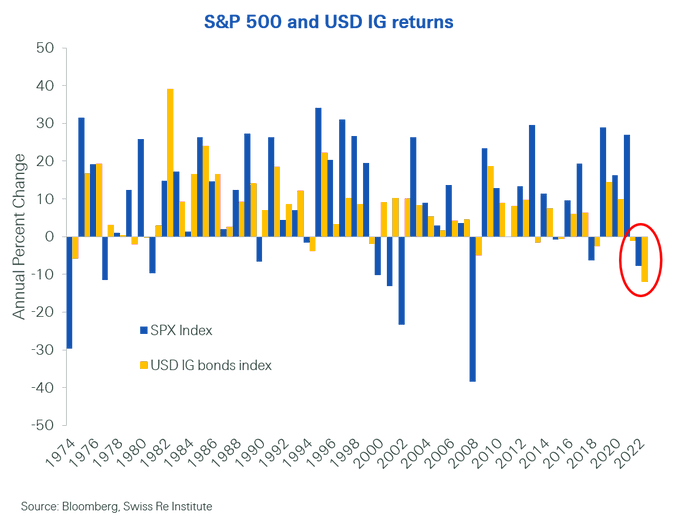
6. Diworsification: Seems like the old hot areas of the market "Search for Yield" and "Growth at Any Price" are both getting butchered at the same time...
7. Price vs Fair Value: The Morningstar median price vs fair value estimate for all the stocks they have ratings on is starting to look cheap (…but perhaps not cheap enough yet?)
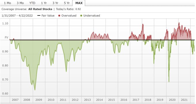
Source: Morningstar Market Fair Value
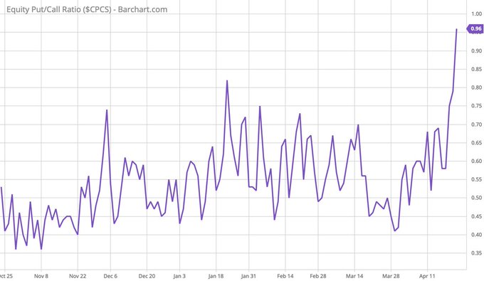
8. Put/Call Ratio: Putty-call starting to show some signs of panic (…or perhaps greater greed on bearish option bets?).
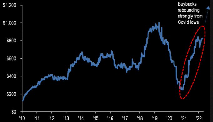
9. Buybacks Bidding Bigger: JPM expecting $1T buybacks this year. Could be a source of buying demand against the bearish backdrop. Albeit, one element: the cost of corporate debt is going up, so there may be less raising of debt to fund buybacks.
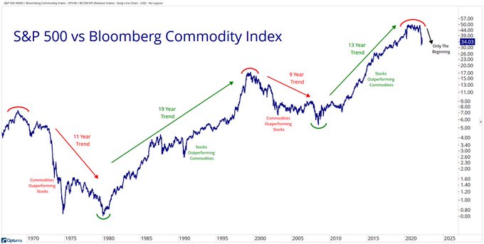
10. Stocks vs Commodities: They say “the trend is your friend“. Maybe we should listen to what our friend is trying to tell us in this chart!
Thanks for reading!
Callum Thomas
Founder and Head of Research at Topdown Charts
Any feedback, questions and views are welcome in the comment section below.
5 topics

