Weekly S&P500 ChartStorm - 25 September 2022
The charts focus on the S&P500 (US equities); and the various forces and factors that influence the outlook - with the aim of bringing insight and perspective...
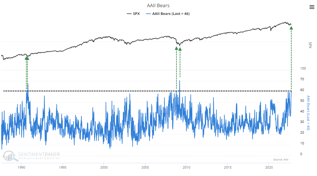
1. AAII Bears
Most bearish reading since 2009. According to SentimenTrader “This week joins just 4 others in 35 years with more than 60% of respondents being despondent in the AAII survey. One year returns after the others: +22.4%, +31.5%, +7.4%, +56.9%”.
So bearish that it’s bullish?
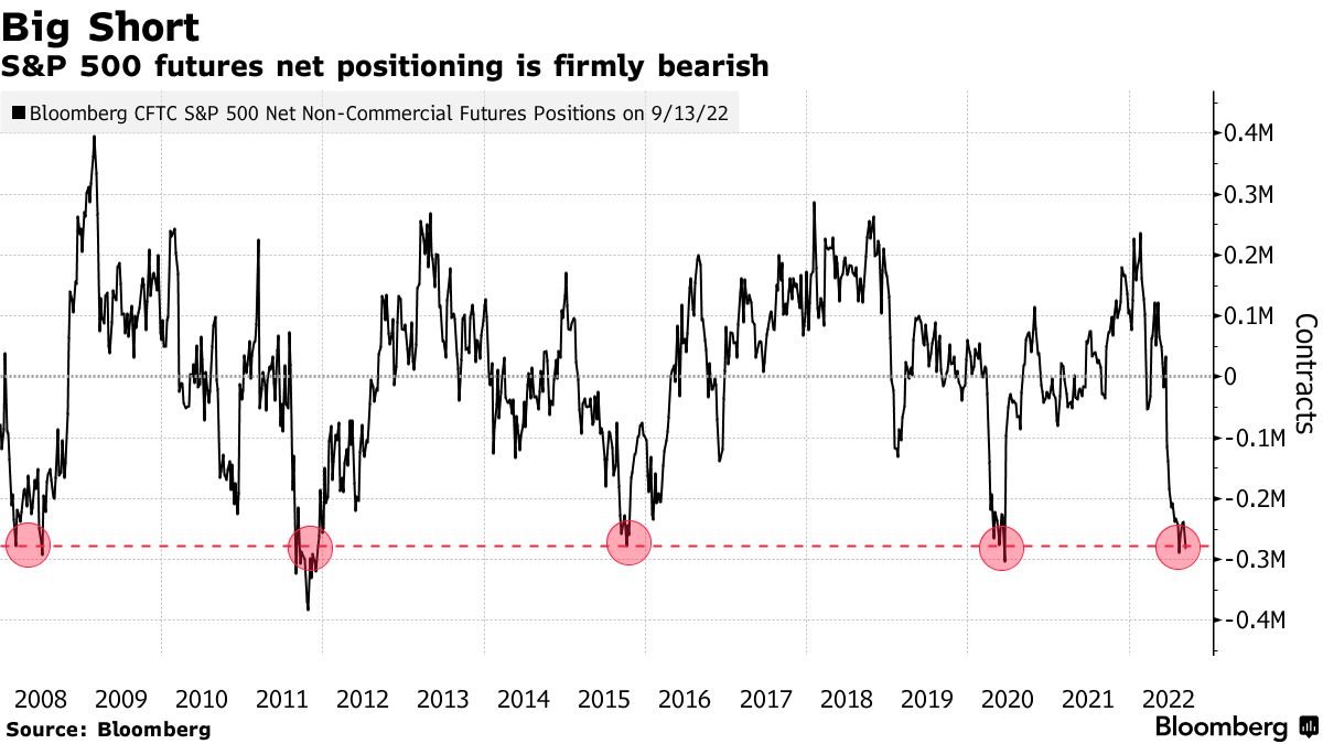
2. Big shorts
Speculative futures positioning is heavily net-short.
Albeit, n.b. this group were crowded short and right in 2008.
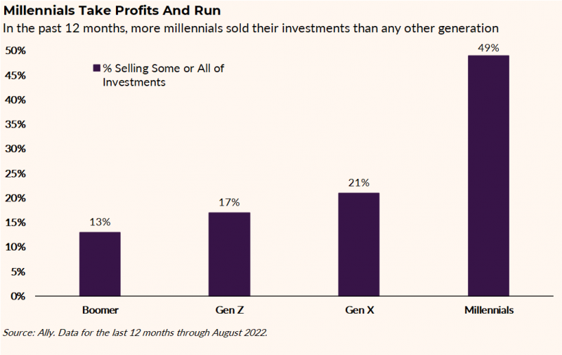
3. Generational selling opportunity
Intriguing statistics. Seems just about every millennial sold some or all of their investments. Could have to do with life stages, but hard to guess what is specifically driving this. The other key thing that sticks out in this chart is that aside from millennials, everyone else has held tight. That gels with my previous observations about the difference between very bearish surveys vs relatively minor movement in equity allocations and margin positions.
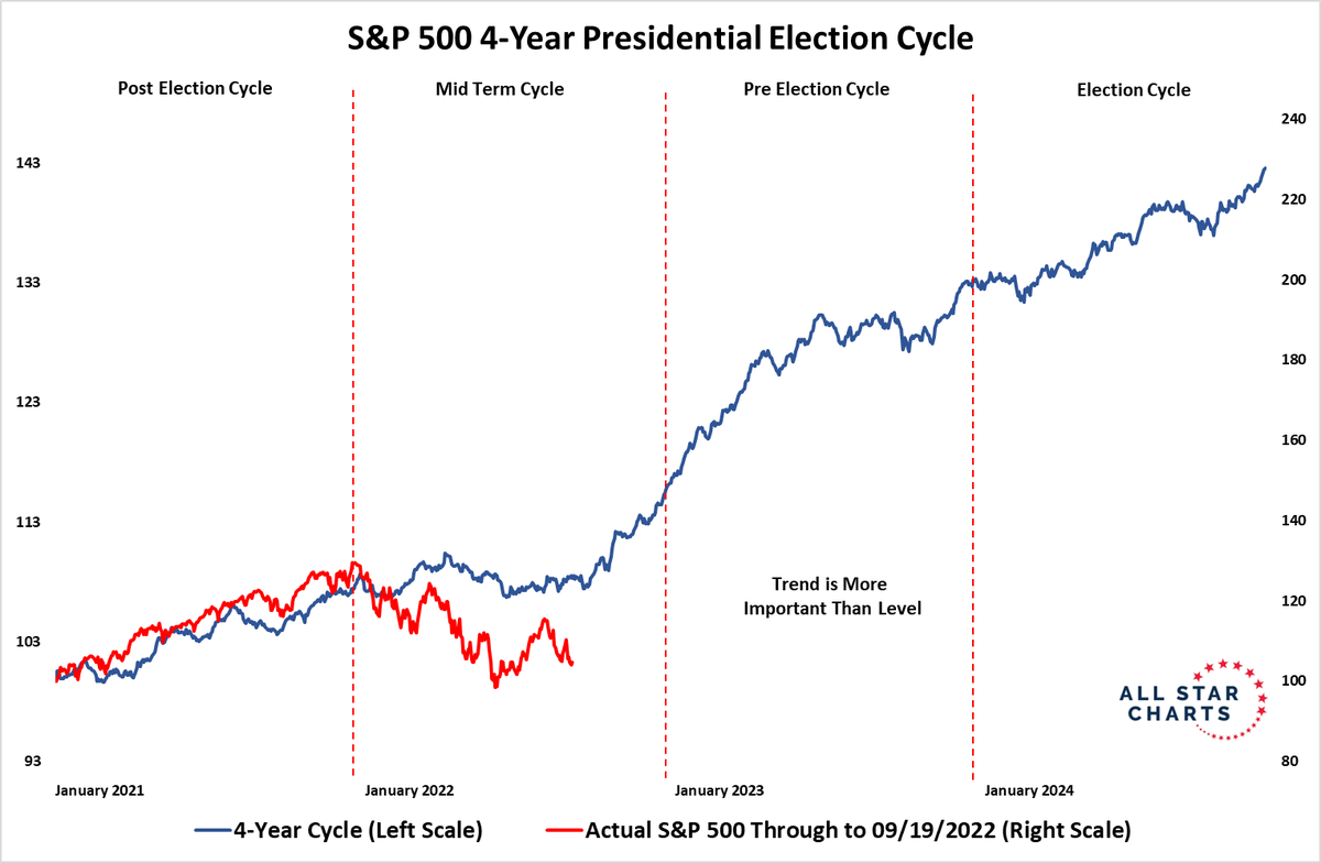
4. Presidential Election cycle
Clearly there is a lot going on, and so naturally the instinct when presented with a chart like this can be to dismiss it and say “yeah but this time is different”. And many things are different. But still, it is an interesting observation, and could become more interesting if there happened to be any (perish the thought) positive surprises.
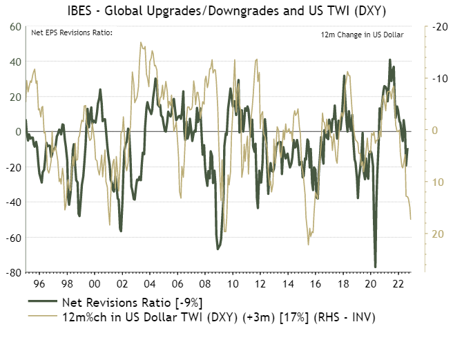
5. Friendly reminder
Strong dollar = tighter financial conditions (= recession = earnings go down). Hard to escape the reality of multiple mounting headwinds, and the inevitable negative impact on earnings.
Source: @IanRHarnett
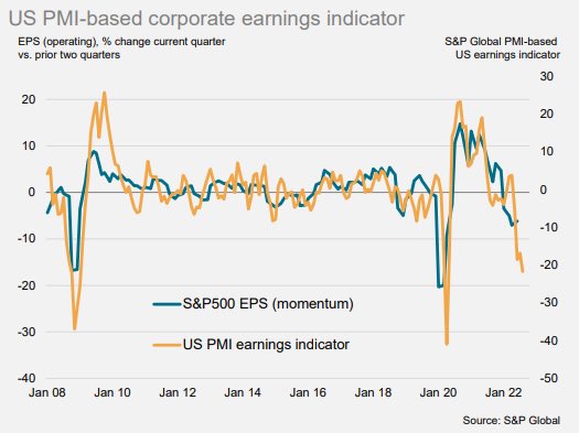
6. Earnings recession
Judging by the S&P Global PMI indicators, an earnings recession is on its way. Seems like just about every week we see a new chart with a new indicator pointing to recession/earnings collapse!
Source: @MichaelAArouet
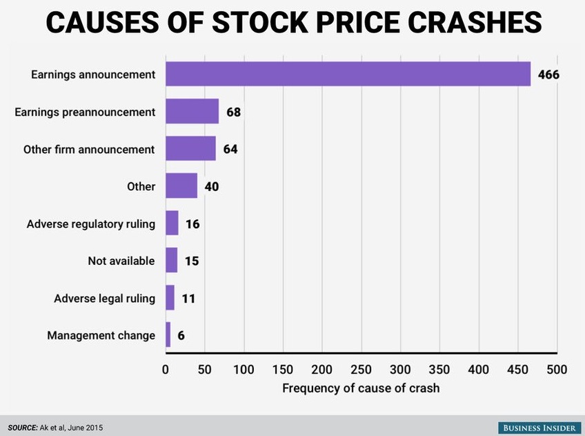
7. Stock price crash drivers
Interesting yet somewhat unsurprising chart.
When it comes to individual stocks, bad earnings announcements are the leading cause of stock price crashes. I would guess we can probably extrapolate this out to the macro/aggregate index level...
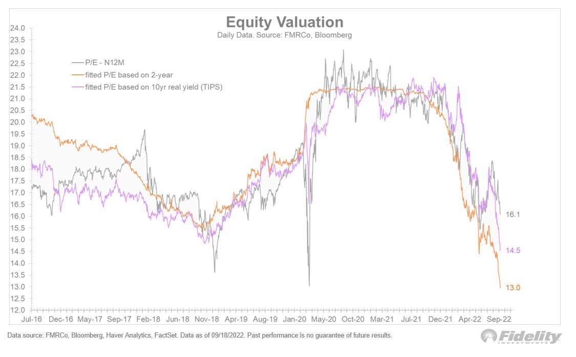
8. Real high real yields = real problem
Monetary tides going out. If you take this chart literally, based on the shift in rates, stocks are still overvalued...
9. Valuations in perspective
In absolute terms, US equity valuations are still elevated vs history; expensive. If it’s any consolation, property is wildly more expensive — most extreme reading on record(!). Commodities meanwhile are about neutral, and bonds by now are starting to look cheap.
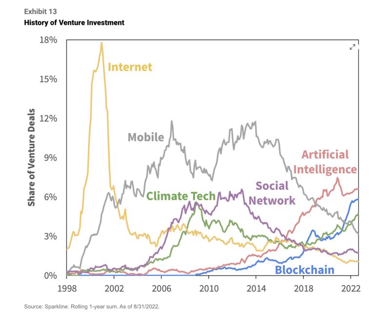
10. Adventures in venture investing
It's a race between AI/Blockchain/Climate.
Thanks for reading!
Callum Thomas, founder and head of research at Topdown Charts.
Any feedback, questions, and views are welcome in the comment section below.
5 topics

![Source: The 12 Charts to Watch in 2022 [Q4 Update]](https://www.livewiremarkets.com/rails/active_storage/blobs/proxy/eyJfcmFpbHMiOnsibWVzc2FnZSI6IkJBaHBBK0ZoQXc9PSIsImV4cCI6bnVsbCwicHVyIjoiYmxvYl9pZCJ9fQ==--193fd439f84b834aa54d42b473e7d3bf7868e8d8/9.png)
