Weekly S&P500 ChartStorm - 28 August 2022
The charts focus on the S&P500 (US equities); and the various forces and factors that influence the outlook - with the aim of bringing insight and perspective...
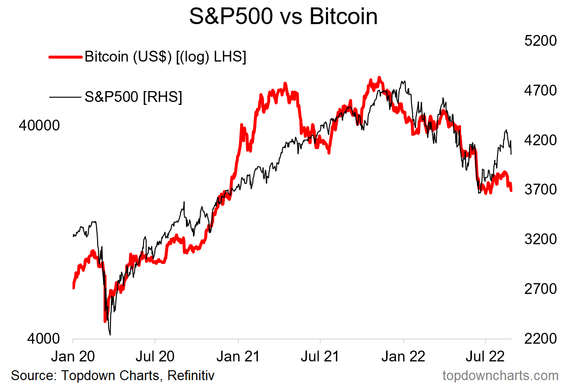
1. Falling to Bits…
Bitcoin back towards the lows. It’s hard for either of the things in this chart to sustainably rally when the monetary tides are going out. Bitcoin is basically a more direct play on that theme, and that's why this chart make sense.
2. System of a Top: Seems like systematic funds bought the rally... will be interesting to see how quant/systematic/trend following strategies perform in this environment — which is very different to that of the previous decade. I think a bear market or simply range-trading market would confound both human algorithms and computer algorithms!
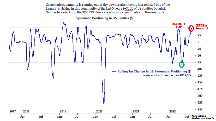
Source: @MacroCharts
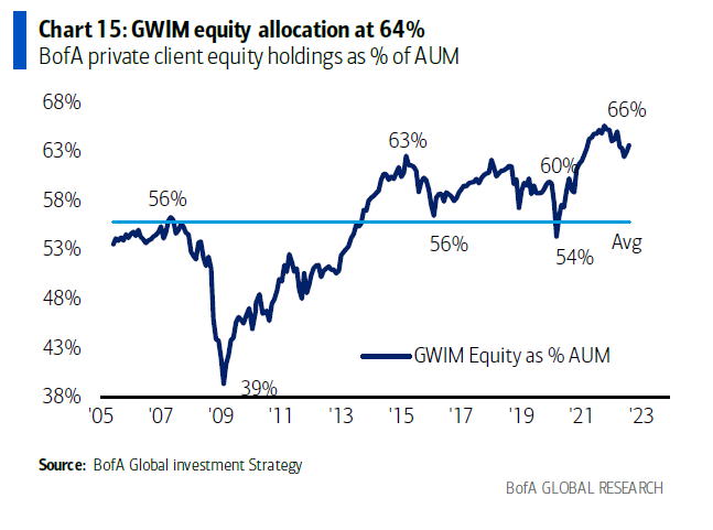
3. Diamond Hands: I’ve mentioned this a few times (e.g. last week chart no.5) and with reference to a few different datasets, but here is another interesting dataset — and this one shows it in a more accentuated form...
Investors have not sold.
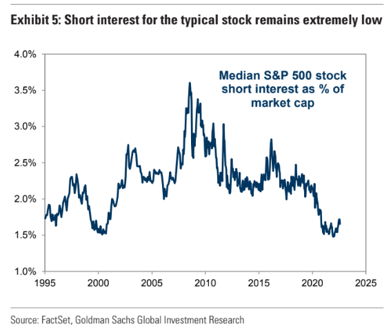
4. Short Interest Short of Interest: Did short selling die in 2020?
(or is it just resting, like in 2000?)
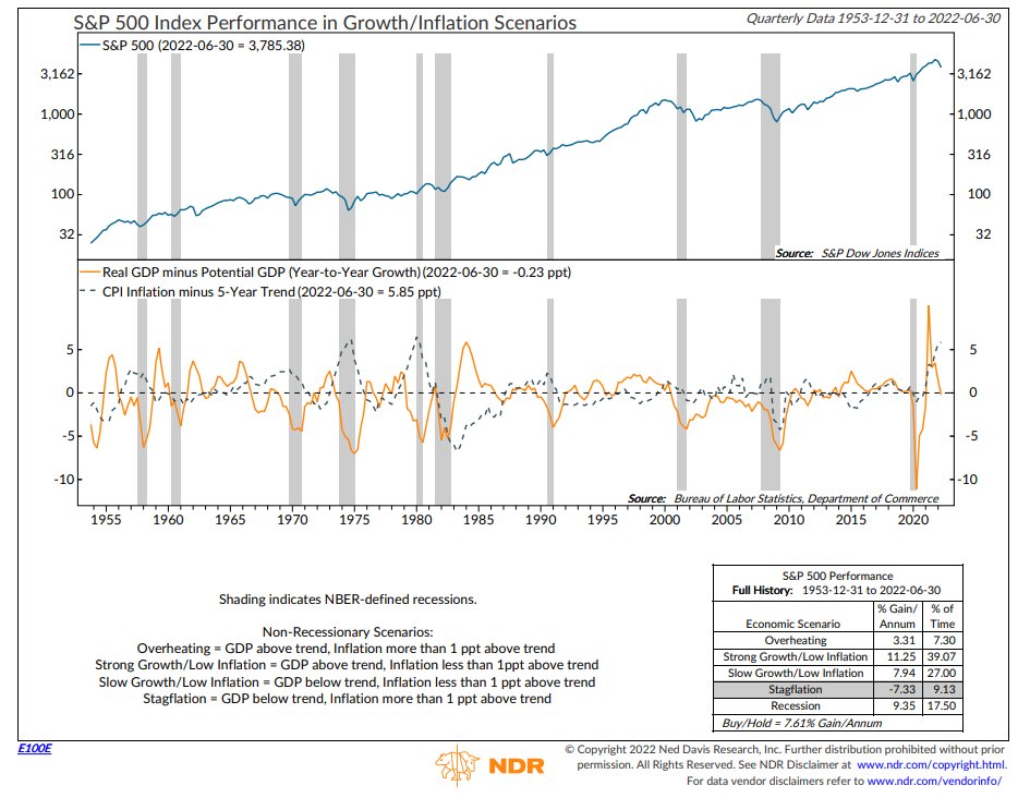
5. Stagflation Sucks for Stocks.
Interesting analysis in the context of Powell’s speech at Jackson Hole, which basically said expect more tightening, but also emphasized the likelihood/necessity of a "sustained period of below-trend growth" in order to combat inflation and prevent the risks of high inflation begetting high inflation. Again, the current macro backdrop is unfriendly for markets.
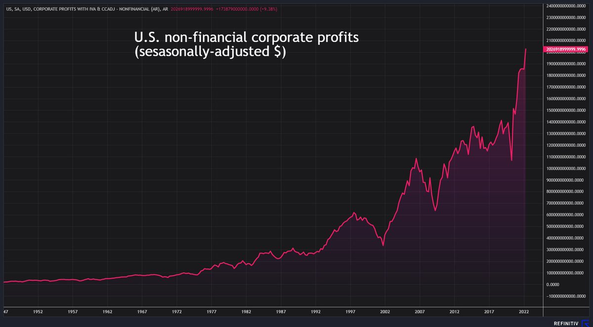
6. Prophets vs Profits: In other news, US corporate profits reached a new all-time high in Q2: surpassing the $2 Trillion mark for the first time in history. (maybe you can call that an upside of high inflation: everyone feels richer, or at least they have more nominal dollars)
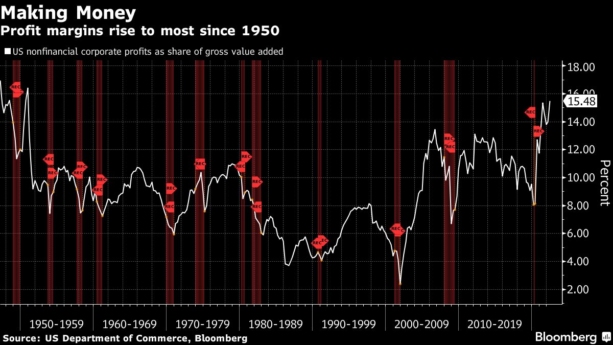
7. Profit-Able: On a related note, profit margins remain near record highs as companies happily pass on rising costs to consumers. Expect this to change as the Fed increasingly steps on the neck of the economy: lower profits = "transmission mechanism".
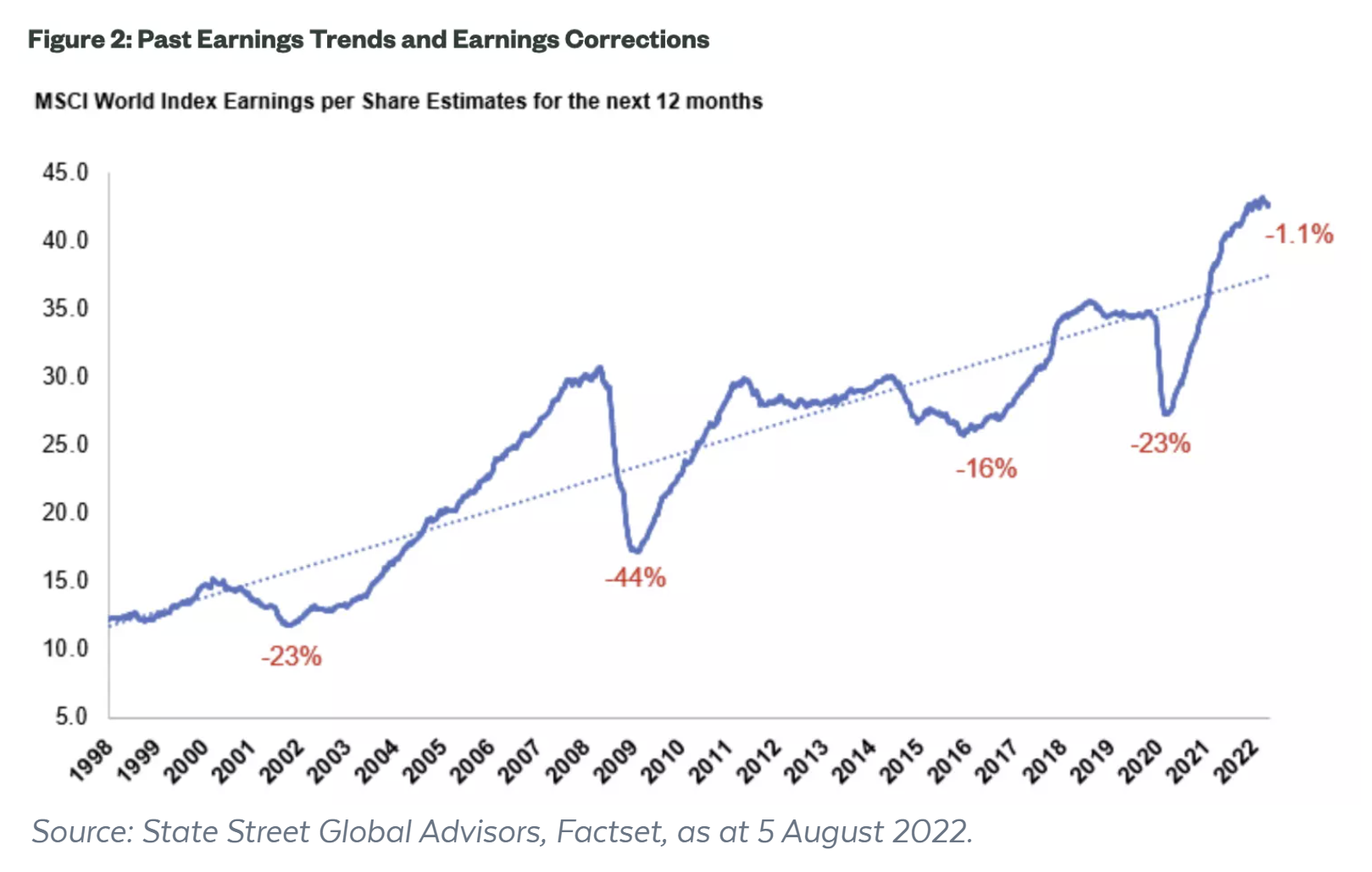
8. Peak Performance: This is what peak performance looks like.
(i.e. a peak in earnings performance)
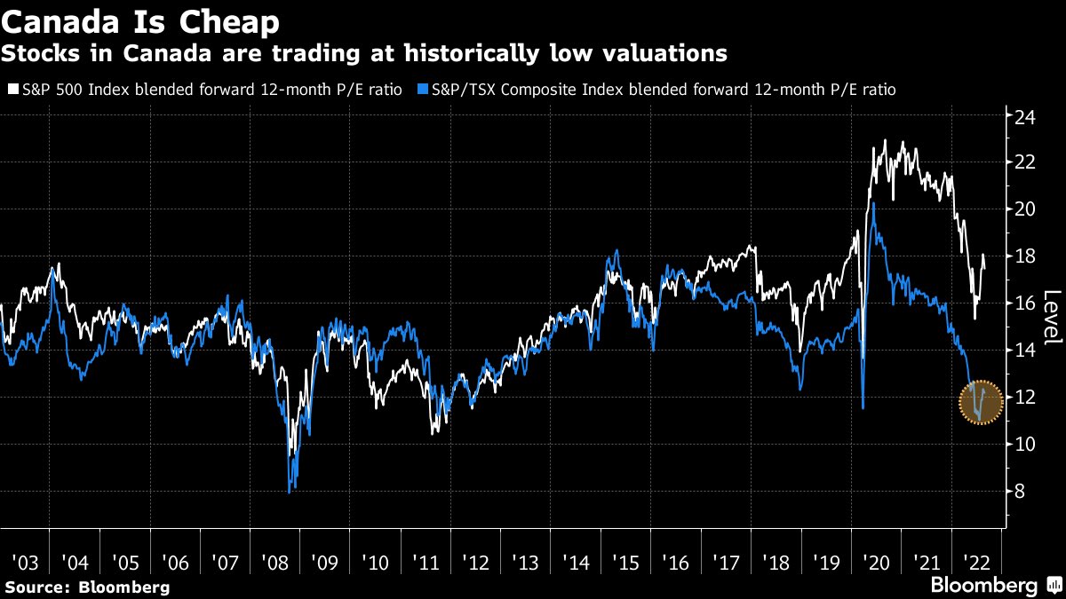
9. Canada is Cheap, eh: Interesting to see the divergence there; Canadian equities have priced in a much different reality vs that of the USA. Naturally though, there is also something to be said about the level of PE ratios if the E drops.
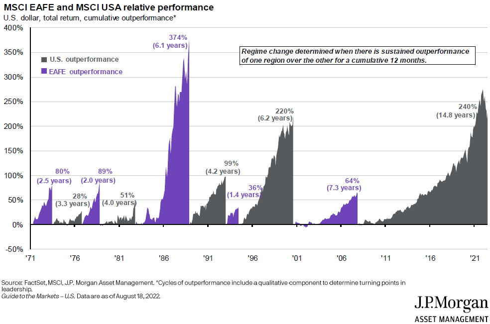
10. USA vs The World: Some (a lot? most?) investment professionals have never seen US underperform vs global ex-US equities during their career.
(would be shocking for them if this flipped)
Thanks for reading!
Callum Thomas, founder and head of research at Topdown Charts.
Any feedback, questions, and views are welcome in the comment section below.
4 topics

