Weekly S&P500 ChartStorm - 3 April 2022
The Weekly S&P500 ChartStorm is a selection of 10 charts that I handpick from around the web and post on Twitter. The purpose of this post is to add extra colour and commentary around the charts.
The charts focus on the S&P500 (US equities); and the various forces and factors that influence the outlook - with the aim of bringing insight and perspective...
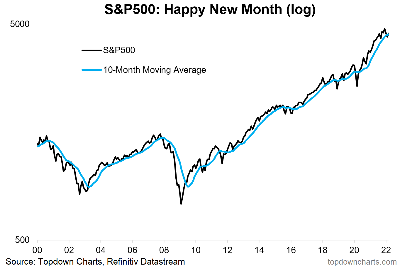
1. Happy New Month! Back above the 10-month (i.e. ~200 trading days) average as at the end of March... They say nothing good happens below the 200dma. Crisis averted?
Albeit, as a side note, interesting to note that the real/CPI-adjusted S&P 500 is still below its 10-month average.
Source: @topdowncharts
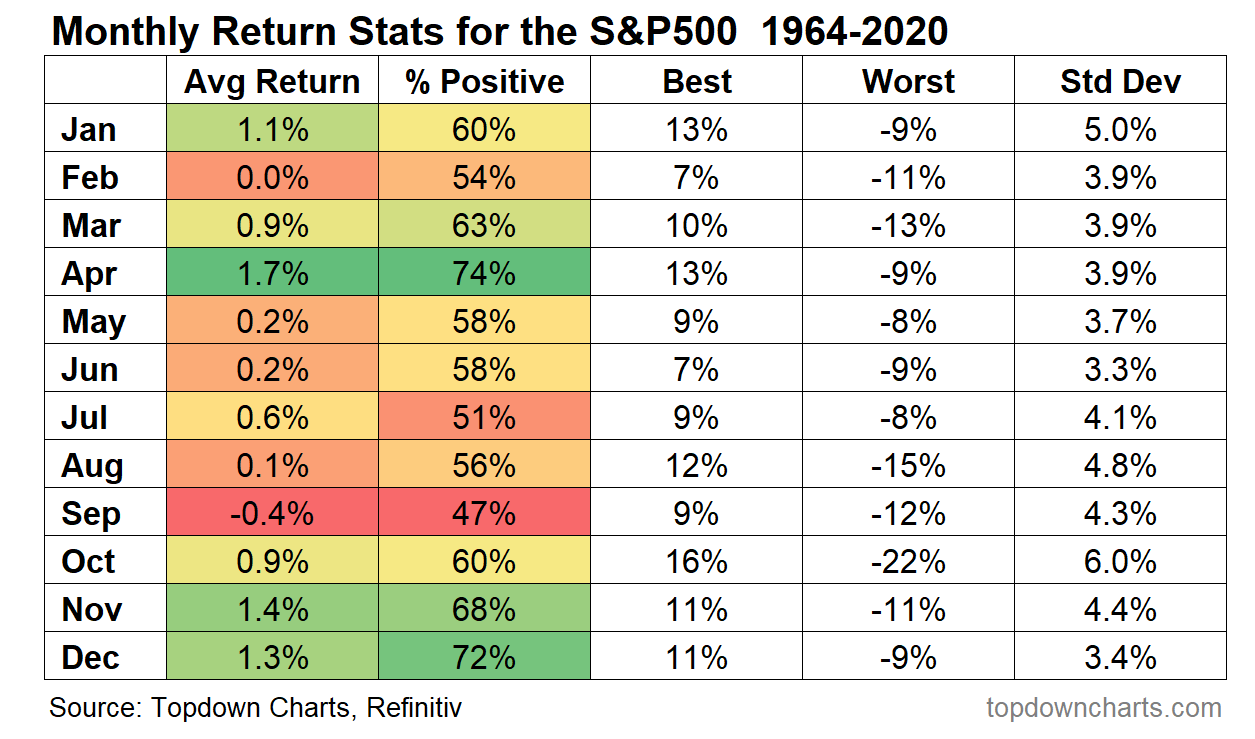
2. Seasonality Statistics: April is historically the best month for the S&P 500 in terms of average return and proportion of times positive.
(n.b. tho: it was negative 26% of the time, and worst April was -9% ...i.e. note the StdDev)
Source: @topdowncharts
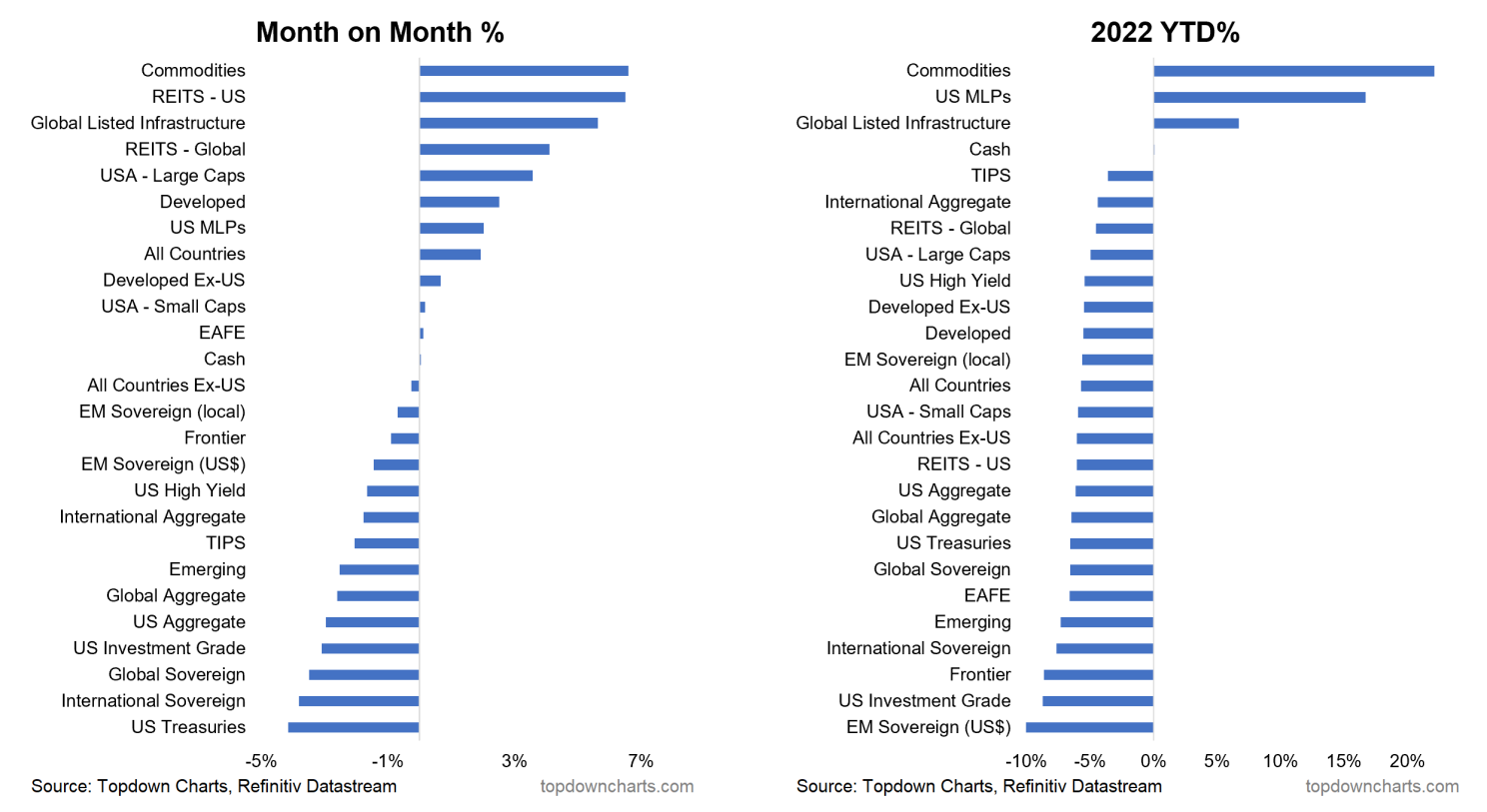
3. March Returns in Focus: US Large Caps March performance in context... Up 3.6% on the month in March, but still down -4.9% YTD. This year the winners have basically been cash and commodities, whereas fixed income was the biggest loser.
Source: Asset Class Returns
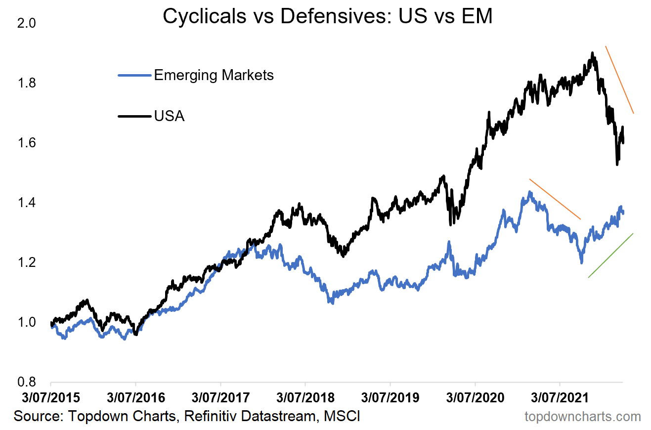
4. Cyclicals vs Defensives: Emerging Markets Cyclicals vs Defensives relative performance line peaked 9 months before the same for the USA did. And troughed in October... bullish or bearish?
Source: @topdowncharts
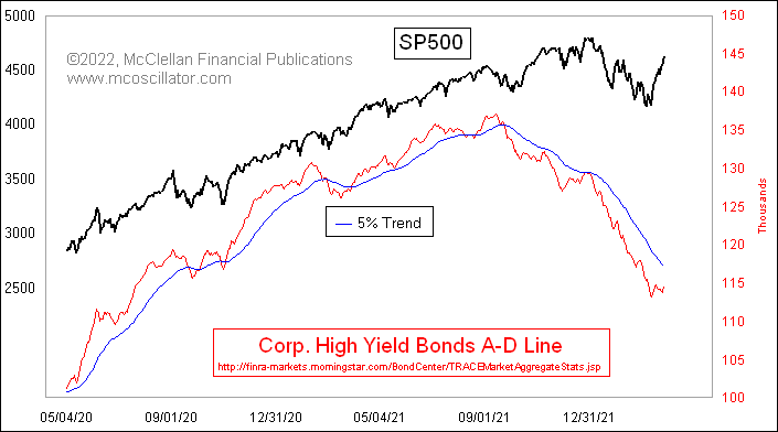
5. Corporate Bond Market: Corporate bond breadth is not confirming the strength in the S&P 500 at this stage. To be fair much of the weakness there is about duration vs credit, but we can't ignore the impact of higher bond yields in general...
Source: @McClellanOsc
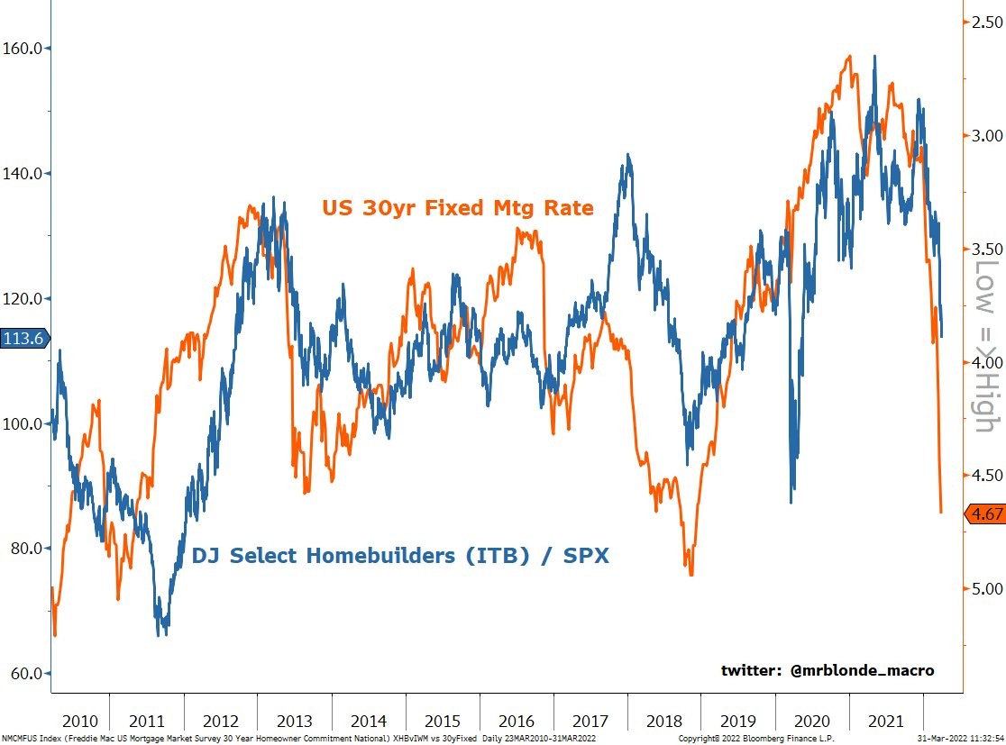
6. Homebuilders vs Mortgage Rates: Higher yields are hazardous...
Don’t underestimate the impact of higher bond yields. On my numbers, the indicative mortgage servicing cost indicator has gone up 94% since the low point (and that may cause issues for the wider growth outlook).
Source: @MrBlonde_macro
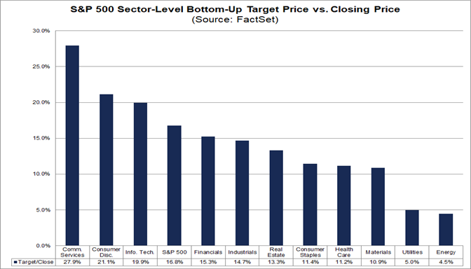
7. Price Targets: Analysts think the techy sectors have the biggest upside.
Source: FactSet
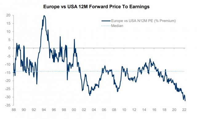
8. European Equities: Due more recently to the impact of geopolitics, European equities are now trading at a record valuation discount vs USA. Some will note that this didn’t matter throughout the past few years that you could have made similar remarks about the valuation discount, but we are at an extreme here and extreme valuation readings take on much greater weight.
Source: @Ozard_OfWiz
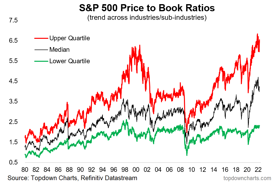
9. Price to Book Valuations: S&P 500 price to book ratios still at eye watering levels.
Correction barely put a dent in valuations: Upper Quartile of industries are trading at price to book ratios *higher* than that seen during the dot com bubble, and this is despite a (minor) reset. Even the Lower Quartile is at the upper end of the range, and last but not least: the Median is well above that ever seen in recent history.
Source: Chart of the Week - Vertiginous Valuations
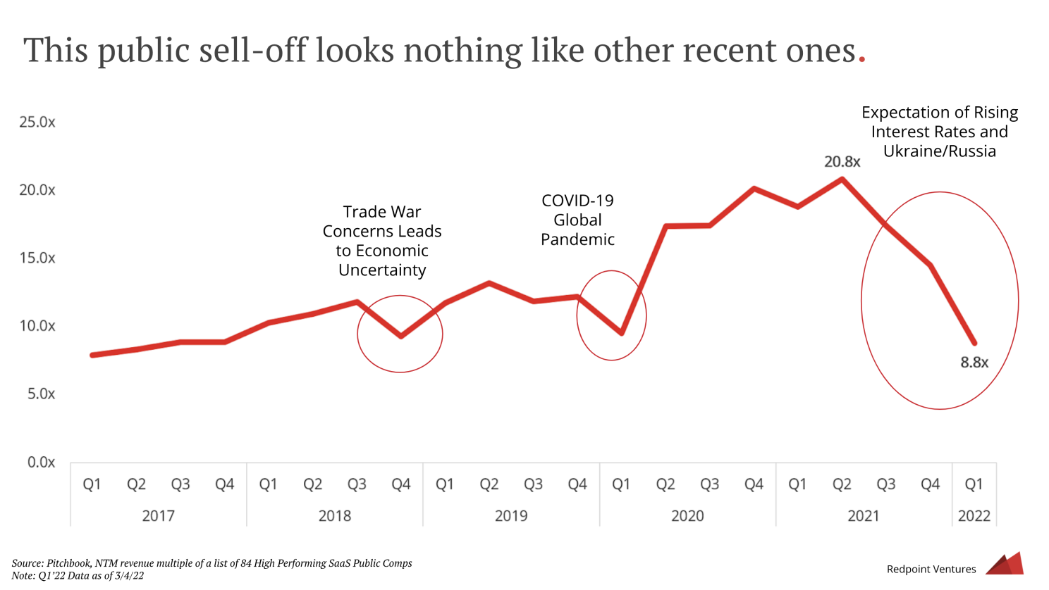
10. SaaS Valuations: Software valuations on the other hand corrected quite a bit (at least compared to recent history -- and of course we do need to assume those "Next Twelve Months’ revenue forecasts" are correct...)
Source: RedPoint Ventures via @SnippetFinance
Thanks for reading! Any feedback, questions and views are welcome in the comment section below.
Never miss an update
Enjoy this wire? Hit the 'like' button to let us know. Stay up to date with my content by hitting the 'follow' button below and you'll be notified every time I post a wire.
Not already a Livewire member? Sign up today to get free access to investment ideas and strategies from Australia’s leading investors.
4 topics

