Weekly S&P500 ChartStorm - 31 October 2021
The Weekly S&P500 ChartStorm is a selection of 10 charts that I hand pick from around the web and post on Twitter. The purpose of this blog post is to add some extra color and commentary around the charts.
The charts focus on the S&P500 (US equities); and the various forces and factors that influence the outlook - with the aim of bringing insight and perspective.
Hope you enjoy!
1. Happy New Month!
The S&P 500 notched up a very respectable 6.9% for the month of October. The chart below shows the monthly progression - n.b. click here for the log chart version (for the log chart enjoyers). Pretty much the reverse of September as seasonality and sentiment shifted.
Source: @topdowncharts
2. Asset class returns in October
Among the assets I keep track of (these are the ones I run Capital Market Assumptions for), the S&P500 was a close second from the top in October. Overall it was a very risk-on month: equities and commodities did well, and just about all flavors of fixed income took a step back as government bond yields surged globally. EM local currency bonds took a double whammy from rising yields and softer EMFX.
Source: Monthly Asset Class Returns update
3. November is here
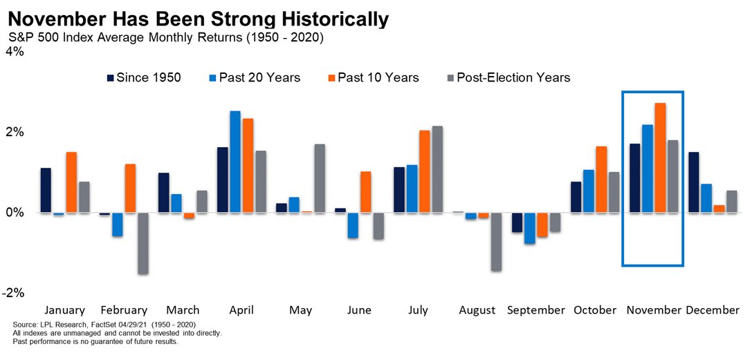
Regular readers will note that seasonality has been a running topic lately (especially given that it helped flag the September stumble and subsequent rebound). Since we’re just about into November, I thought this chart would be worth highlighting - it shows that historically November has been one of the best months of the year. But then again, one could ask the question: how many of those Novembers featured the Fed announcing taper?! (n.b. the FOMC meets this coming week!).
Source: @RyanDetrick
4. Seasonal Fund Flows
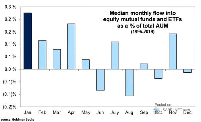
A logical flow-on, as you might expect: November has historically been one of the strongest months in terms of inflows into equity funds.
Source: @ISABELNET_SA
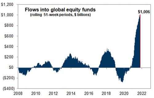
5. Sensational fund flows
From seasonal fund flows to sensational fund flows - again, I guess another question worth asking is how many of those Novembers from the chart above featured THIS:
Source: @MichaelGoodwell
6. Institutional Investor Confidence
This next one shows a measure of investor confidence based on actual data from the massive State Street global custodian business. Key point is that institutional investors seem to be getting more confident: perhaps in part due to declining covid cases, or simply just better price performance - possibly an element of bullish capitulation.
Source: @topdowncharts
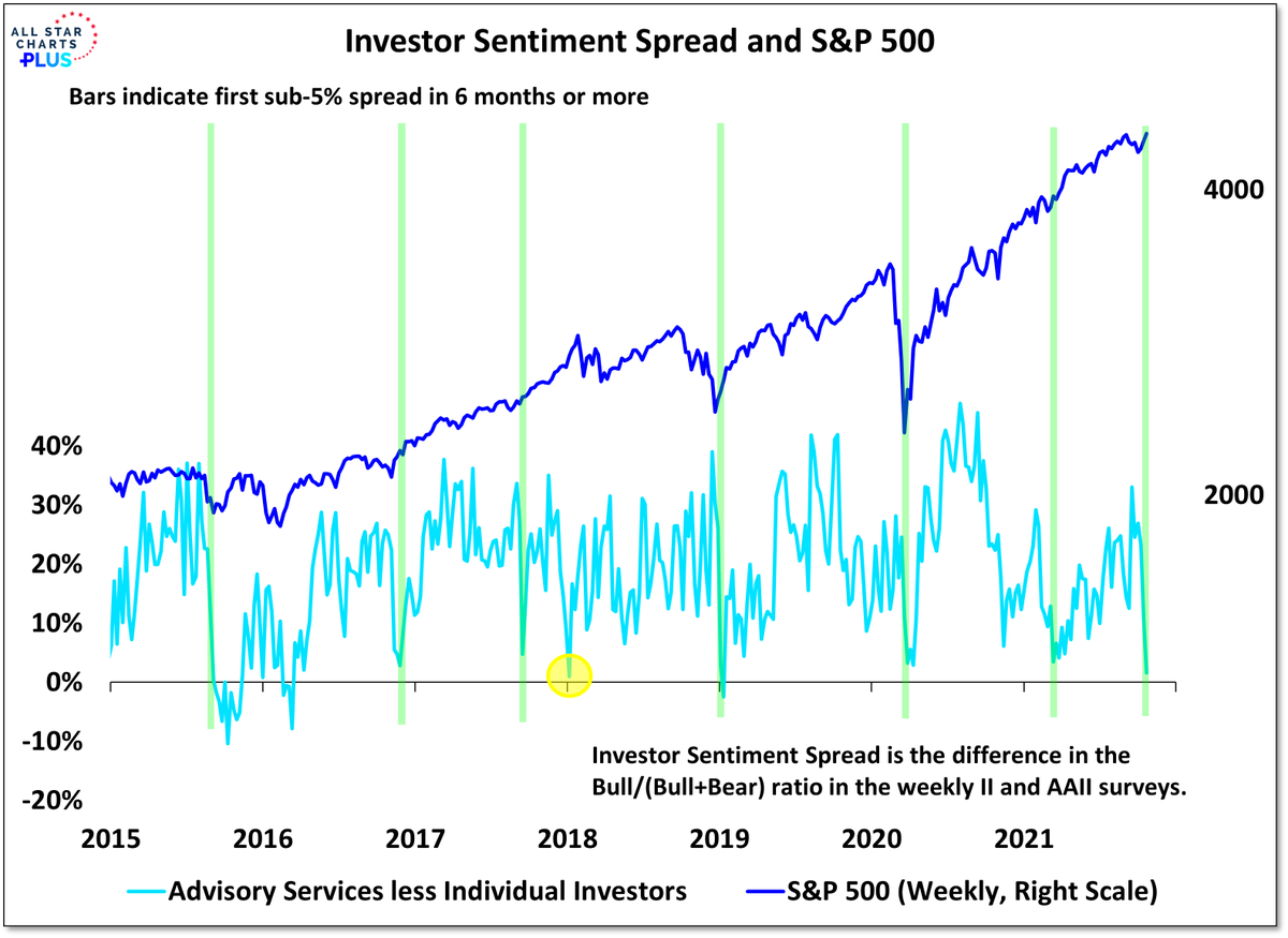
7. Investor sentiment disagreement levels
This one requires a bit of explanation - what it basically shows is the level of disagreement between two separate investor sentiment surveys… the signal seems to be that the less disagreement (i.e. the lower the spread between the surveys), the more bullish the tactical outlook is for equities. So a fairly interesting chart in terms of the signal, and a novel approach.
Source: @WillieDelwiche
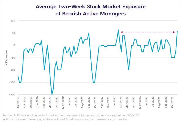
8. Bullish bears
Another survey, the NAAIM - this one shows the stockmarket exposure of the most bearish active managers who responded to the survey. As we can see: even the most bearish are becoming more bullish (well, strictly speaking: less bearish, given their net exposure is still only just above 50%).
Source: @LizYoungStrat
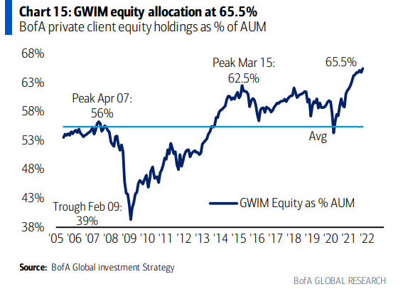
9. Equity allocations (exhibit 1)
A new all-time high for the S&P 500 last week, and a new all-time high for BofA’s private client allocations to equities. Part of this will just be the market drifting allocations higher (i.e. performance driven, rather than active allocation decisions)… but I always point out with this sort of thing that even just standing by and letting the market decide your allocations for you is effectively an active decision (because you could rebalance/reduce exposure in response).
Source: @MikeZaccardi
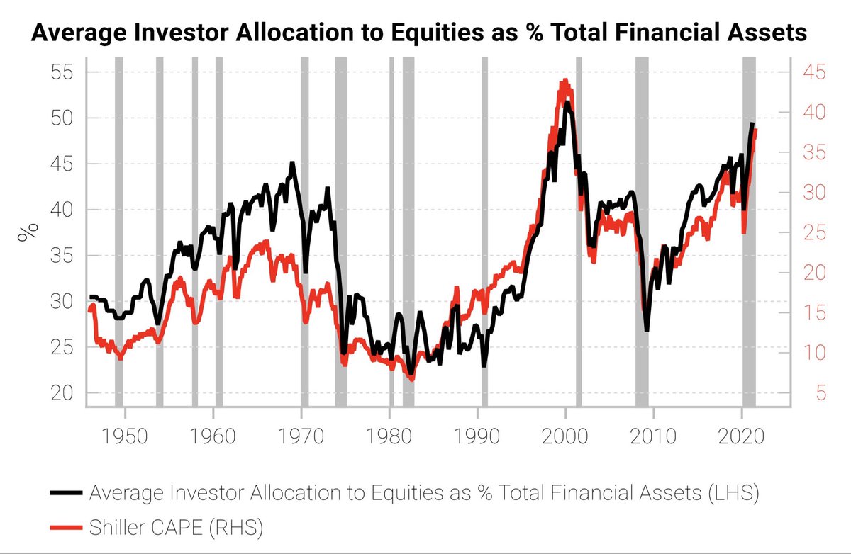
10. Equity Allocations (exhibit 2)
Similar to the previous chart, but a much wider sample-size, this one shows total average US investor allocations to equities (as a proportion of financial assets). Again it is in some sense both a sign of complacency and a sign rising risk appetite (rising (over?)confidence) — all of these sentiments also mirrored in the ever higher valuations signaled by the shiller PE ratio.
Source: @SnippetFinance via @MichaelAArouet
Thanks for reading!
Feedback/questions/views welcome in the comment section below.
Never miss an insight
Enjoy this wire? Hit the ‘like’ button to let us know. Stay up to date with my content by hitting the ‘follow’ button below and you’ll be notified every time I post a wire.
Not already a Livewire member? Sign up today to get free access to investment ideas and strategies from Australia’s leading investors.
4 topics

