Weekly S&P500 ChartStorm - 6 February 2022
The Weekly S&P500 ChartStorm is a selection of 10 charts that I hand-picked from around the web and post on Twitter. The purpose of this blog post is to add some extra colour and commentary around the charts.
The charts focus on the S&P500 (US equities) and the various forces and factors that influence the outlook - with the aim of bringing insight and perspective.
Hope you enjoy!
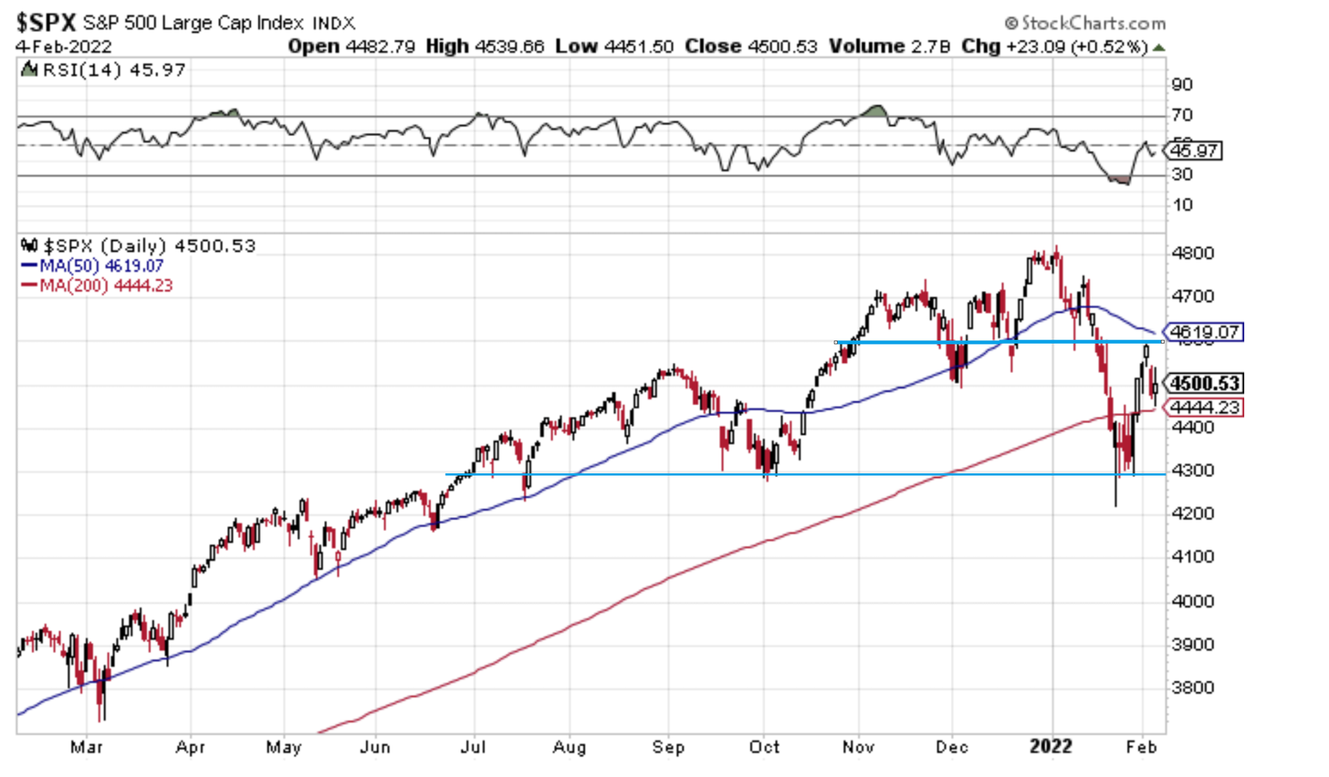
1. S&P500 Sandwich: The market is currently sandwiched between support and resistance — AND the 50dma vs 200dma. It’s all a bit of push and pull, tug of war between bulls and bears playing out in the markets right now.
Source: @Callum_Thomas
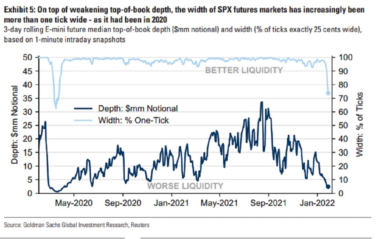
2. Lacking liquidity: This chart puts on display a few key features of the current market environment — e.g. indecision, uncertainty, lower participation, and therefore: higher price gyrations.
Source: @averygrrl
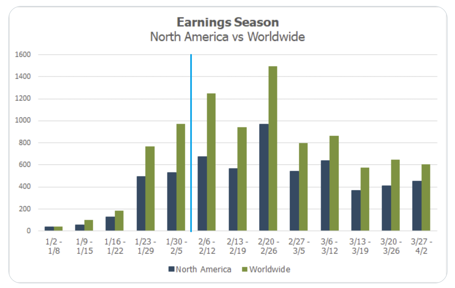
3. Earnings Season Calendar: Looks like we’ve got more Earnings Season fun and games ahead the next few weeks both in the US and abroad...
Source: @MikeZaccardi
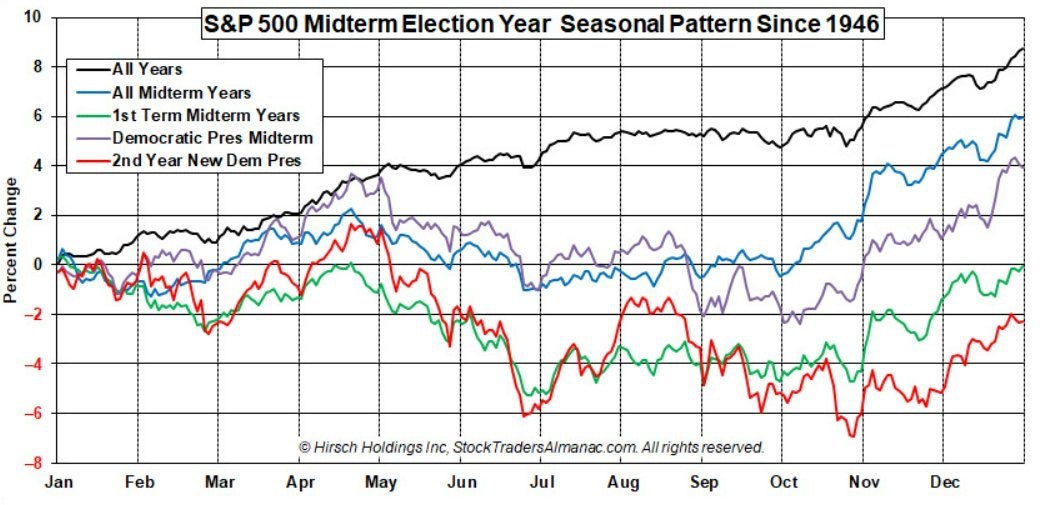
4. Election Cycle Seasonality: Pay attention to the red and green lines…
Source: @AlmanacTrader
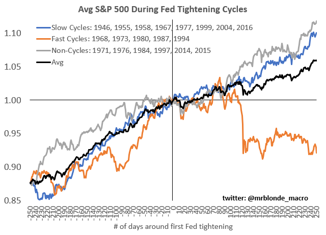
5. Fed Hiking Cycles and the Stockmarket: Speed matters!
This cycle is likely to be fast as the Fed is behind the curve, and easing was in response to a shock vs garden variety recession. Either way, pay close attention to the Fed because “don’t fight the Fed“ takes on a different meaning on the way out…
Source: @MrBlonde_macro
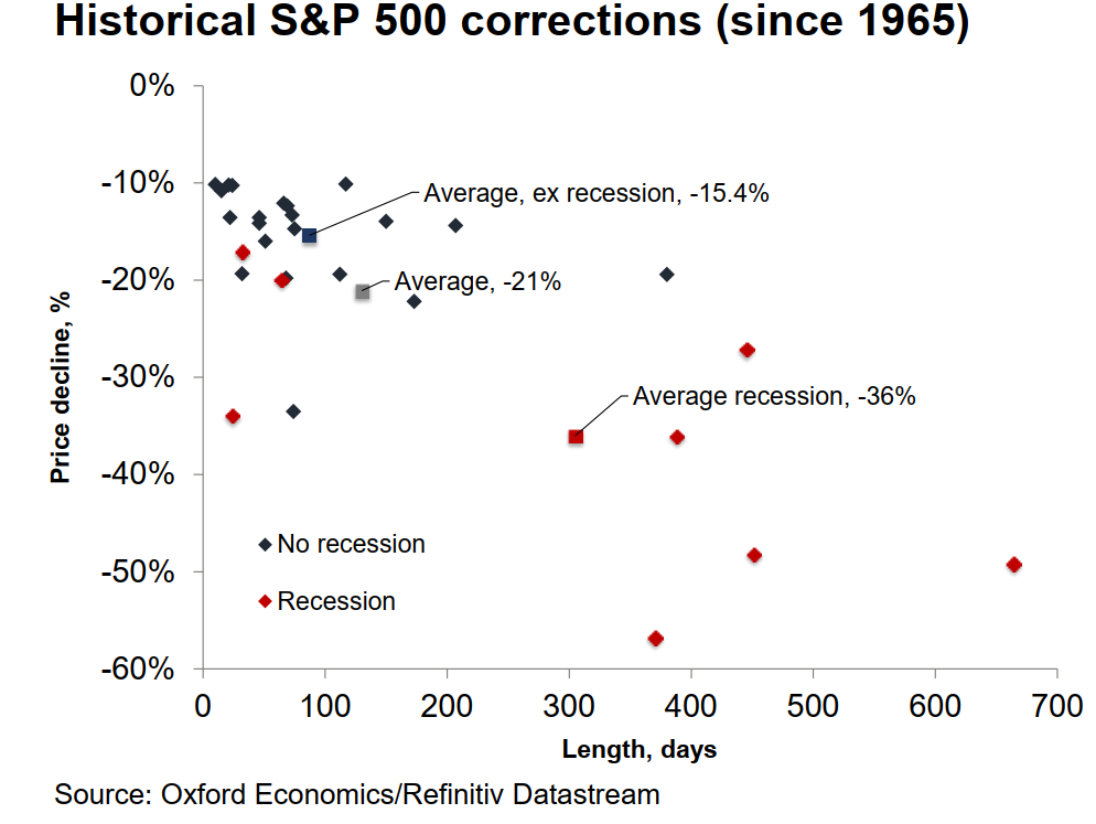
6. Correction Map: "The average S&P 500 pullback during non-recessionary periods is -15.4% and -36% during recessions."
The current S&P500 correction was about -12% from high-to-low, which is about in line with average ex-recession...
Source: @HumbleStudent
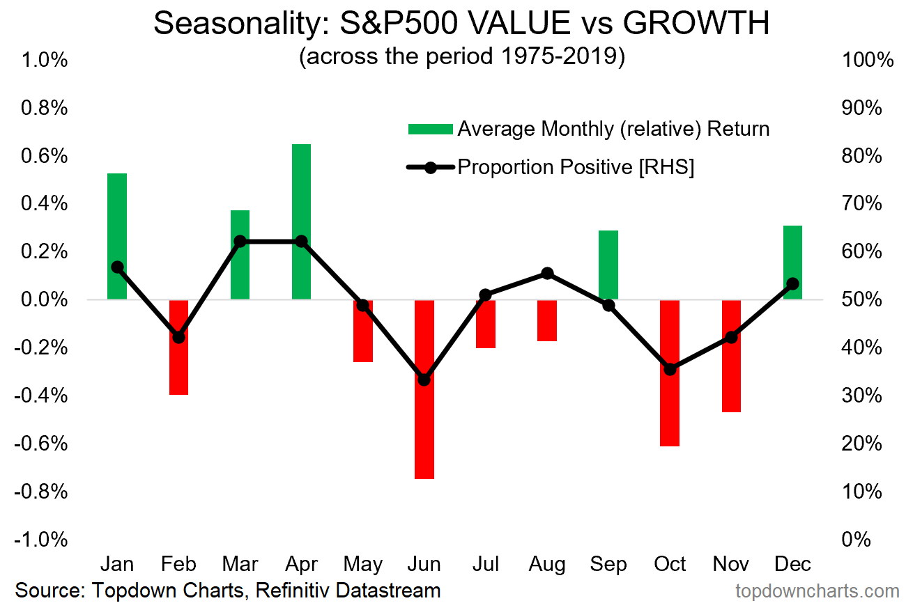
7. Seasonality of Value Vs Growth: Value vs growth relative performance line was up 7% in Jan — which is actually well in fitting with its typical tendency to outperform in January. The seasonal map below says Feb is typically a wash… but Mar/Apr tend to be very strong months historically for value vs growth relative performance.
More rotation to come?
Source: @topdowncharts
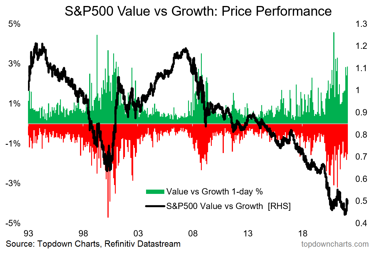
8. Volatility Rising — Value vs Growth Edition: This chart reminds me of an earthquake seismometer... also reminds me of the dot-com turning point!
Source: @topdowncharts
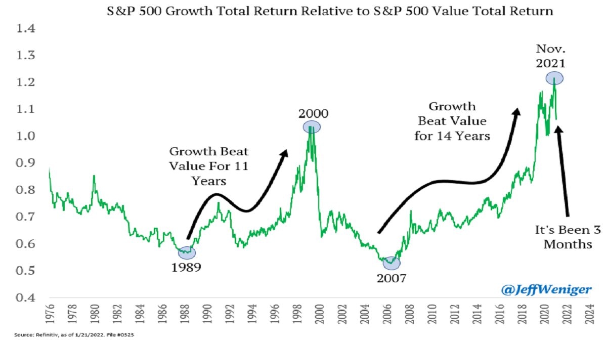
9. Stockmarket Regimes: Growth vs Value…
1989 - 2000: Growth Stocks
2000 - 2007: Value Stocks
2007 - Nov. 2021: Growth Stocks
2022 - ???
Source: @JeffWeniger
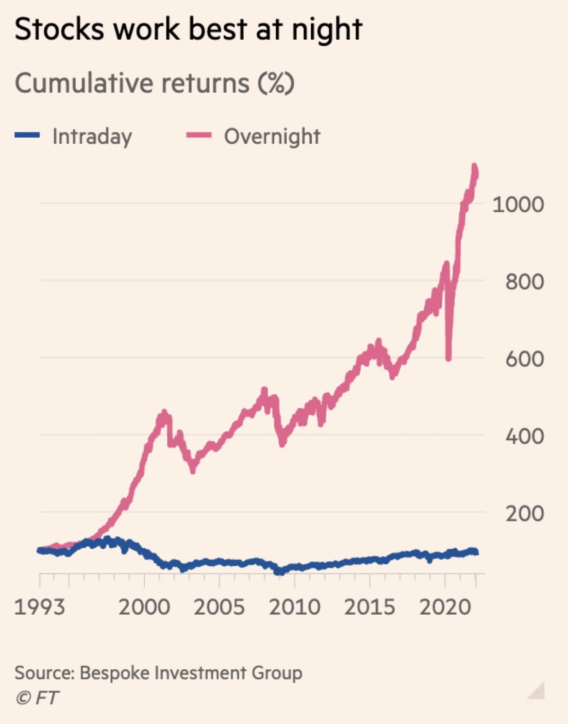
10. Stockmarket Stats: Bulls come out to play at night.
Source: @RobinWigg via @DuncanLamont2
Thanks for reading!
Feedback/questions/views welcome in the comment section below.
5 topics

