Weekly S&P500 ChartStorm - 7 November 2021
The Weekly S&P500 ChartStorm is a selection of 10 charts that I hand pick from around the web and post on Twitter. The purpose of this blog post is to add some extra color and commentary around the charts.
The charts focus on the S&P500 (US equities); and the various forces and factors that influence the outlook - with the aim of bringing insight and perspective.
Hope you enjoy!
1. S&P500 Seasonality (Again!): It’s everyone’s favorite chart again. I noted on Twitter that there is still some seasonal updrafts headed into year-end, but I also pointed out how the rally has already been fairly significant. Perhaps even a little overcooked against the typical seasonal trend.
Source: @Callum_Thomas
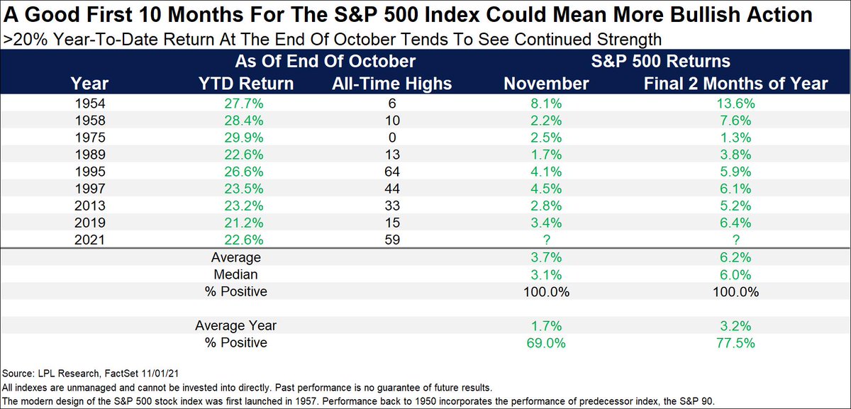
2. Winning Streaks: But before we go getting bearish, it’s worth highlighting these interesting statistics. Whenever the market has been up 20%+ YTD through to October (like e.g. THIS YEAR), it has *always* had an up month in November (albeit with a n=8). Basically I would say it speaks to the momentum in the market, which despite the September stumble seems pretty much alive and well.
Source: @RyanDetrick
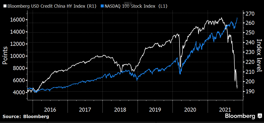
3. China Credit Crunch: I remarked the other day on Twitter that when the Evergrande issues initially came to the attention of global markets that folk were perhaps overreacting --- but now I can't help but wonder if folk are underreacting. Particularly in the face of charts like the one below. I still think that push comes to shove, the PBOC steps in and prevents wider contagion within China (and therefore rest of world). But I am paying closer attention than usual to the macro/property/risk backdrop in China, and there are some clear downdrafts in play at the moment.
Source: @SofiaHCBBG
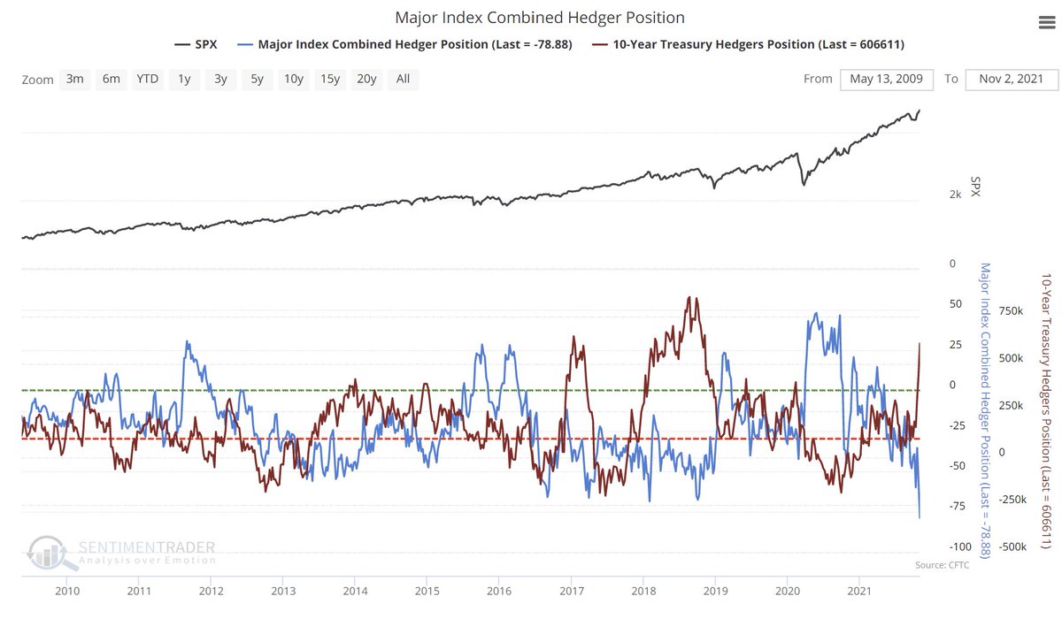
4. Smart Money? So-called smart money hedgers have sharply increased their long positioning in US treasuries (a bet that would pay off if bonds rallied e.g. in response to a growth scare or policy mistake), and short positioning in equities (a position that would pay off if equities fell out of bed). Basically a double-bearish position. Now in fairness this is “hedging“ so it may just be a hedge against a possibility triggered by volatility/momentum-driven market models. But interesting to see such a sharp shift.
Source: @sentimentrader
5. IPO Withdrawals: The number of IPOs pulled during October spiked to the highest level in 2 years. It’s likely just a knee-jerk reaction to the spike in volatility we saw during September, but it is worth keeping an eye on as it’s one of those indicators that does tick up late-cycle, and perhaps more notable this time around given the booming IPO/SPAC activity of the past 2 years.
Source: @topdowncharts
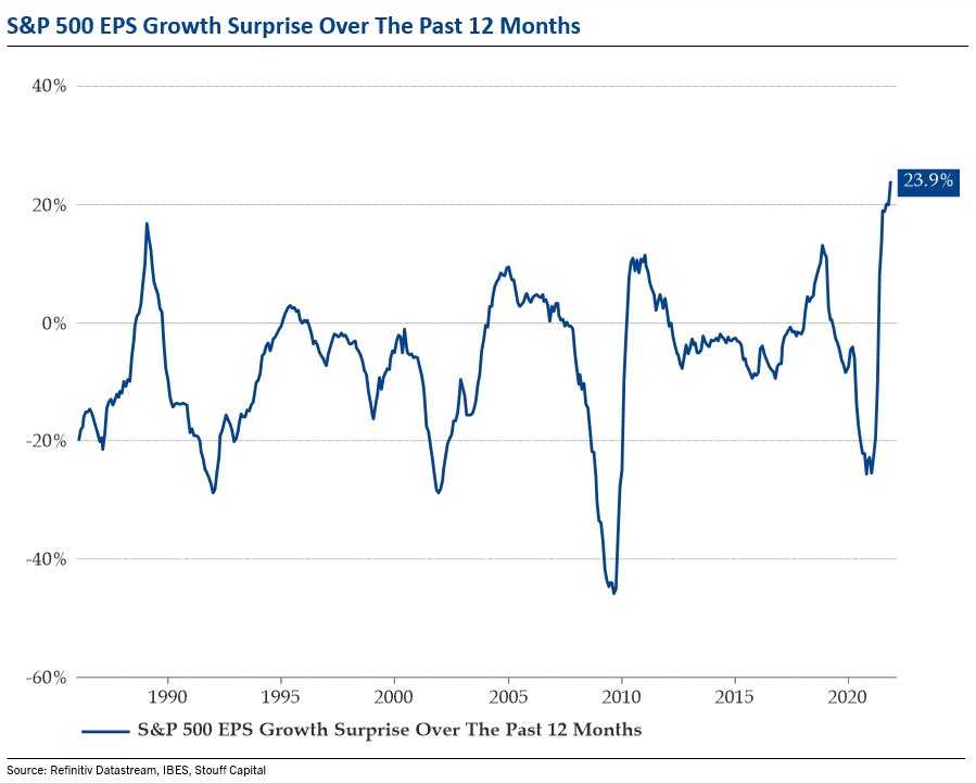
6. Earnings Surprise! Never before have earnings surprised this much to the upside. Albeit, I would note that it does look like a bit of mean-reverting series, so perhaps it’s a situation of “it’s so good that it’s bad“.
Source: @BittelJulien
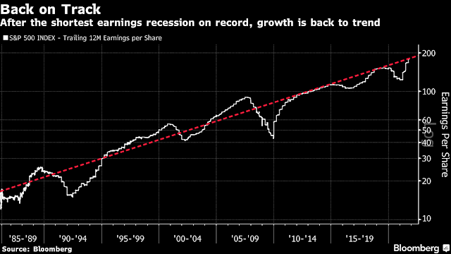
7. S&P 500 Earnings Trend: As an interesting follow-on from the previous chart, earnings are now officially back to trend. That means the "easy" part (i.e. the bounce back) is already baked in -- can earnings now go above and beyond trend?
Source: @HumbleStudent
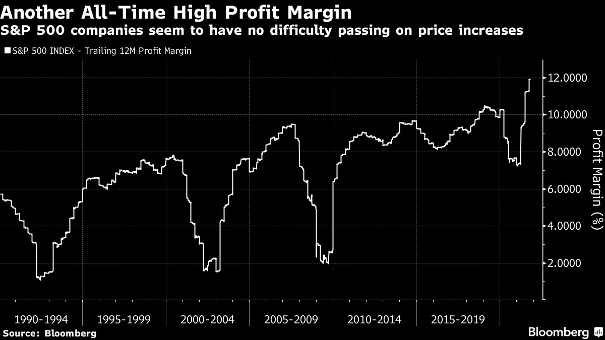
8. Record High Profit Margins: S&P 500 companies laugh in the face of inflation -- they can just pass the costs on.
Source: @MarketPictorial
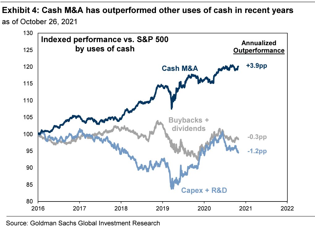
9. Best Use of Cash? …maybe M&A. Companies deploying cash on M&A have significantly outperformed those returning cash to investors or investing in capex/R&D. However, there is likely some compositional survivorshipy kind of effects at play here (e.g. it’s probably tech companies growing by acquisition to scale up and acquire capabilities and talent… meanwhile those heavy into buybacks and capex tend to be older industry e.g. energy and financials). Composition always matters.
Source: @RobinWigg
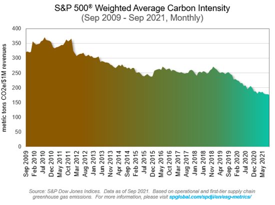
10. Carbon Intensity: On that last note, I also can’t help but wonder if this next one is just another case of composition matters (being a weighted average). For instance, the Oil & Gas sector weighting went from double digits in 2010 to a record low single digits recently. Still a very interesting trend, and something worth keeping tabs on as the world attempts a transition to zero carbon.
Source: @SamRo and @SPDJIndices
Thanks for reading!
Feedback/questions/views welcome in the comment section below.
3 topics

