Weekly S&P500 ChartStorm - 8 May 2022
The Weekly S&P500 ChartStorm is a selection of 10 charts that I handpick from around the web and post on Twitter. The purpose of this post is to add extra colour and commentary around the charts.
The charts focus on the S&P500 (US equities); and the various forces and factors that influence the outlook - with the aim of bringing insight and perspective...
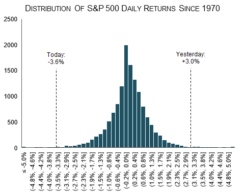
1. Tails of the Fed: On Fed-day, the market put in a relief rally of 3% as it looked like the mythical 75 basis point hike was off the table...
...the next day, however: the market realises zero relief will be provided by the Fed in its tightening cycle until inflation is under control and a "soft landing" acquired, and down it went -3.6%. Two tails of the distribution in one week!
2. Stocks versus rising bond yields: The monetary tides are going out and equities are going to be left high and dry (especially those that traded on priced-for-perfection record-high valuations).
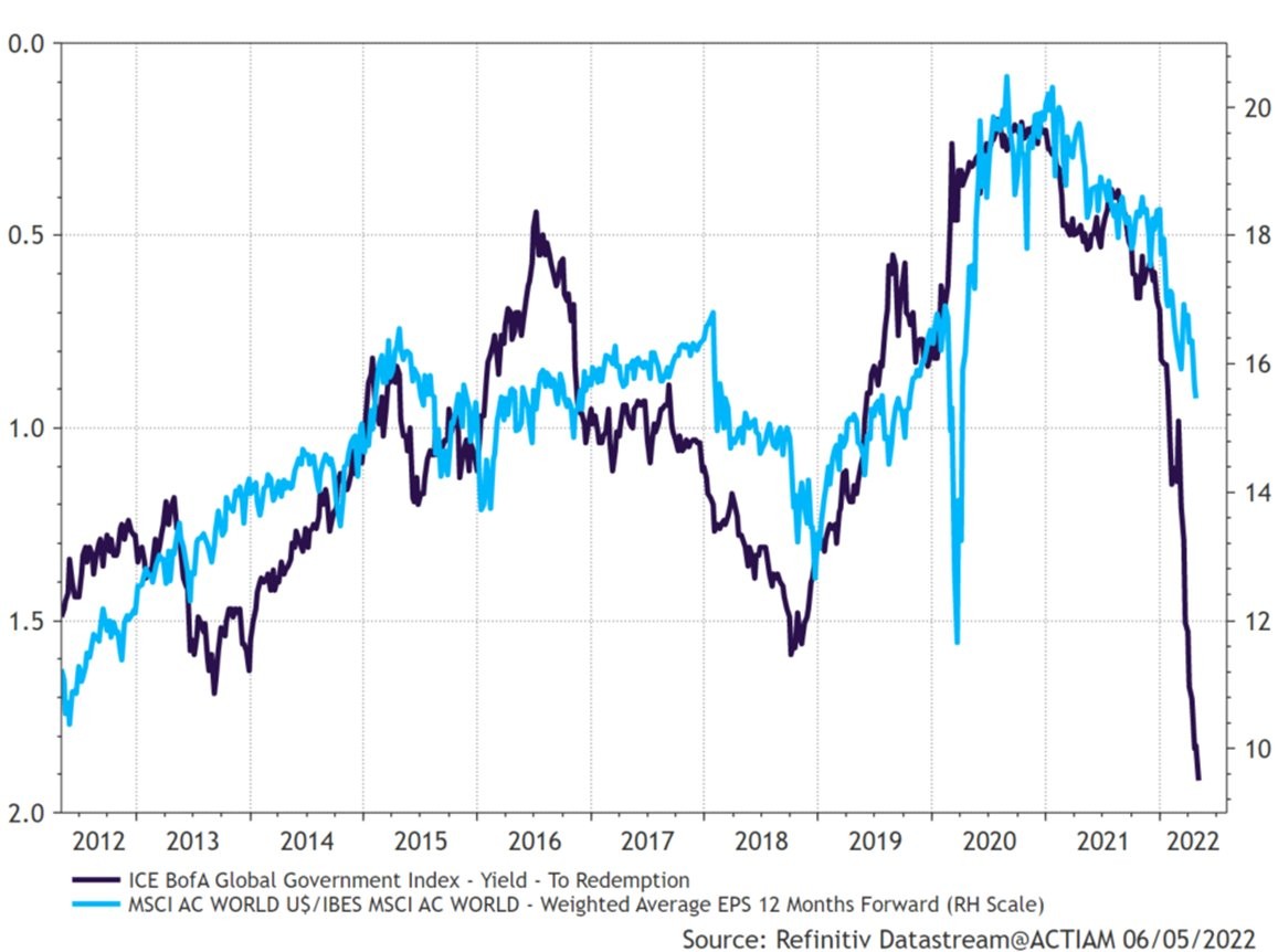
3. Bonds to the slaughter: Bonds are getting murdered.
This is not good for stocks...
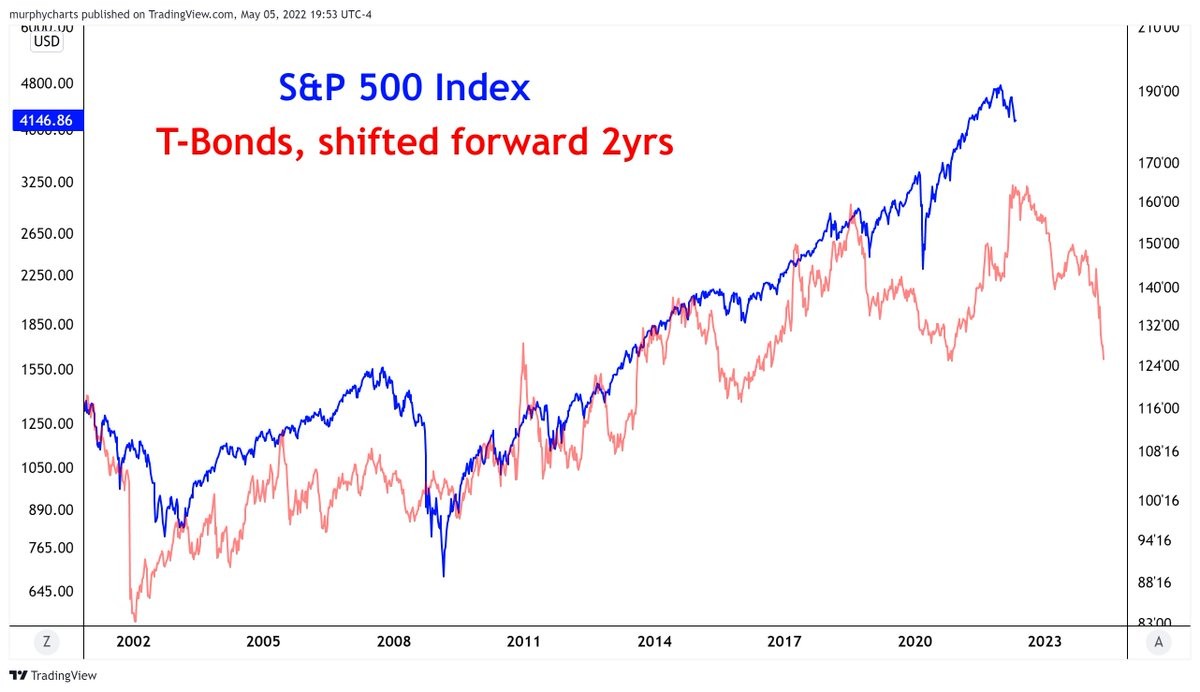
4. Rate hikes: This chart shows the “A/D Line“ for central banks (cumulative sum of the net amount of rate cuts minus rate hikes). Basically, if it is going up then more central banks are cutting rates, and if it is going down then more central banks are hiking rates. As you might expect, the market echoes its movements, and apparently, the market seems to follow with a lag, which makes sense (i.e. in terms of leads/lags of monetary policy transmission).
My take: don't overthink it, you can either swim with the tide or try to swim against it...and right now it is a tsunami of rate hikes.
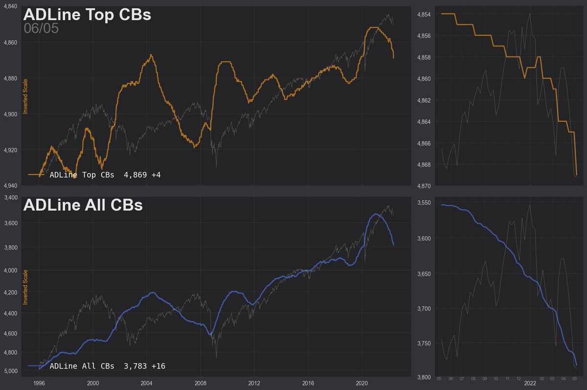
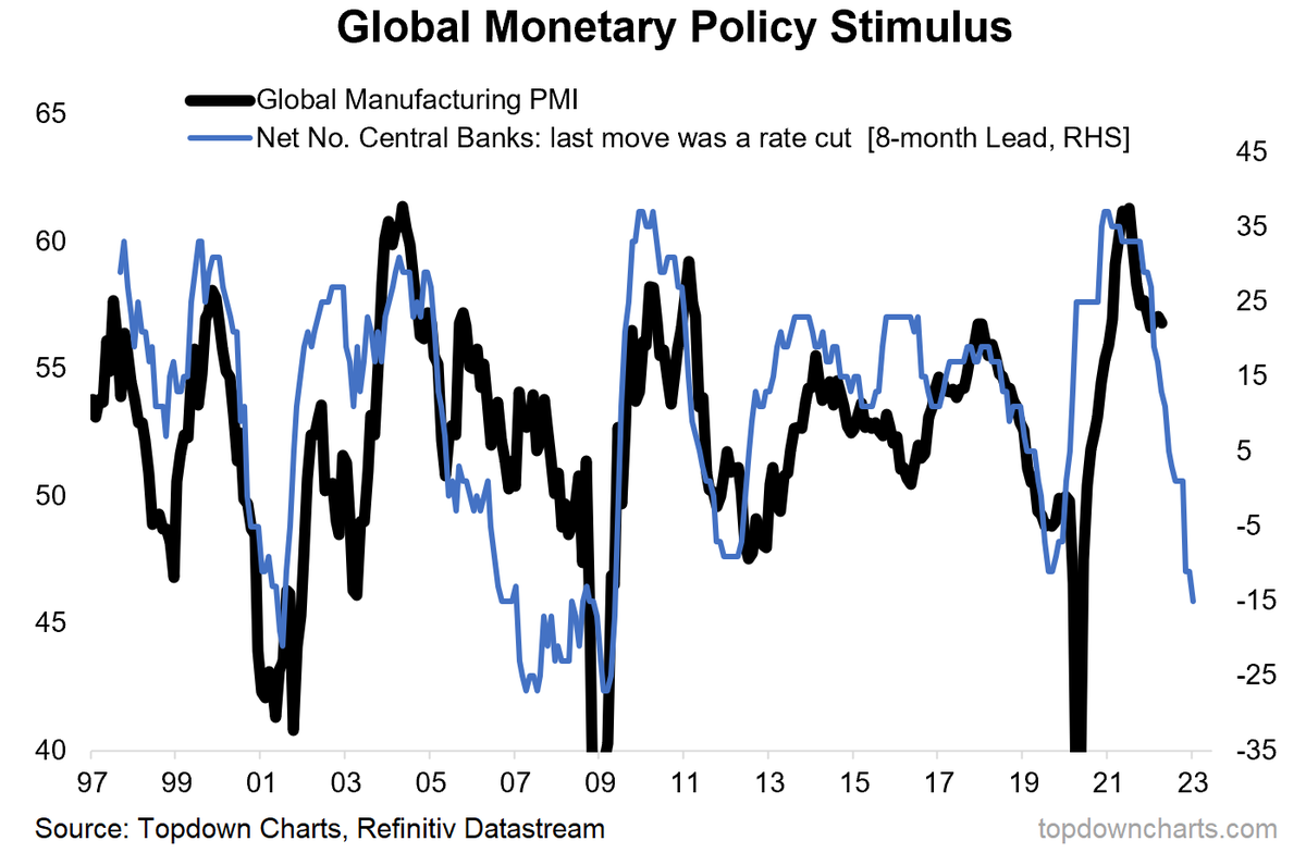
5. Monetary policy tightening: Similar type of indicator: same message, but focused on the underlying economic pulse...
Globally there has been a big pivot to monetary policy tightening by central banks, and this should logically lead to an economic slowdown.
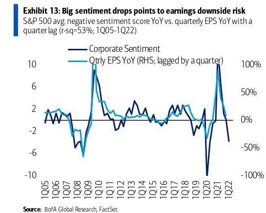
6. Corporate earnings sentiment: It should be no surprise then to see that corporate sentiment has plunged, putting earnings per share at risk.
(Tighter financial conditions hit stocks directly in terms of liquidity, but also indirectly in terms of the economic/earnings pulse.)
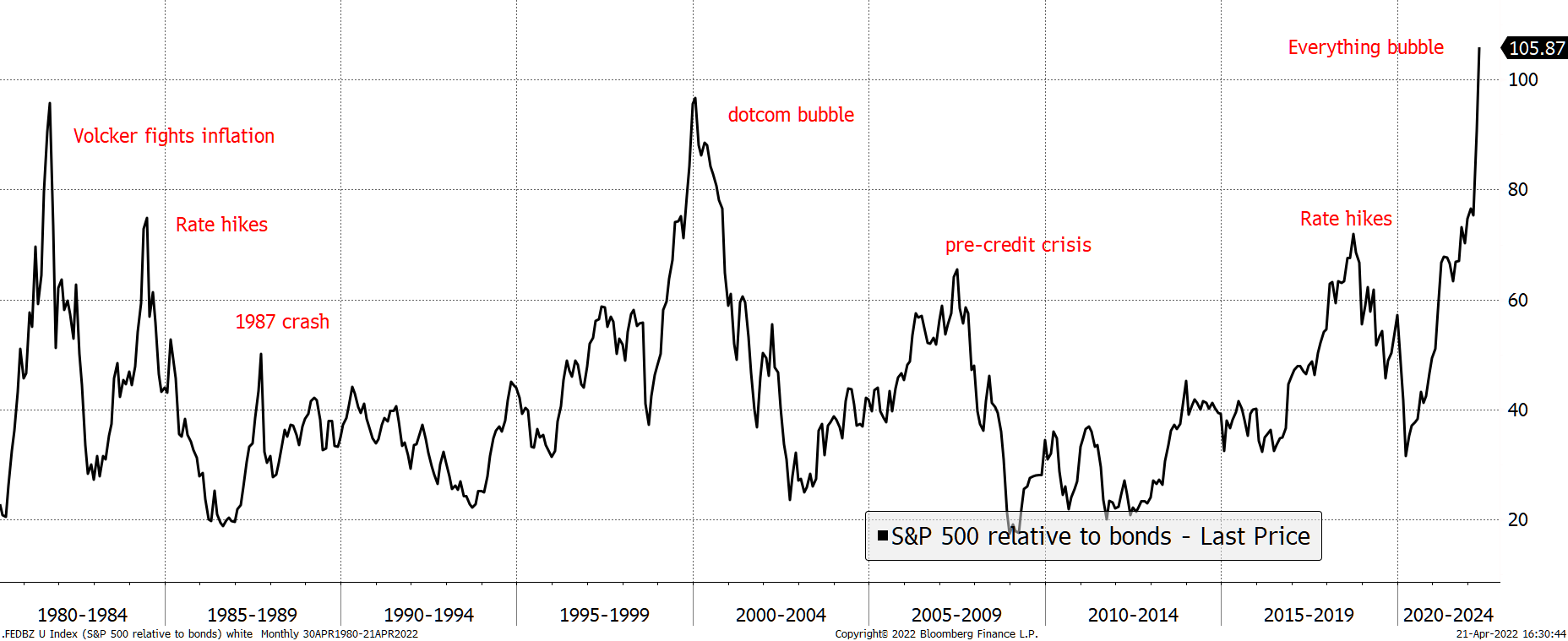
7. Stocks versus bonds: It seems like the S&P500 has melted up versus bonds.
The chart shows the S&P 500 versus the ultra-long bond since 1980: "Not only is the level high, but massively overbought in a relatively short period of time."
8. History lesson — Bear market rallies: A useful piece of reference material in terms of how seducing and stark the bear market rallies can be.
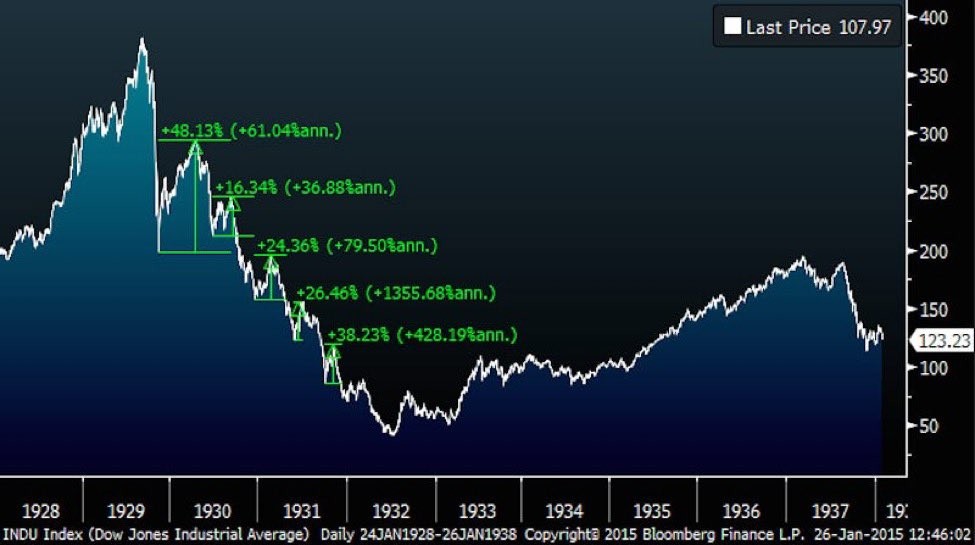
Source: @WifeyAlpha
9. Stockmarket valuations: A smoothed longer-term view of S&P500 valuations
Maybe we ditch that “permanently higher plateau” term and instead go with “Permanently Parabolic?
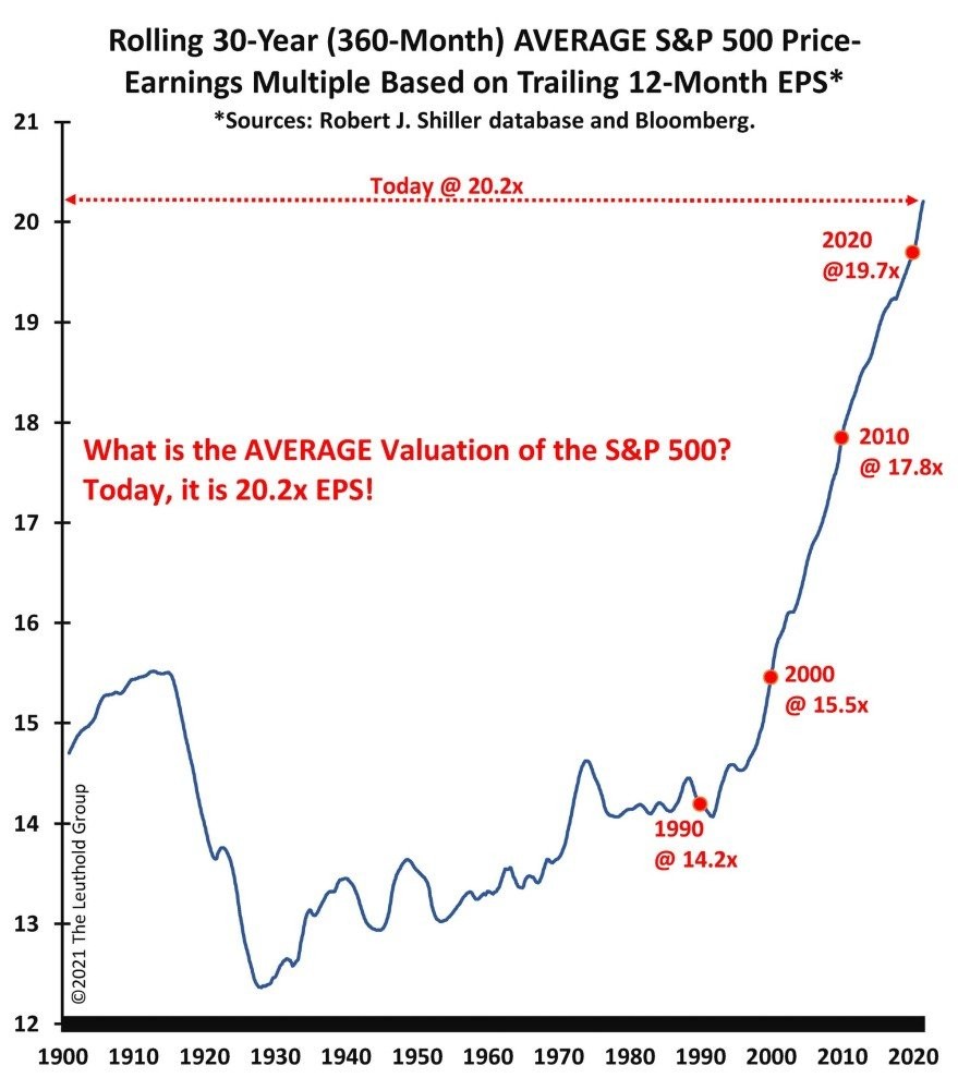
Source: @LeutholdGroup via @StuLoren
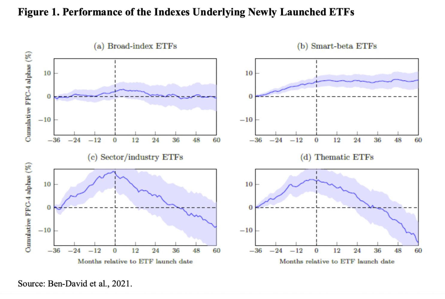
10. ETF strategies performance post-Launch: According to a study, thematic strategies have a habit of underperforming post-ETF launch (might say they are good at picking the top -- easiest time to raise AUM is when a strategy/style/sector is hot)
Thanks for reading!
Callum Thomas
Founder and Head of Research at Topdown Charts
Any feedback, questions and views are welcome in the comment section below.
4 topics

