What's left to keep inflation high?
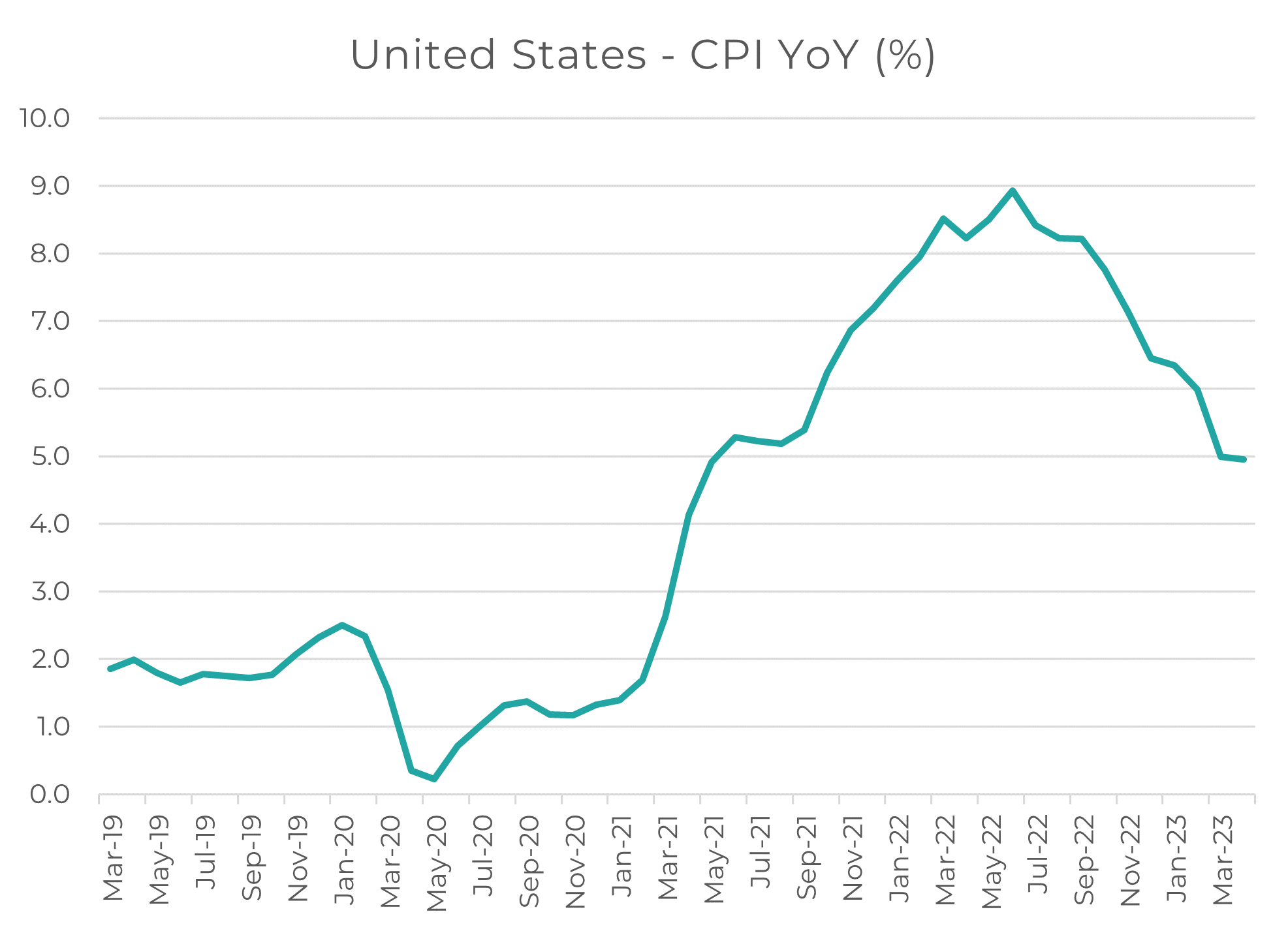
The most recent US inflation numbers beat market expectations, coming in at 4.9% - a meaningful decline from its peak of nearly 9.0% in June 2022, and yet still meaningfully above the 2% target.
With energy prices at pre-Russia/Ukraine levels, and global supply chain pressures meaningfully easing from the COVID lockdowns (see the chart below), what is left to keep inflation higher?
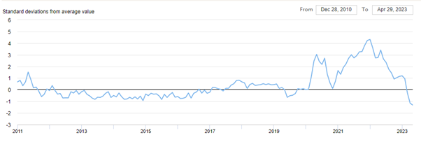
Today, we’ll examine the current drivers of inflation, how the individual components of CPI have changed their contribution recently, and consider some of the dynamics of inflation that play out over the multi-year time horizon.
Domestic Inflation
Aussie CPI printed at 6.3% for March, down from our recent peak of 8.4% but still triple the 2-3% inflation target band set by the RBA.
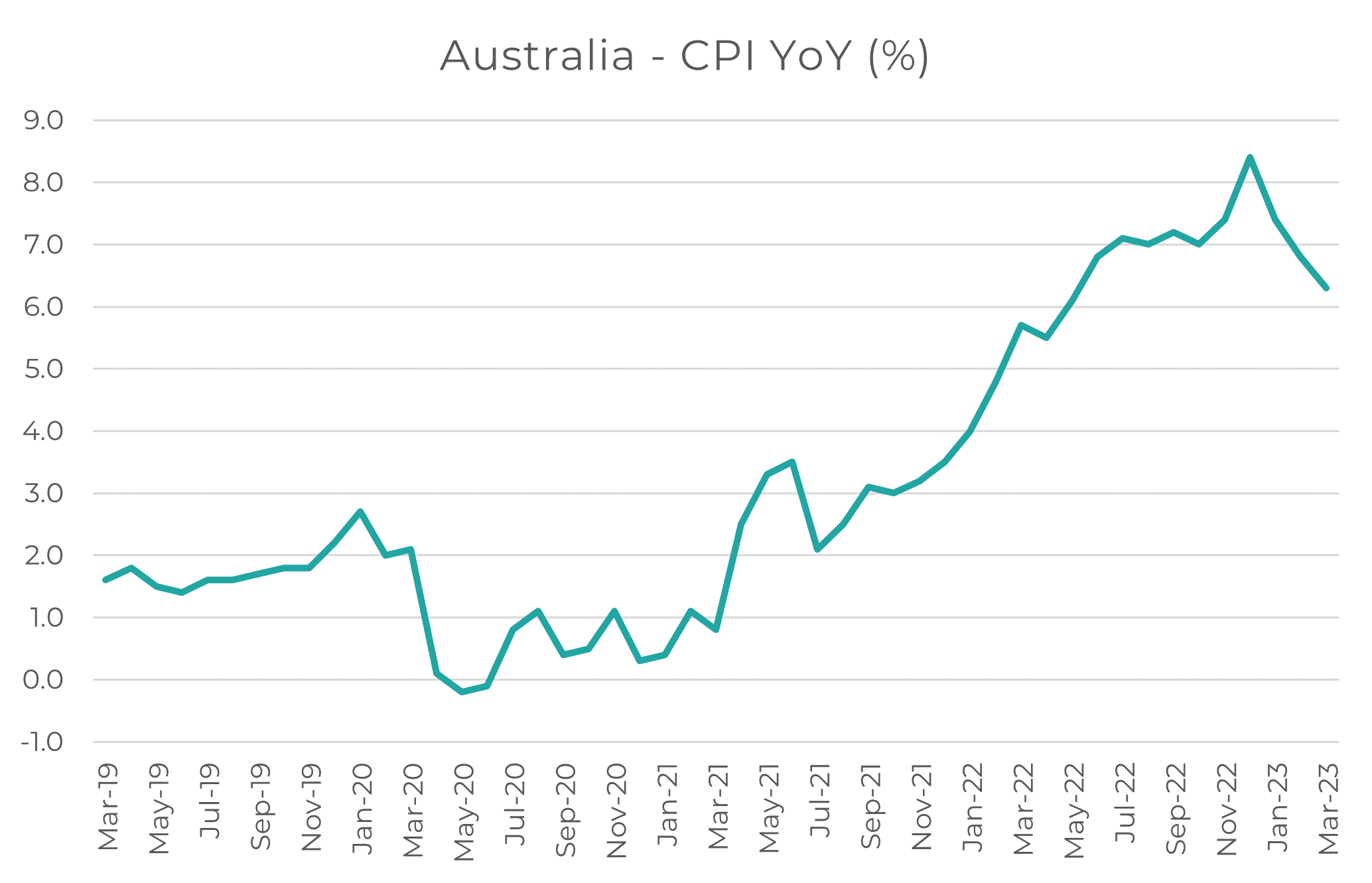
And yet if you look at the headline figures for each of the underlying components, some aspects of inflation look alarmingly high; Housing at 9.5% YoY, Food at 8.1% YoY both stick out as meaningful (and non-negotiable) costs of living.

A better way to visualize the recent contributors to inflation is a graph like below, where we can see the ebb and flow of various components and their total allocation of overall ‘headline’ CPI:
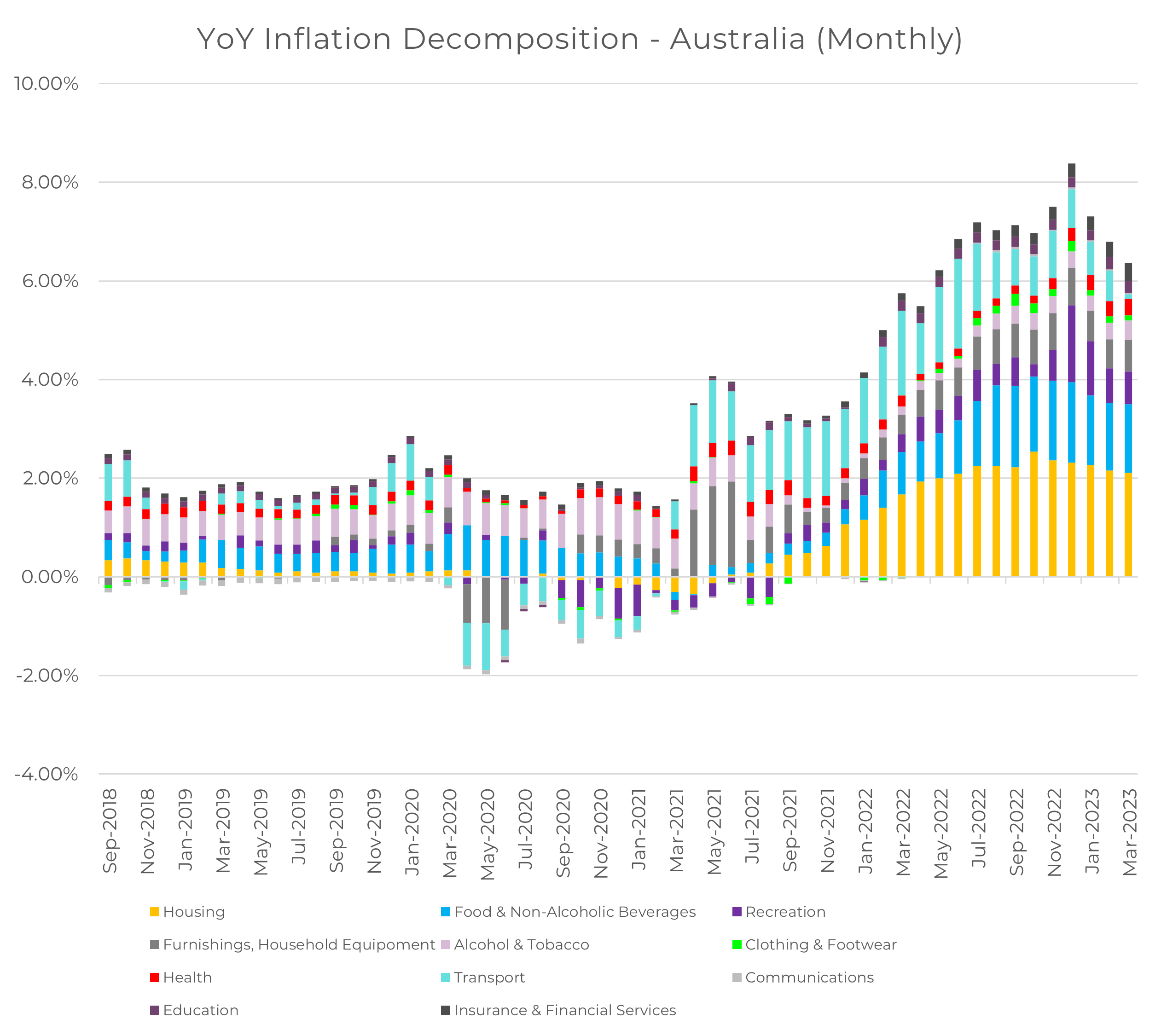
We can clearly see that Housing and Food are still major contributors to the overall inflation print, but we can also see both of them are declining relative to 2022 levels. Naturally, a slowing inflationary impulse from two of the highest-weight components puts downward pressure on future CPI results, not upward.
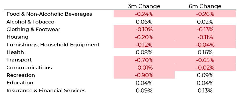
Alcohol, Health, Education and Insurance/Financial Services have shown increasing inflation pressures in the last 3 months – that’s less than 20% of domestic CPI components by weighting.
Certainly, if components such as Housing, Transport and Recreation continue to trend downward at this rate, it’s reasonable that inflation will print below 4-5% within 2024, possibly within this year.
But how do those components behave? Given the relatively short length of time that Australia has published a monthly inflation report, we must now turn to the US to answer that question.
United States Inflation
US CPI printed at 4.9% for March, making significant progress on a peak which was almost 9% this time last year – albeit still well in excess of the Fed’s desired 2% target.
Looking at the chart below, it’s remarkable to see the fluctuations in Transportation (largely correlated with the price of oil), going from deflationary in 2020, to highly inflationary in 2021-2022, and back to deflationary in 2023.
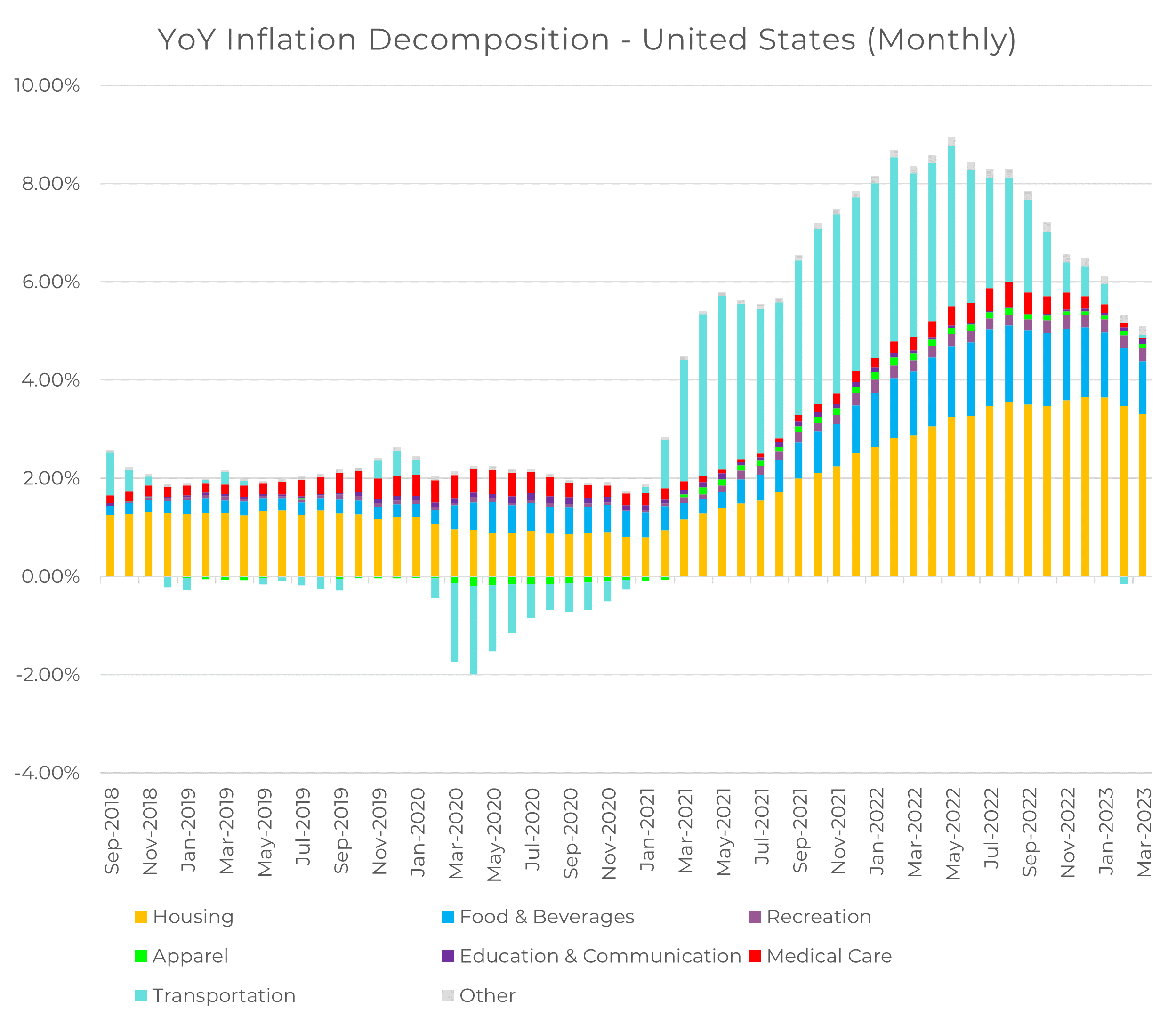
When considering the actual impulse of the different components of US CPI, we see a very similar story to Aussie inflation: Food, Housing, Medical Services and Transportation are all heavily negative. In this case, those components still seeing increasing inflationary pressures represent only ~17% of all of the US CPI.

Given the richer volume of US data, we can look throughout time and consider how different components of inflation behave based on past data (or how future data will behave based on today).
To do this, we’re going to look at the autocorrelation of historical inflation numbers – this is simply the correlation of data throughout time, for instance, how correlated today’s CPI print is to the CPI print from March 2022. The higher that number is, the more influence today’s data will have on the future’s data.
Let’s consider how much each major component of US CPI is correlated to itself, stepping out from 1 month to 24 months in the future – this is how persistent the level of today’s inflation will impact future inflation:
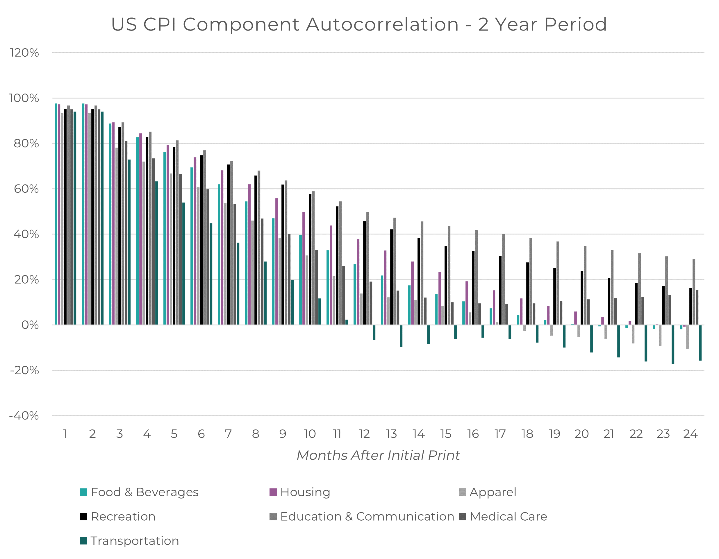
This representation gives a clear visual that certain components are dramatically more persistent long into the future than others – and, in fact, some components are more cyclical in nature, and become negatively correlated in a year.
A heatmap gives a more granular look at this information:
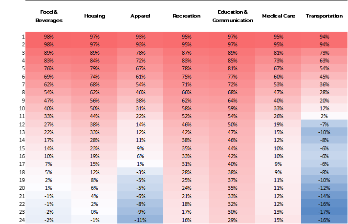
Heavily services-based components, such as Recreation, Education/ Communication and Medical Services are all highly persistent in the future, whilst more goods (or commodities) based components are cyclical over time, such as Apparel or Transportation.
What conclusions can we take away from this?
- “Services inflation is sticky” is not simply a market heuristic: we can see clear evidence here that certain services-driven inflation impulses have strong influences on future inflation up to two years into the future
- Food & Beverages and Housing maintain a relatively strong relationship out to 1 – 1.5 years. Both those components peaked 9 months ago, suggesting their contribution to slowing inflation may not last much longer
- Goods inflation is cyclical, actually turning negative and influencing inflation the other way after 1 – 1.5 years. The peak in inflationary impulse from Transportation was 17 months ago, so based on historical behaviour (and oil at $70/bbl), there is a risk that this could turn inflationary again in the not-so-distant future.
Sticking Around
High inflation is not a market dynamic that we should want to stick around for the long term, but neither is deflation. A stable equilibrium level of price growth is generally the sustainable situation for most developed economies.
The most important thing to keep in mind when considering the next few months of inflation prints is that not all components which are declining at the moment can decline forever – an environment in which food, house prices and fuel are constantly going down in price, is a very poor environment for growth.
But based on historical data, and the dynamics that different components have, there is certainly a risk that certain components switch from decelerating to accelerating, prompting a so-called ‘second wave’ of inflation, as many market analysts have noted.
This is why it is important to not only challenge market heuristics but look deeper into data and ask “why is this holding up?” – understanding the behaviour of the underlying components can help investors better deal with future dynamics or surprises.
4 topics

