Aussie equities: Great for income, only OK for growth.
Who saw the front page of the AFR this weekend? In case you missed it:

For those of us who are Advisers, one of the things I love about the business we’ve all chosen is how full of smart and interesting people it is. That said, it astounds me how many Australian Advisers focus exclusively on Australian stocks when searching for a pure growth option.
To be very clear, almost all portfolios should be fully diversified and they should include stocks and bonds, from multiple geographies, but probably also a variety of private markets ideas, as well as growth and income diversifiers. Even some cash these days.
Now, the basis for the Aussie-equities-for-growth idea is, seemingly, the following chart. But I always ask two things - first, do you know anyone with a 125-year time frame? And second, do you think the next 25 years looks more like the last 25 years of this chart, or the first 100 years of this chart?
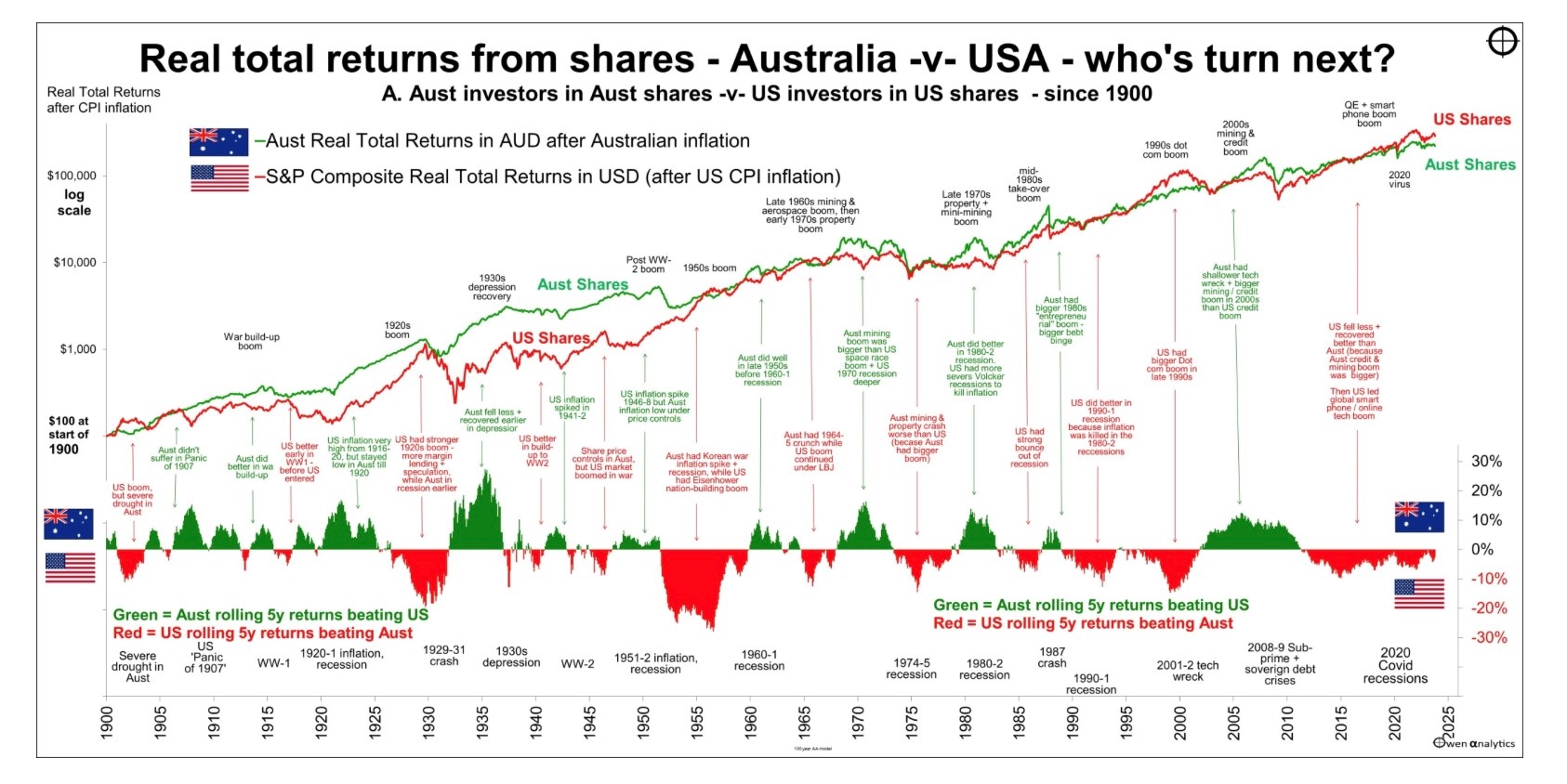
I think the answer to that question is easy.
Note that the chart above does NOT include the Nasdaq 100. If it did, the US shares chart would tower over the Australian shares chart.
The franking credit system makes Australian shares hard to beat for income-only investors. But if you’re a growth investor, or you need at least some growth, and you choose only Australian shares, we need to talk - the risk-adjusted growth return from Australian equities is easily outmatched by other readily available options. This piece here below also includes an earlier piece I wrote on the topic embedded in it:

And then check out this series of graphs:
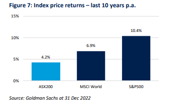
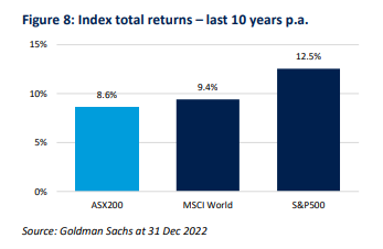
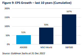
The above charts essentially say that the US share market has performed better than any other readily available share market on the planet because the earnings inside the S&P 500 have far out-stripped the rest of the world. As noted, the Nasdaq 100 is not included here and if it were, the case would be even stronger.
Then check this chart from the Australian Financial Review last year:
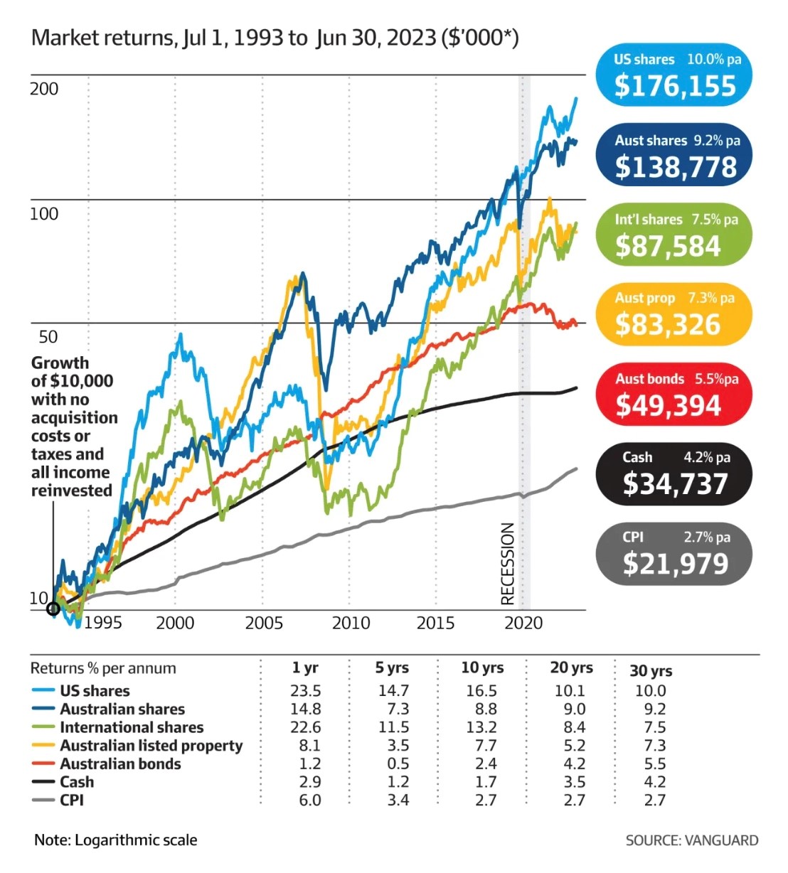
Starting with this past weekend’s AFR front page, all of those charts say the same thing - that US stocks grow more than Australian stocks, whether it be over 10 years through 31 Dec 2022, over 30 years through 30 Jun 2023, or over 30 years through 30 Jun 2024.
Home country bias impacts almost everyone but we can’t afford that as Australian investors.
All portfolios are different and in almost all cases, portfolios should be fully diversified. But when simply making choices between income and growth within your equity allocation, too many Australians have heard or have been advised that they need not look beyond Australian shares. That is poor advice, and it has cost investors a lot of money over the last 30 years.
Australian shares are fantastic for income and are likely the best option for Australian resident taxpayers. But if you want or need growth out of the equity allocation within your portfolio, it is almost certain that your best option is to buy into US equity markets. Past performance is no guarantee of future results, we all know that, but it's hard to argue with all of these charts, isn't it?
Good luck out there.
5 topics

