Chinese home prices, US inflation, and corruption perceptions
.png)
This week’s charts begin with a deep dive into Chinese real estate, showing the cities that have experienced the steepest home-price declines while presenting evidence that the situation is stabilising. Turning to US inflation, we break down sectors by standard deviation, showing a broad disinflationary trend with a few outliers – and then conduct a scenario analysis for 2024, showing how month-on-month CPI trajectory will affect the annualized inflation print. For the European Union, we chart perceptions of corruption; some nations appear to be cleaner since 2011, but the opposite is the case for others. And in emerging markets, we chart the potential return to normal for Indian rainfall and the history of Brazilian currency volatility through the two eras of President Lula. Finally, we visualise the US mega-caps, led by Big Tech, that have returned to an all-time market value high.
Chinese real estate, city by city
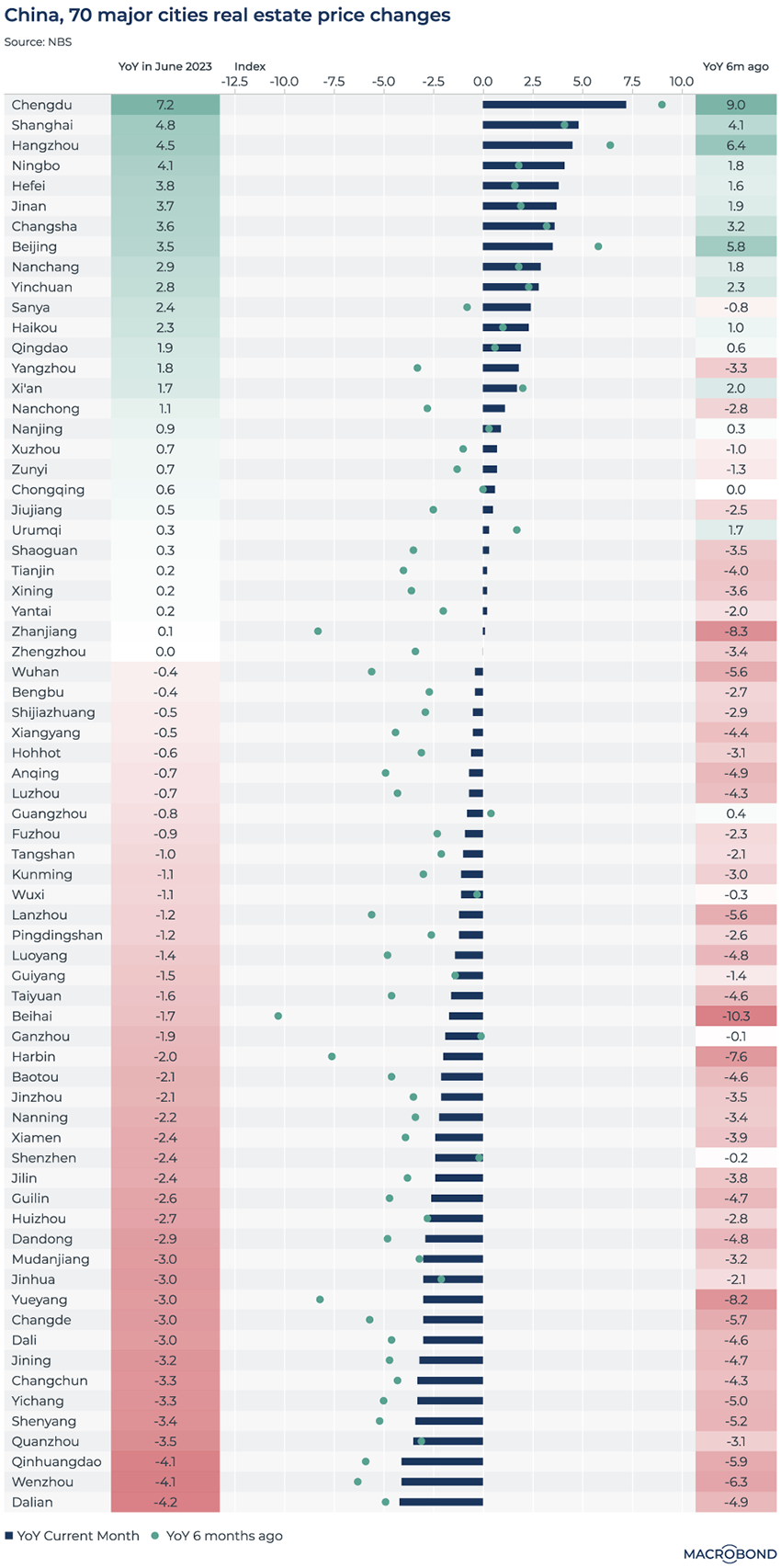
As global real estate comes under pressure from higher interest rates, this dashboard examines residential real estate prices in China’s 70 biggest cities.
This breadth is important given that declines have largely been seen in second-tier markets. By contrast, Beijing, Shanghai and Chengdu, for example, are in much better shape.
The first and last columns track the year-on-year percentage change reported for June (which drives the top-to-bottom ranking) and six months earlier, respectively.
The middle graph aims to visualise how trends have evolved since mid-2022 – and how the distress appears to be stabilising. The blue bars show the latest year-on-year price change; the green dots represent that figure’s value six months earlier, which was worse (i.e. further to the left) for most cities.
A cooling US inflation heatmap by sector
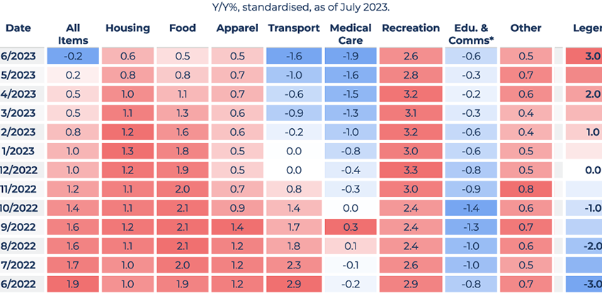
This heat map examines the cooling trend in US inflation from a new angle. It breaks down different sectors using the statistical deviation (or Z-score) from the normal rate of change.
As the “legend” column indicates, bright blue indicates year-on-year growth in CPI that is far below the norm. Bright red indicates inflation in that sector was running much hotter than usual.
As the “all Items” overall reading for June shows, headline CPI is finally cooling down – driven by the transport, medical care and education sectors. Inflation is still running hotter than the historic norm for food, housing – and especially recreation, where price growth is 2.6 standard deviations above the average.
Revisiting US inflation scenarios for 2024
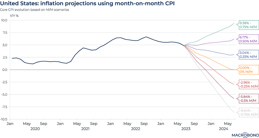
Despite positive signals of disinflation, this visualisation (which revisits an analysis we published almost a year ago) shows just how much of a journey it would take for inflation to flatline completely.
These scenarios chart the potential evolution of year-on-year inflation figures, assuming different month-on-month trends.
A “Goldilocks” soft-landing scenario for Chairman Powell might be the blue line, or something just below it. CPI growth of 0.25 percent month-on-month for the next 12 months would result in the year-on-year inflation print receding to about 2.6 percent, approaching the Fed’s long-term target.
The scenarios represented by the yellow line, and the lines below it, indicate a situation where Powell might have hit the monetary brakes too hard.
On the other hand, if month-on-month CPI stays at 0.5 percent or higher, the year-on-year figure will be even higher than it is today.
Anti-corruption peaks and valleys in the EU
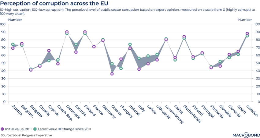
This visualisation uses an index of perceived public-sector corruption compiled by the Social Progress Imperative, a US non-profit organisation, to measure European Union countries.
A higher score indicates that a country is perceived as more “clean.” Predictably, the Nordic nations of Denmark, Finland and Sweden score the best, with little difference from a decade earlier.
What’s interesting is how trends have changed in many other nations since 2011. Italy, Greece and the Baltic states appear to have made notable progress in cleaning up corruption.
Scores for Hungary and Cyprus, meanwhile, are deteriorating.
(Macrobond users can toggle between this visualisation and an alternative “candlestick” chart.)
Brazilian currency volatility, from Lula to Bolsonaro and back
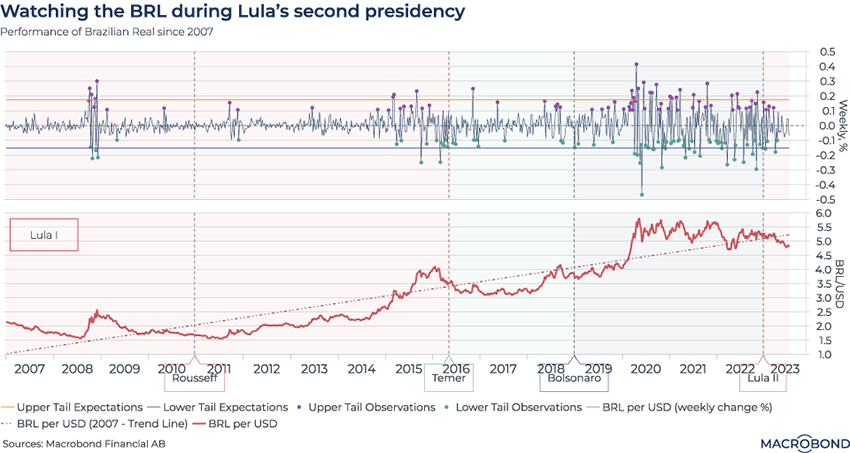
This double-paned visualisation explores volatility and the exchange rate for Brazil’s currency under different presidential regimes.
The top pane tracks weekly percentage change in the real’s exchange rate against the dollar. A notable spike is seen around the global financial crisis of 2008, as one might expect. However, the sustained BRL-USD volatility since the outbreak of the pandemic is remarkable.
The second pane tracks the exchange rate against the dollar. Over a 15-year period, the broad story is depreciation – but higher prices for Brazil’s commodity exports coincide with a stronger real, as we saw during much of President Lula’s first stint in office.
Post-2020, as the world learned to cope with coronavirus, President Bolsonaro’s Brazil was a global monetary policy outlier, as we wrote last year – hiking rates earlier and harder than most, making the real one of the few currencies to appreciate against King Dollar.
Notably, volatility has been receding since Lula returned to office this year.
Rainfall relief in southern India
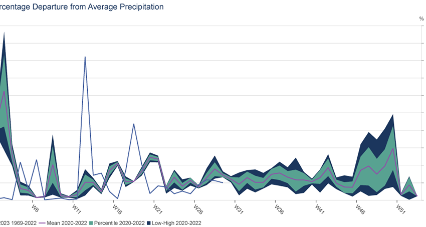
As we have previously written, El Niño is back. This phenomenon can result in droughts for some Asia-Pacific nations and heavy rain in others. (In May, we wrote about how Thailand’s rice crop was threatened.)
This chart tracks South India, which experiences a monsoon period from June to September every year. The nation’s meteorological department recently confirmed that South India had its hottest, driest June in more than a century.
This chart’s Y axis tracks the positive and negative percentage rainfall difference from the historic average over the calendar year. It tracks both 2023 and the highs and lows from 2020-22. The line for 2023 indeed shows the lower-than-average rainfall in June, while also showing a return to the historic average so far in July.
This visualisation also shows the power of Macrobond’s granular, regional data. Users can access even more local micro-geographies if needed.
US mega-stocks defy gravity
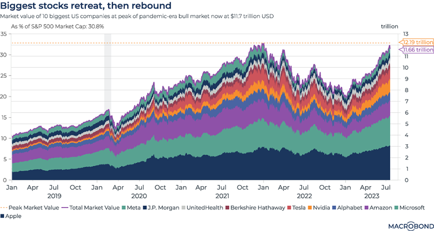
In May, we studied how the largest companies in the US – especially Big Tech – were almost solely responsible for gains by the S&P 500.
This visualisation tracks 3 ½ years of performance by the 10 biggest US stocks by market capitalisation: Meta, JPMorgan, UnitedHealth, Berkshire Hathaway, Tesla, Nvidia, Alphabet, Amazon, Microsoft and Apple.
After swooning through 2022, their combined market cap is almost back at its all-time high. The outperformance by Meta, Microsoft and Apple since January is particularly notable.
Some might say the present period has parallels with the early 1970s “Nifty Fifty” bull market. These were viewed as can’t-miss, buy-and-hold, blue-chip equities, and investors piled into them even after valuations became stretched. (They subsequently underperformed.)
4 topics
.png)
Macrobond delivers the world’s most extensive macroeconomic & financial data alongside the tools and technologies to quickly analyse, visualise and share insights – from a single integrated platform. Our application is a single source of truth for...
Expertise
.png)
Macrobond delivers the world’s most extensive macroeconomic & financial data alongside the tools and technologies to quickly analyse, visualise and share insights – from a single integrated platform. Our application is a single source of truth for...
.png)