Currency volatility, Blue Chip and El Niño
.png)
This week’s charts begin by visualising volatility in the foreign-exchange market over the decades, comparing the effects of events like the Plaza Accord and Black Wednesday to the relatively benign environment of the present day. We move on to showcase our new partnership with Blue Chip forecasts, which are projecting a decline in borrowing costs next year. On the climate front, we compare damage from natural catastrophes to incidences of El Niño. And as forecasters ponder prospects for recession, we show how few OECD economies are contracting compared to the recent past. Finally, in Europe, we measure the lingering effects of central-bank interventions and show how overcrowded households are unevenly distributed across the EU.
Currency volatility over the decades
.png)
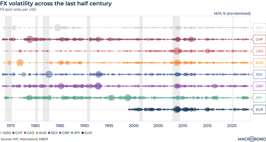
Currencies have been in the news during this tightening cycle as “King Dollar” demolished all rivals in 2022 and retreated this year. There was also a bumpy ride during the US debt ceiling drama.
However, on a historic basis, recent years have not been all that volatile, as our chart shows.
We measured historic volatility for eight of the G-10 currencies against the dollar by applying a month-on-month percentage change and standardising the results. Using the resulting Z-score (a statistical measure of deviation from the norm), we generated volatility “bubble sizes” for moments in time.
The 2008 financial crisis stands out as a period of unanimous volatility against the greenback. It’s also of note that several currencies appear to have been more volatile pre-2000. Japan’s yen experienced more sustained volatility after the 1985 Plaza Accord.
Britons scarred by the Truss/Kwarteng episode might be surprised to see that recent sterling trading has not been especially volatile compared to the early 1990s era of “Black Wednesday,” when the pound crashed out of the European exchange-rate system. (As we wrote last year, while some UK market moves in late 2022 were historic on a weekly basis, the market turmoil was relatively short-lived.)
Projecting borrowing-cost expectations using Blue Chip
.png)
This chart requires a subscription to Blue Chip forecasts. Read more about our new partnership with this data provider here.
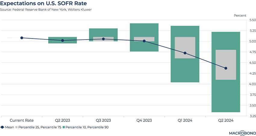
The prestigious Blue Chip forecasts, published by Wolters Kluwer, compile predictions from top US economists to generate key insights on the economy. To demonstrate their power, we chose to examine the US secured overnight financing rate (SOFR).
SOFR is a broad measure of the cost to borrow dollars overnight while posting Treasuries as collateral. (It was developed as an alternative to the scandal-ridden Libor rate.) Effectively, it’s a measure of changing credit conditions.
Blue Chip’s survey compiled SOFR expectations from 41 institutions. This chart tracks their average and various percentile ranges.
It shows how, overall, analysts are pricing in cheaper borrowing costs – and, by implication, Federal Reserve rate cuts – from early next year. But the percentile ranges highlight the diversity of opinion. Several economists are predicting a steep decline; others, presumably concerned about financial stress or sticky inflation, predict little change.
As El Niño returns, watch out for damage
.png)
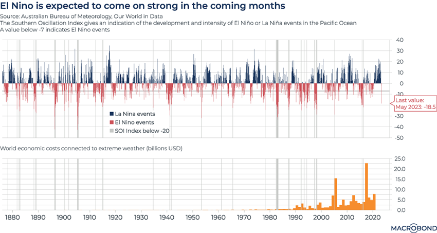
El Niño is back. This climate pattern mostly affects Pacific-facing nations like Australia, but sometimes it can impact the global economy. Some regions experience severe droughts; others, heavy rainfall. The last time a strong El Niño was in full swing, in 2016, the world saw its hottest year on record.
This chart displays the Southern Oscillation Index (SOI), which measures differences in sea level pressure and helps capture this climate event – and its “sister,” La Niña (a cooling event). Sustained negative values (below -7 on the chart) indicate El Niño episodes. We have highlighted the most severe events, when the SOI was below -20.
The more negative the value, the more severe the El Niño – making the sudden shift in May concerning: the SOI plunged from 0 to -18.5.
The second panel tracks the economic costs of extreme weather, which have been gradually increasing over time. Since 2000, two notable spikes have coincided with severe El Niño events.
Surprisingly few OECD economies are in recession
.png)
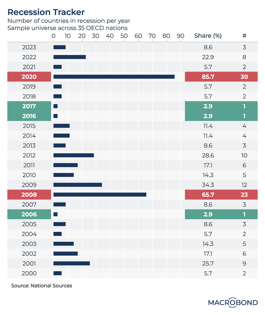
Markets are fretting about the prospects for a global recession. But on a historic basis, the global picture for developed markets has rarely been better than it is in 2023.
This dashboard tracks the number of countries in a recession per year. The sample universe is 35 countries, all of which are OECD member nations.
It may not be a surprise that 2020 and 2008 stand out for broad economic trauma. Meanwhile, 2006, 2016 and 2017 were golden years.
Three economies are in recession in 2023 and one of them is Germany – which recently dragged the entire eurozone into a recession in revised data.
Crowded houses in Europe
.png)
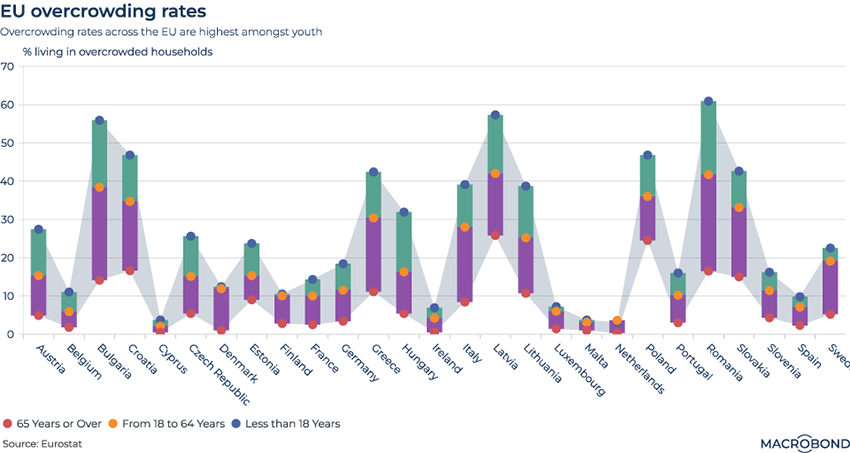
As Europe’s economy grows ever more integrated, cultural and economic differences remain. This chart examines the variation in intergenerational households – or overcrowding, if you’re a young person stuck at home and sharing a room.
Eurostat defines the “overcrowding” percentage rate as the proportion of households that do not meet the following standard: one common room, one room per couple, one room per single adult, and one room per pair of children or same-gender teenagers.
Our chart indicates that under-18s are more likely to suffer from overcrowding in pretty much all member states, but particularly in Eastern European countries such as Bulgaria, Latvia, and Romania.
There are also prominent numbers of “overcrowded” adults in Greece and Italy. It’s possible that this reflects cultural traditions of young adults living with their parents for longer.
The sticky legacies of ECB interventions
.png)
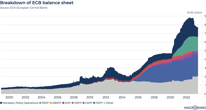
This chart shows how the legacies of past central bank interventions get wound down very slowly.
We’ve broken down the European Central Bank’s balance sheet to show the effects of different asset-purchase programmes. The most significant increase occurred in 2015, with the launch of the PSPP (public sector purchase programme). The ECB bought “peripheral” (ie. Spanish, Portuguese, Italian and Greek) government bonds to support market liquidity.
Most of these economies have recovered from the worst of the early 2010s debt crisis, but more than EUR 2.5 trillion in PSPP purchases still weigh on the ECB balance sheet.
The aftermath of the pandemic is lingering, too, as seen by the green wedge stemming from PEPP (pandemic emergency purchase programme).
The ECB said in May that its asset purchase programmes will cease reinvestments in July. But it will take years for these portfolios to mature and shrink substantially
The darkest-coloured part of the chart reflects monetary policy operations. As the ECB tightens policy to tame inflation, it has shrunk by about EUR 1 billion over the past year.
4 topics
.png)
Macrobond delivers the world’s most extensive macroeconomic & financial data alongside the tools and technologies to quickly analyse, visualise and share insights – from a single integrated platform. Our application is a single source of truth for...
Expertise
.png)
Macrobond delivers the world’s most extensive macroeconomic & financial data alongside the tools and technologies to quickly analyse, visualise and share insights – from a single integrated platform. Our application is a single source of truth for...
.png)