Earnings season forecasts are diverging at a historic pace
.png)
For our first pack of new charts in 2024, we take a deep dive into historic trends – comparing 60-plus years of Fed cycles, more than 150 years of US recessions, and economic growth and earnings volatility in different decades. As central bank watchers anticipate “pivots,” we show how markets have slightly scaled back rate-cut expectations. We also look at Turkey’s rampant inflation and President Biden’s approval ratings.
The sluggish 2020s extend a multi-decade plateau in global growth
This chart can be applied to different countries using Macrobond’s change region functionality.
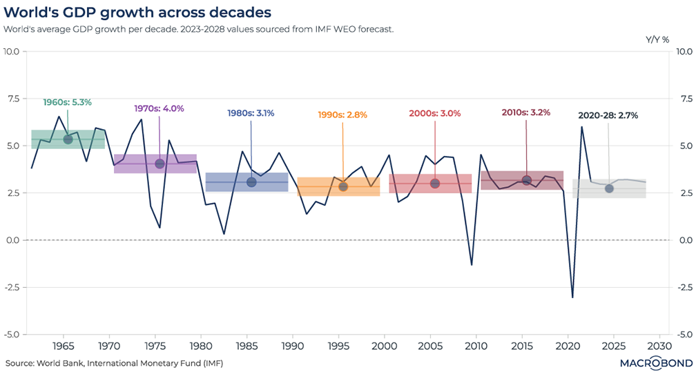
We’ve entered the fifth year of the 2020s, so it’s not too early to start thinking about decade-on-decade economic comparisons.
This chart uses data from the World Bank and International Monetary Fund to compile global GDP growth rates from 1960. The coloured stripes represent the mean growth rate for each decade.
Even as the post-Covid snapback led to the quickest growth since the 1970s, the lingering damage from the pandemic makes the 2020s the weakest decade on our chart.
Interestingly, the 1990s, a golden era for the American economy, were only slightly better than the 2020s on a global basis. This could reflect the depth of the contraction in post-Soviet and other post-Communist states. China, meanwhile, had already started to grow quickly, but from a much lower share of global wealth than it has today.
Turkey’s inflation problem spreads across the economy
This chart can be applied to different countries using Macrobond’s change region functionality.
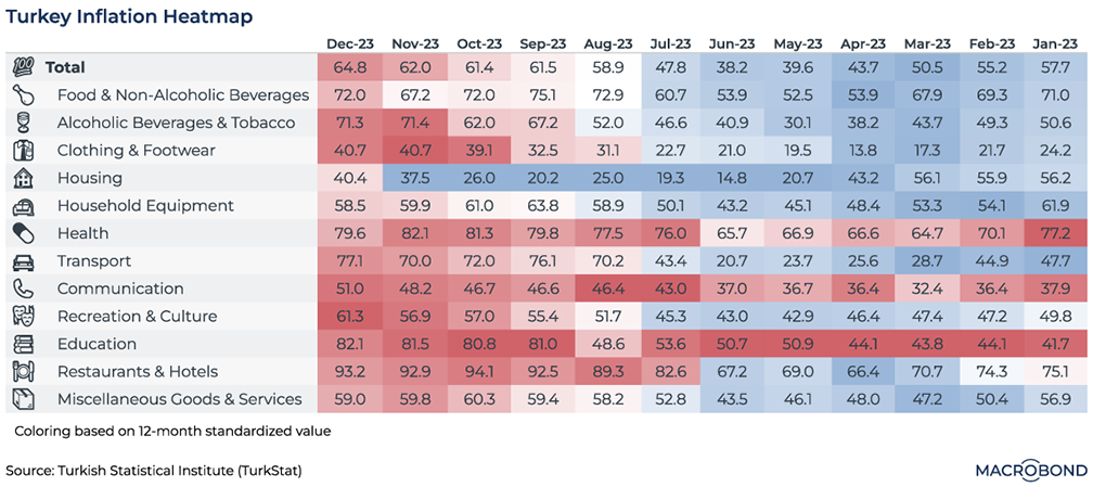
Disinflation might be taking hold in much of the world, but not in Turkey.
The central bank has spent half a year unwinding the unconventional interest-rate policies formerly espoused by President Erdogan, but inflation has only become worse – ending 2023 at a whopping 65.7 percent. Meanwhile, the currency is sliding to more record lows.
This inflation heat map shows all sectors in various shades of red for December, indicating that they are exceeding their 12-month average. Education, hospitality and transport experienced some of the most significant inflationary pressures. Last month, housing became the last relatively “cool” category to go.
It's a historically uncommon moment for the Fed to end rate hikes
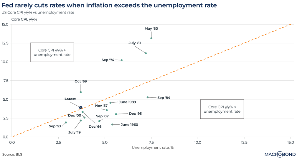
Unemployment versus inflation is the classic central-banking tradeoff. Therefore, it’s historically unusual, though not unknown, for the Federal Reserve to stop tightening policy when inflation remains higher than the unemployment rate.
The moments in time on this scatterplot represent the final rate hikes in Fed cycles going back to 1957. Data points below the dotted line show moments when unemployment exceeded the inflation rate at the time.
Just four cycles are on the other side of the line – all in the inflationary 1969-81 era bookended by Paul Volcker’s crushing interest-rate hikes.
Today, we are again north of the dotted line, but just barely. US unemployment stands at 3.7 percent, while inflation, as defined by the change in the year-on-year core consumer price index, is 4 percent. Jerome Powell is hoping to land a disinflationary soft landing; his critics charge that he risks repeating the mistakes of the 1970s by halting rate increases (as the market assumes he has) before inflation has truly been crushed.
Short, sharp recessions vs. long depressions, before and after WWII
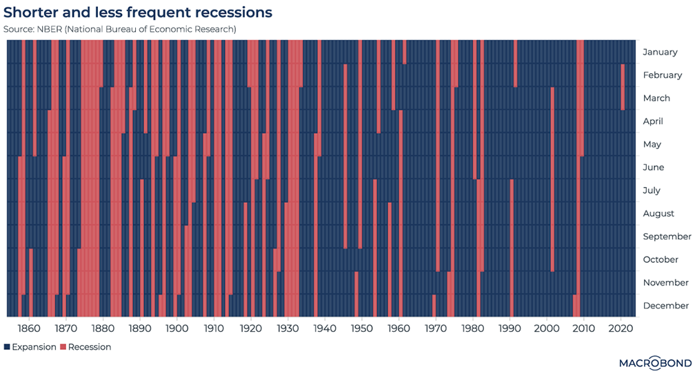
The National Bureau of Economic Research is viewed as having the official word on whether the US is in recession. The NBER also has data on business cycles going back to the Civil War, allowing us to examine very long-term trends.
As the red strips in this chart show, long-lasting recessions were quite frequent – indeed, almost more of a norm than economic growth – before World War II. The Great Depression was not unique; the “Long Depression” of the 1870s, known for gradual, post-bubble deflation rather than the misery of the 1930s, is clearly visible.
Since the late 1930s, the pattern has changed completely; expansion is the norm, interrupted by recessions that seldom last more than a year. Economists often attribute this to the abandonment of the gold standard, allowing policymakers much more leeway to stimulate the economy (and create inflation).
President Biden falls behind Trump’s approval-rating trend – again
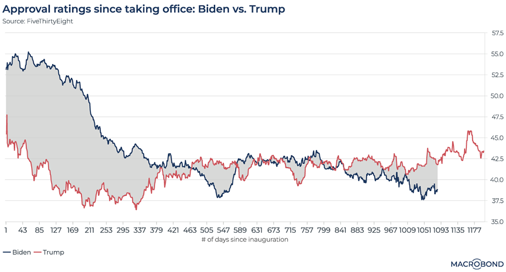
This chart tracks the progress of approval ratings for Presidents Trump and Biden as compiled by FiveThirtyEight, the website founded by pollster Nate Silver.
Donald Trump is notable for his quick descent into unpopularity, followed by a slow rebound from the second year of his presidency as the economy kept growing. Still, his approval rating never truly approached 50 percent.
Joe Biden took office with considerably more enthusiasm from the electorate, only to see his rating deflate as the pandemic wound down and inflation kicked in. He has fallen below Trump’s approval rating at the same point in his presidential term several times.
With the current president not far off his lowest approval rating, the Democratic Party remains concerned that his predecessor might also be elected as his successor later this year.
Two weeks into 2024, markets expect a smaller “pivot” in Europe
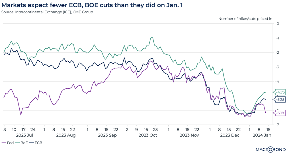
This chart visualises the progression of futures-market expectations for action by the Federal Reserve, European Central Bank and Bank of England this year.
It’s notable how the gap between perceptions of the different central banks closed over the course of 2023. Last summer, markets were betting on a sharp Fed pivot but tighter policy for longer in the UK and Europe. Fed and ECB expectations converged in September, and then moved in unison back towards a more severe pivot.
By the end of 2023, the markets were expecting the same outcome for all three central banks: six rate cuts. However, as of Jan. 12, expectations had been trimmed to “only” about five cuts for the ECB and BoE.
Expectations for the Fed were following suit after unexpectedly strong US nonfarm payrolls, but futures markets were back to predicting six cuts at the time of our publication.
Earnings forecasts by sector are diverging the most in decades
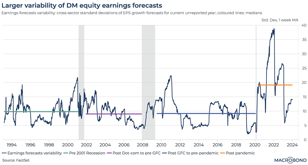
This chart requires a subscription to the Macrobond/FactSet Equity Factor Aggregates add-on database.
It would seem obvious that the pandemic was a boon to some industries and inflicted serious damage on others. This chart provides evidence for that assertion by tracking how analysts’ earnings estimates for different sectors have diverged.
This chart uses historic data on developed-market earnings-per-share estimates from FactSet to calculate this dispersion, i.e. cross-sector standard deviations.
The coloured lines track the median dispersion in different “eras” over the past 30 years: Alan Greenspan’s “irrational exuberance” 1990s, the post 9/11-post-dot-com 2000s, and the years that followed the global financial crisis.
Variability between sectors has been dramatically higher since 2020.
4 topics
.png)
Macrobond delivers the world’s most extensive macroeconomic & financial data alongside the tools and technologies to quickly analyse, visualise and share insights – from a single integrated platform. Our application is a single source of truth for...
Expertise
.png)
Macrobond delivers the world’s most extensive macroeconomic & financial data alongside the tools and technologies to quickly analyse, visualise and share insights – from a single integrated platform. Our application is a single source of truth for...
.png)