Global inflation, air freight, trade trends and the shekel
.png)
The inflationary Aussie consumer price basket
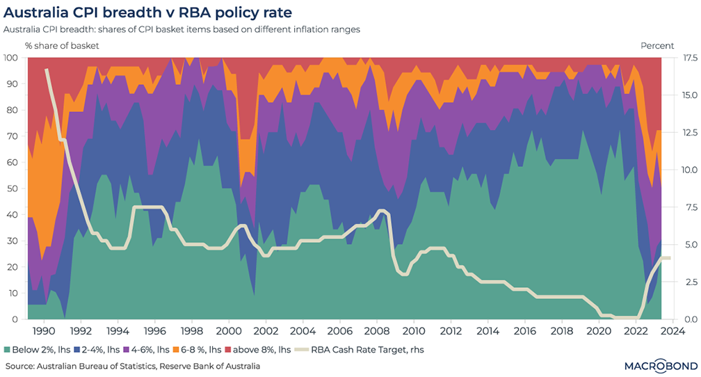
Australia’s third-quarter consumer price index (CPI) is released on Oct. 25. Amid persistent inflation, the nation’s central bank has been making hawkish noises. This chart breaks down Australia’s CPI basket by showing the proportion of items where prices are rising more than 8 percent year on year (in red), less than 2 percent on the same basis (in green), and several inflation ranges in between. We’ve overlaid the Reserve Bank of Australia’s key interest rate during that time.
The large swath of green shows the prevalence of a low-inflation norm over the three decades before the pandemic. That came to an end in 2022, as inflation breadth started looking more like the early 1990s.
The most recent data shows a small rebound in the percentage of shopping-basket items with relatively stable prices. The RBA will want to see that trend continue for policy makers not to resume rate hikes.
Pricing in a weaker Israeli shekel
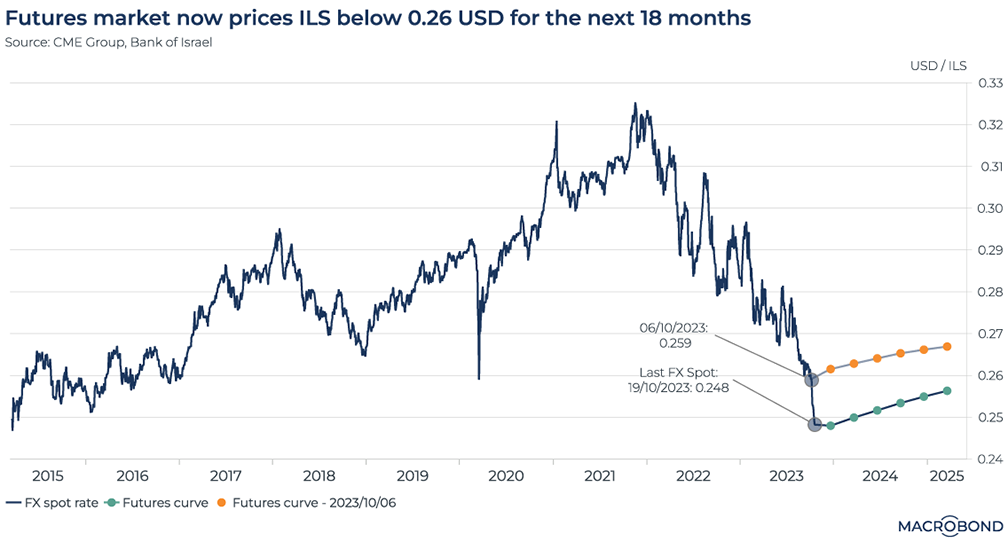
Israeli Prime Minister Benjamin Netanyahu said this week that his nation’s conflict with Hamas will be a “long war.” Currency traders appear to be pricing that message in.
The Israeli shekel has dropped more than 4 percent against the dollar since Hamas’ Oct. 7 attack, reaching an eight-year low of about 25 cents. That prompted the Bank of Israel to say it would deploy USD 30 billion in reserves to support the currency.
This chart compares the Oct. 6 curve for USD/ILS to the one we see today. Despite the Israeli central bank’s support, traders are pricing in an exchange rate through 2025 that’s about one US cent below the pre-conflict scenario.
The Fed’s favourite inflation measure has only been revised higher lately
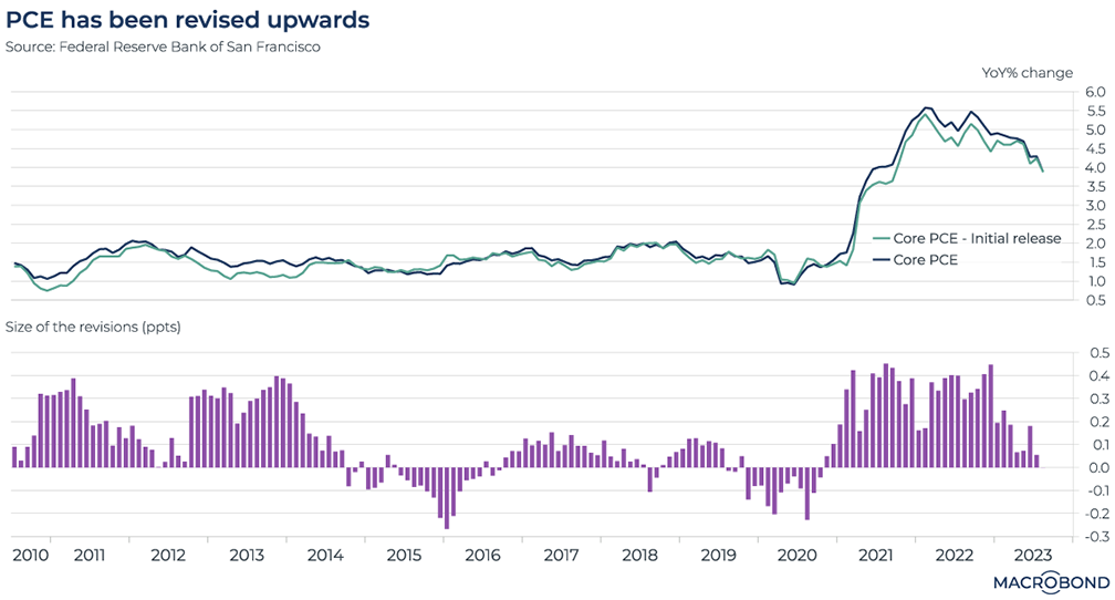
Tip: this chart requires a Data+ subscription to access Revision History.
The US releases data on personal consumption expenditures (PCE) next week. The Federal Reserve is known to pay closer attention to measures of PCE rather than the better-known CPI (which puts a heavier weight on shelter, food and energy).
This chart tracks core PCE over the past decade – comparing the data’s initial release value to its final, revised print, using our Revision History tool.
While the two lines track each other quite closely, the second panel is fodder for inflation hawks: every core PCE data point has been revised upward for three consecutive years.
Gauging the speed of G7 inflation
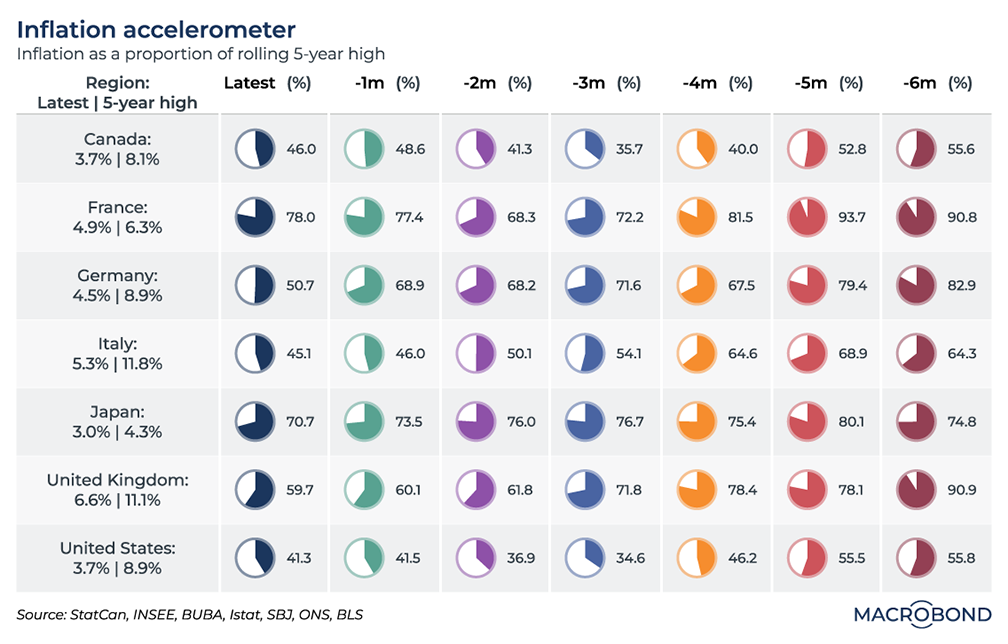
As policymakers assess whether inflation is slowing sufficiently, this dashboard enables us to track the progress of price increases across the G7 industrialised nations over the past six months.
As automotive dashboards have speedometers, we’ve dubbed this an “accelerometer” – visualising the speed of inflation every month over the past half year.
The individual accelerometers (or pie charts, or Trivial Pursuit pieces) track the inflation rate as a percentage of its rolling 5-year high.
Broadly, the most recent readings show a definite slowdown from six months earlier. But there are regional particularities, and recent months have seen an inflation “plateau,” or even moderate acceleration.
Japan, which is particularly focused on wage growth as the weak yen imports inflation, has hardly seen price increases slow at all.
The World Trade Monitor’s recession signal hasn’t kicked in (yet)
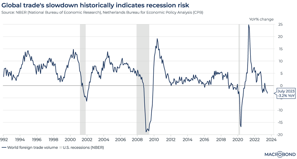
The Netherlands Bureau for Economic Policy Analysis (known by its Dutch acronym CPB) will publish an updated edition of its World Trade Monitor on Oct. 25.
Fittingly for a nation that pioneered international merchant capitalism, this respected Dutch publication compiles a “merchandise trade aggregate” as a measure of global trade.
Since this indicator’s inception in 1992, merchandise trade had always grown on a year-on-year basis – except for the last three US recessions: the 2001 dot-com hangover, the global financial crisis of 2008-09, and the 2020 pandemic plunge, as our chart shows.
Like the persistently inverted US yield curve, the merchandise trade aggregate has been ringing an alarm bell, but there has been no recession in sight. The indicator has stayed in negative territory through much of 2023.
The Shenzhen stock index is having a historically bad year
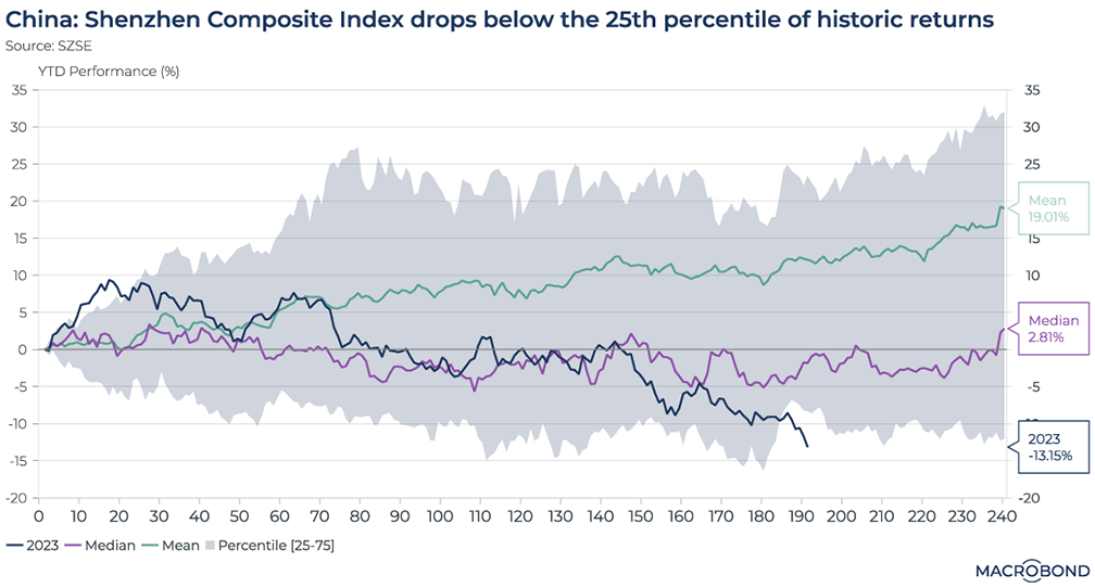
China’s disappointing economic rebound this year has been reflected in the stock market.
This chart tracks the performance of the Shenzhen Composite Index over the course of this year, comparing it to this benchmark’s median and mean trajectories. We also compare it to the 25-75 percentile range of historic performance (highlighted in gray); the index just stepped outside that zone, entering the bottom quartile of historic performance.
The Shenzhen exchange is generally seen as a home for more entrepreneurial stocks than the bigger equities traded in Shanghai. It is also more associated with individual investors than the institutional trading that prevails in Shanghai.
As such, it’s quite a speculative index: the median annual return is less than 3 percent, while the historic average return is a whopping 19 percent (almost double the historic equivalent for the S&P 500) due to the outsized gains of 2007, when the benchmark doubled.
Air freight rates are attempting takeoff in Asia
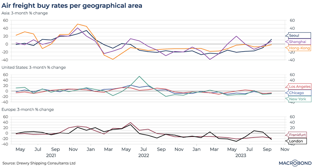
Macrobond carries several datasets from Drewry, the shipping consultancy: its well-known World Container Index (a measure of seaborne trade) and detailed air freight rates.
This visualisation charts the different trends in air freight for three continents. We aggregated rates to ship goods from major airports in Asia, the US and Europe.
Since mid-2022, there has been a broad, worldwide price decline (as measured on a three-month percentage change basis) as the post-pandemic resurgence in shipments dissipated.
It is interesting, however, that Seoul and Shanghai are seeing an upturn recently. This could dovetail with the OECD leading indicator we published last week, showing relative optimism for China.
5 topics
.png)
Macrobond delivers the world’s most extensive macroeconomic & financial data alongside the tools and technologies to quickly analyse, visualise and share insights – from a single integrated platform. Our application is a single source of truth for...
Expertise
.png)
Macrobond delivers the world’s most extensive macroeconomic & financial data alongside the tools and technologies to quickly analyse, visualise and share insights – from a single integrated platform. Our application is a single source of truth for...
.png)