Tech stocks rally, hard and soft landings, and past Fed pauses
.png)
This week’s charts begin by revisiting our table of winners and losers in the S&P 500, showing the reversal in 2023 as tech rallies and energy stumbles. We also show how individual stock investors are staying in the market despite broad negativity amongst American consumers. With all eyes on the Fed’s attempt to engineer a “soft landing,” we examine previous recessions and historic examples of monetary tightening “pauses” by the central bank. In Europe, our “clock” of the business cycle shows consumers are a positive outlier as sectors like construction remain in the doldrums. In Russia, energy revenues are sliding, while in Asia, tourism is surging back to pre-pandemic levels. Finally, we generate a forecast for US house prices using our partnership with Indicio, a machine-learning platform.
S&P winning sectors rotate in 2023
.png)
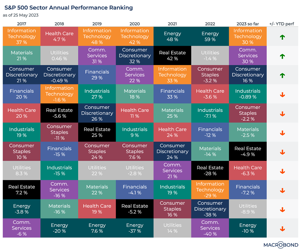
This chart revisits our “checkerboard” visualisation in December, which ranked winning and losing industry groups in the S&P 500 for every calendar year.
Adding the year-to-date performance in 2023, the winning and losing sectors have almost reversed. Energy was the only sector with positive returns in 2022; it ranks last so far this year. This year’s top three performers were the three worst laggards of 2022.
Amid a surprisingly resilient global economy, communications services, technology and consumer discretionary stocks are leading the gains.
Hard, soft and crash landings through history
.png)
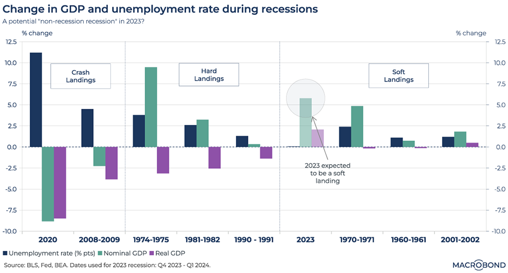
The Fed is in search of a “soft landing.” These aren’t mythical, but they are relatively rare.
Our chart aims to classify the time periods before, during and after various US recessions as “hard,” “soft” or “crash” landings. We assess three indicators – the unemployment rate, nominal GDP and inflation-adjusted real GDP – and chart their moves.
Current Fed estimates call for a two-quarter, soft-landing recession that begins at the end of this year. We’ve charted this accordingly. Historic precedents include 1970-71, 1960-61 and the early 2000s downturn after the tech bubble popped.
As for crash landings, the pandemic episode of 2020 is in a class by itself. Perhaps unsurprisingly, the GFC was second worst.
Will this recession be more like the hard landings of the mid-70s and early 80s? The CEO of Apollo Global Management is expecting a “non-recession recession,” where the pain is felt more in asset prices. (The 2001-02 popped dotcom bubble period could be categorized this way.)
Previous Fed rate-hike pauses were in much more positive environments
.png)
We wrote recently that high-profile investors think the Fed is done hiking rates. Inflation has slowed for a tenth straight month, and financial stress is elevated after high-profile bank failures. Markets are pricing in rate cuts later this year, but if inflation stays high and the economy is resilient, the Fed could “pause, not pivot” for some time.
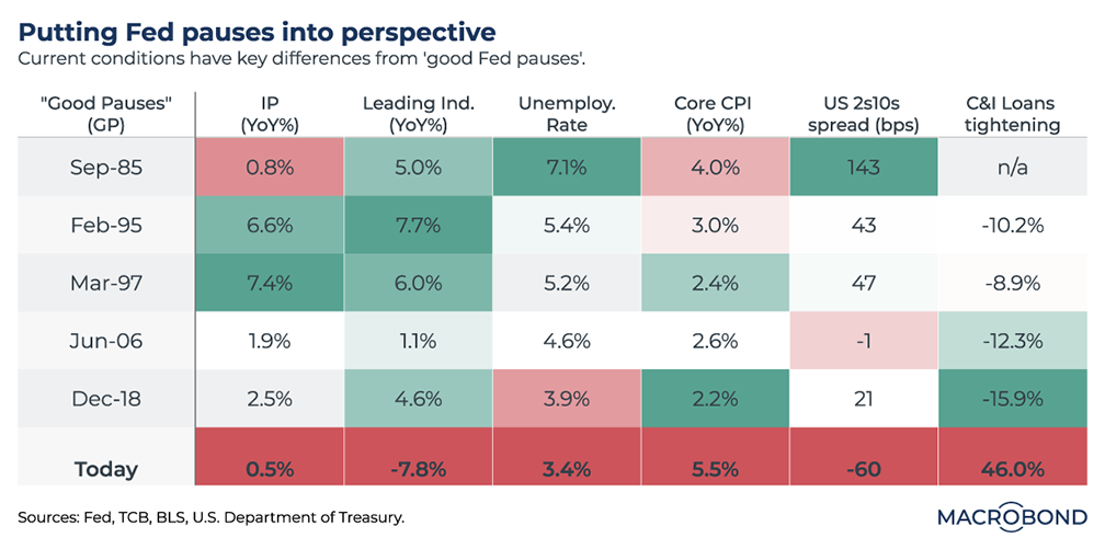
In 1985, 1995, 1997, 2006 and 2018, the Fed eased off tightening when the economy was in good shape. Stocks rose. We characterize these as “good pauses.” The current environment is quite different.
As our table shows, industrial production is stagnating, the Conference Board’s composite of leading economic indicators is sliding, the yield curve is sharply inverted, and banks are tightening their industrial lending standards significantly.
It might be counterintuitive to have the highest unemployment rate in positive green and the current tight labour market in red – but from a central bank’s perspective, this reflects the “buffer” effect, or slack, that high unemployment has to absorb an inflationary spike.
The current inverted yield curve is not a bullish indicator for stocks. Far from a “good” pause, the bright red may be telling us that rate cuts will come soon and a sharp recession is ahead.
European consumer confidence is a positive outlier in our economic cycle clock
.png)
Tip: this chart allows for change region functionality.
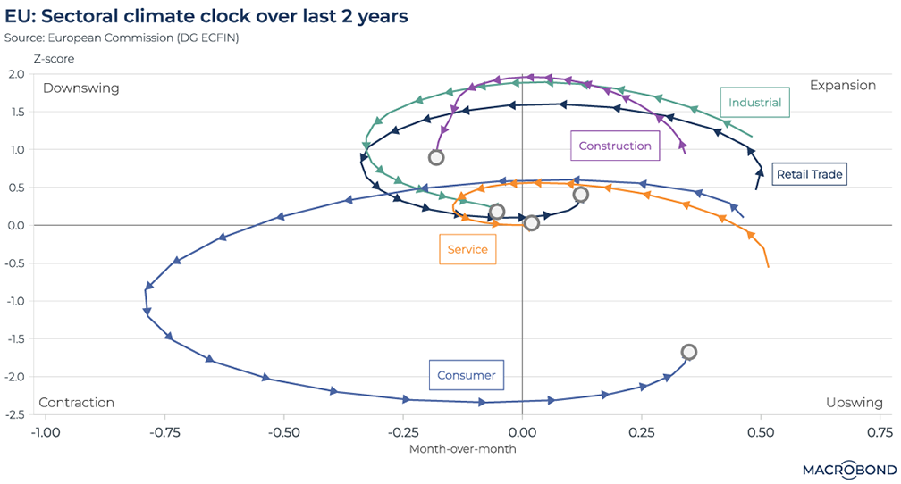
This is a version of various “clocks” that visualise business cycles through an upswing, an expansion, a downswing and a contraction. This clock tracks the business climate for various economic sectors in the European Union over the past two years, and its methodology is based on this research paper.
Consumer confidence stands out. It took a major swing into contraction from January 2022, even before Russia’s invasion of Ukraine sent energy prices surging. However, it was already in the upswing quadrant by November and has continuously improved since.
Persistent inflation and interest-rate hikes pushed most other business sectors into the downswing quadrant. There appears to be light at the end of the tunnel, however, as they move toward expansion; retail trade is already there. Construction, however, remains depressed and hasn’t started to make a positive turn.
Steadfast US stock investors defy bearish consumer sentiment
.png)
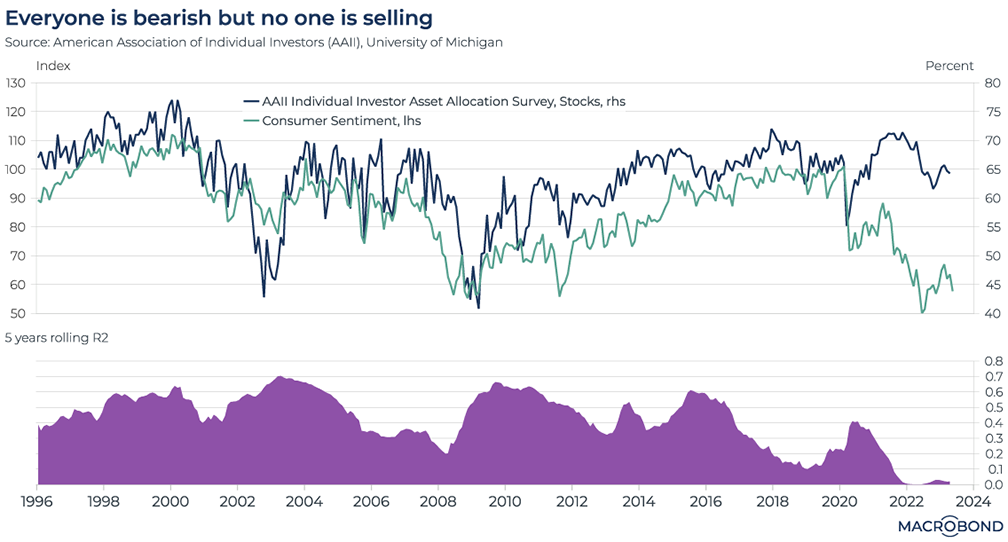
Historically, as the US consumer became bearish, individual investors pulled money from the stock market. That relationship has broken down, as our chart shows.
This visualisation tracks the results of a survey by the American Association of Individual Investors (AAII), which measures the proportion of portfolios that are positioned in stocks. The divergence with the University of Michigan’s consumer sentiment index began in 2020 – a year that saw the pandemic hammer the economy while tech stocks surged.
The second panel reflects a statistical measure of correlation. For decades, the 5-year rolling correlation spent most of its time above 0.4, approaching 0.7 several times. Recently, that correlation has sunk to zero.
As consumer sentiment remains in the doldrums, the AAII says its members continue to position more than 60 percent of their portfolios in stocks.
Russian energy revenues slide
.png)
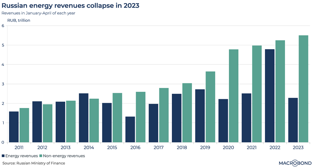
This chart tracks Russia’s energy- and non-energy-related government revenue for the first four months of each calendar year. The effects of volatile oil prices can clearly be seen.
Moscow appeared to derive a perverse benefit from invading Ukraine last year; oil prices surged and so did energy revenue.
However, a year later, revenue has tumbled – even though Moscow’s April oil exports rose to the highest since the conflict began.
While international oil prices have come down, sanctions are making a difference too; with the EU banning Russian oil imports, Russia is selling crude at a discount elsewhere.
A tourism recovery across Asia
.png)
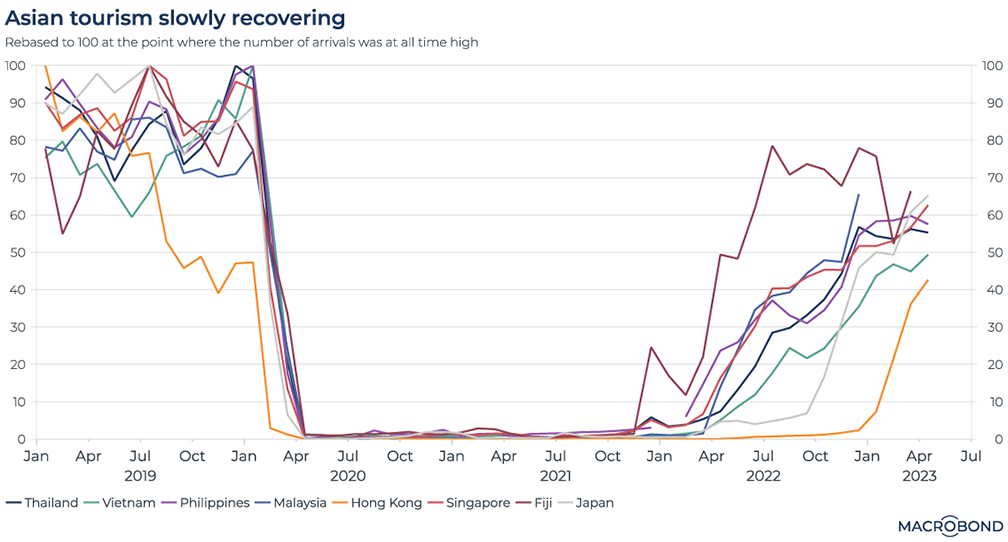
International travel is steadily resuming across Asia. As our chart of tourist arrivals shows, we are well on the way back to pre-pandemic norms.
We track destinations ranging from the urban bustle of Singapore to the beaches of Thailand (a favoured destination for Chinese tourists) and Fiji (especially popular with Australians and New Zealanders). The top of the chart – 100 on the y-axis – represents a nation’s all-time high.
Except for Hong Kong, which reopened later than the rest, tourist arrivals are more than halfway back to former peaks.
Forecasting Case-Shiller house prices with Indicio
.png)
Indicio is a machine-learning platform that lets the Macrobond community easily work with univariate and multivariate time-series models to forecast macroeconomic and financial data. Indicio aims to combine different modelling approaches, potentially creating a super-forecast that can outperform any single model.
With global real estate in focus, as interest rates rise, we’ve used Indicio to generate a forecast for one of the best-known measures of US house prices: the S&P Case-Shiller index. Ahead of the March figures, which will be released on May 30, our model predicts the coming 12 months for a composite index of 20 major metropolitan areas.
Indicio allows us to create a broad range of univariate and multivariate models. We opted to keep 24 multivariate models, using stepwise RMSE (a measure of historic accuracy) to weigh each input model.
Our forecast is quite bearish. It calls for the Composite 20 index to have entered negative territory in March (-1.28 percent year-on-year in the weighted model) and keep dropping from there.
(For a deeper dive into the methodology of using Indicio, read a longer article about how we forecast US payrolls here.)
5 topics
.png)
Macrobond delivers the world’s most extensive macroeconomic & financial data alongside the tools and technologies to quickly analyse, visualise and share insights – from a single integrated platform. Our application is a single source of truth for...
Expertise
.png)
Macrobond delivers the world’s most extensive macroeconomic & financial data alongside the tools and technologies to quickly analyse, visualise and share insights – from a single integrated platform. Our application is a single source of truth for...
.png)