7 remarkable charts that reveal a novel insight for 2025 and beyond

On the 7th day of Christmas, Livewire gave to me...
A set of remarkable charts that tell a story about the world today
When I created Signal or Noise three years ago, I really created it for one purpose - to explain and educate investors on the value that macroeconomic analysis and data can add to your investment decisions. But since that first episode (we've produced 31 episodes in the three seasons we've been on the air), we've also discovered a new love among both the Livewire audience and the guests who are kind enough to grace our show - an obsession with a good chart.
So with that spirit in mind, and given Signal or Noise is now off on its summer hiatus, I've asked seven alumni of the show to share with us their favourite chart and a few words explaining the investment insight they glean from it.
Let's start with the economists: AMP's Shane Oliver and Westpac's Luci Ellis:
Shane's Chart: Time is an investor's best friend
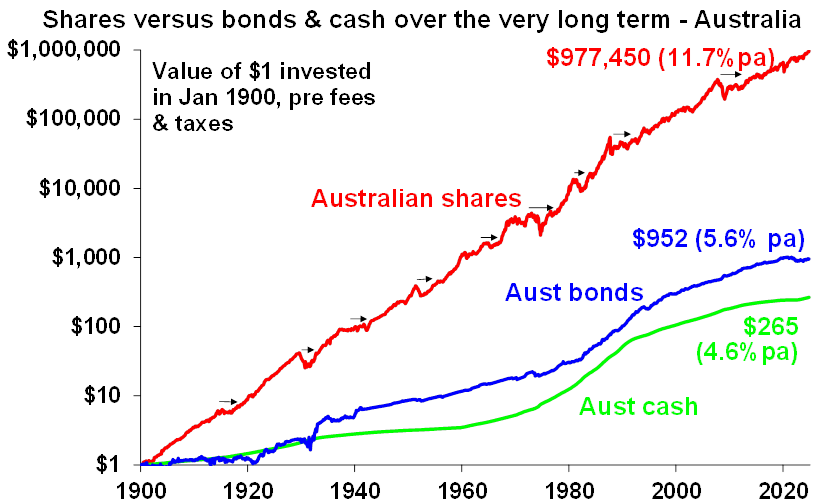
Note: Arrows show extended rough patches for shares. (Source: ASX, Bloomberg, RBA, AMP)
"This shows the value of $1 invested in cash, bonds and shares in 1900. It highlights the power of compounding returns. The key is to make the most of this with assets like shares and property and not get blown off course in uncertain times - like we may see in 2025!" Dr Oliver said.

Luci's Chart: Where are all these job seekers finding work?
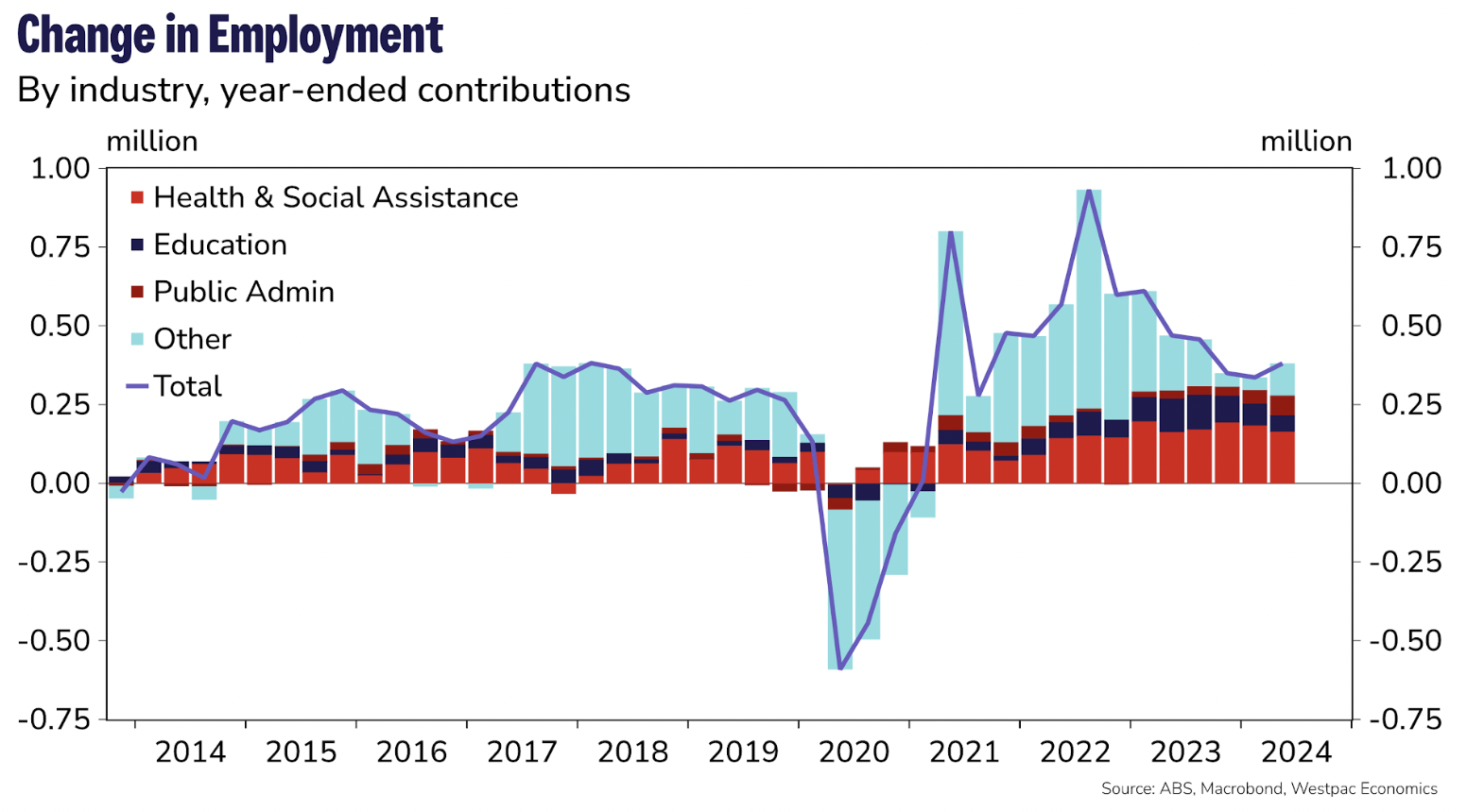
As inflation continues to decline, the Reserve Bank's focus has squarely been on the local job market. Any material uptick in unemployment could be enough to kick-start a bigger interest rate-cutting cycle.
"The RBA is currently highlighting that forward indicators of labour market conditions have stabilised or been strengthening, so a change in direction would be very consequential," Ellis said.
“Employment growth has been strong lately, but it needs to be. Growth in the working-age population is also unusually high since the borders re-opened, and the participation rate is trending up. ‘Non-market’ sectors account for most of the recent growth, meaning total employment growth could weaken suddenly if policies change,” Ellis added.

Next up, the asset allocators: Kerry Craig of JPMorgan Asset Management and Thomas Pouallouec of T. Rowe Price:
Kerry's Chart: Forget the "dollar smile" - here's the "trade smile"
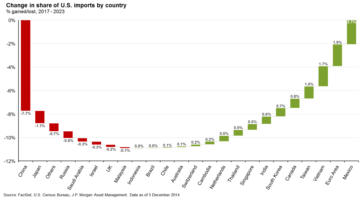
But what if there was another smile worth eyeing?
"Investors know the 'dollar smile,' but what about the 'trade smile'? Since the last trade war, U.S. trade has shifted from China to Canada, Mexico, Europe, and Vietnam. The U.S. aims for tougher trade policies to renegotiate for a “fairer deal”, but Australia is likely to avoid the ire of U.S. trade officials – as the chart shows, our share of trade has barely shifted," Craig said.

Thomas' Chart: Inflation is the wild card
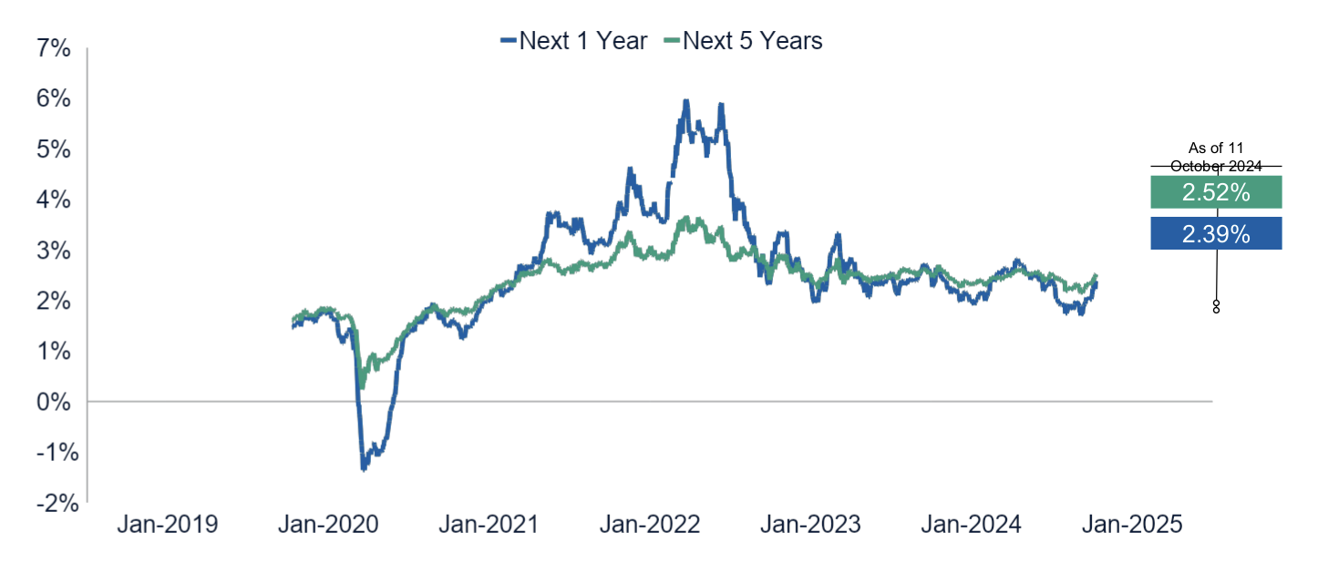
"A key question for 2025 markets is how long and variable is the lag after Federal Reserve action on monetary policy? A long lag would delay the impact of Fed easing, causing concern about the labour market (and potential recession) rather than inflation. A short lag raises concerns about inflation over unemployment. We believe the lag will be short, making us positive on growth but wary of sticky inflation," Poullaouec shared with us.
"In an environment where not enough uncertainty is priced into most asset classes, we keep an overweight to cash and to real asset stocks due to inflation risks."
Finally, the fund managers: Amy Xie Patrick of Pendal Group, Schroders' Kellie Wood, and Tom Nash of UBS AM:
Amy's Chart: Don't fear the loss of bank hybrids
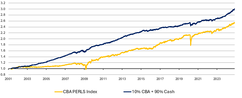
"APRA has ruled that banks can no longer issue hybrids for their capital needs, leaving investors hunting for alternative sources of returns. Thankfully, a portfolio of 90% cash and 10% CBA shares would have given investors a stronger and smoother return outcome over the last 20 years compared to CBA PERLS (hybrids). Better outcomes don’t always come with more risk," Xie Patrick said.

Kellie's Chart: It's all about sovereign bonds!
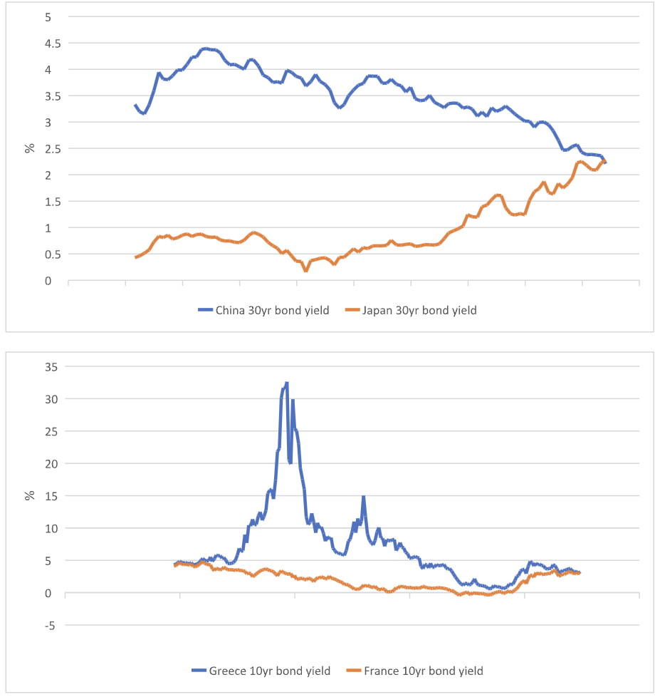
"We are seeing two fascinating Sovereign crossovers. First, Chinese 30yr yields are now trading more than 10bps below their Japanese equivalent, and French 10yr yields above Greek 10yr yields for the first time in any observable long-term history and currently remaining flat to each other," Wood noted.
"For the first of these, there has to be some risk that investors believe that China is facing the same structural issues that have plagued Japan for decades, whilst also thinking that Japan is slowly normalising. On the second theme, France is in the midst of a political storm and on the brink of the first successful no confidence vote in the Government since 1962. That’s led to a significant reappraisal of sovereign risk. All this means fiscal policy is under intense scrutiny from the markets," Wood added.

Tom's Chart: Not enough rate cuts are being priced for Australia
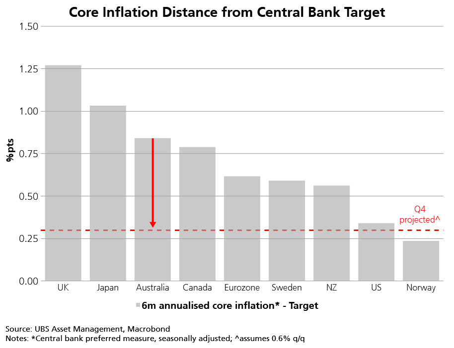
"Tracking the progress of inflation towards central bank targets has helped us to deliver strong alpha in global rates strategies as the easing cycle broadened across regions. While the RBA has not yet eased, our analysis suggests that the market narrative supporting restrictive rates - that underlying inflation is “stickier” in Australia – now looks shaky. We see better opportunities for Aussie bonds going into 2025 as this narrative shifts," Nash said.
.jpg)

